Global Application Settings
- 3 minutes to read
This section contains information on all application-wide appearance and behavior settings available for DevExpress components and forms.
Appearance Settings
The DevExpress Skin Engine is a convenient tool that allows you to maintain the visual consistency of your application. To apply a built-in or custom skin and switch between color schemes available for vector skins, you can use the TdxSkinController component, which provides access to DevExpress Skin Engine functionality.
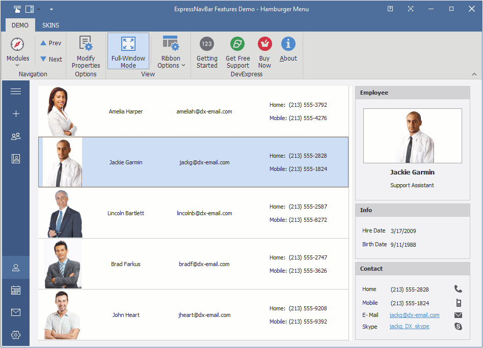
Refer to the following topic for detailed information on appearance customization options available for DevExpress-powered applications: Appearance Settings.
Project Settings
Project Settings is a design-time dialog where you can configure all project settings related to DevExpress components. To open the dialog, navigate to the Project menu category of your RAD Studio IDE and click DevExpress Settings for ProjectName.
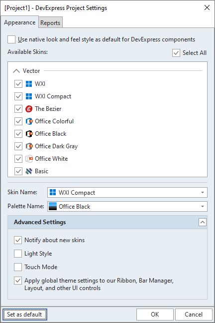
Refer to the following topic for detailed information: Project Settings.
Diacritic Marks and Related String Comparison Settings
A diacritic mark is a glyph added to a base letter. The majority of European languages uses diacritic marks to stress vowels and designate different sounds for the same base letter in an alphabet.
DevExpress data controllers and text field-based editors treat a base letter with different diacritic marks as different characters for all comparison operations that allow you to search, sort, and filter data. You can set the TdxDiacriticStringOptions.ComparisonMode class property to TdxDiacriticStringComparisonMode.Insensitive in the initialization section of the main application to treat all variations of the same letter in an alphabet as the same character for string comparison.
Code Example: Configure Diacritic Settings
The following code example configures global diacritic mark-related settings at application startup:
uses
  dxCore;
// ...
begin
  TdxDiacriticStringOptions.ComparisonMode := TdxDiacriticStringComparisonMode.Insensitive;
  TdxDiacriticStringOptions.NormalizationMode := TdxDiacriticStringNormalizationMode.System;
  // ...
  Application.Initialize;
  Application.MainFormOnTaskBar := True;
  Application.CreateForm(TMyForm, MyForm);
  Application.Run;
end.
Refer to the TdxDiacriticStringOptions class description for detailed information on all available options.
Diacritic Setting Limitations
Diacritic mark settings have no effect on server mode data controllers and the following lookup editors:
- TcxExtLookupComboBox
- An unbound lookup combo box editor that displays a data-aware Table or Banded Table grid View as its drop-down window.
- TcxDBExtLookupComboBox
- A data-aware lookup combo box editor that displays a data-aware Table or Banded Table grid View in its drop-down window.
- TcxDBLookupComboBox
- A data-aware lookup combo box editor.
- TcxLookupComboBox
- An unbound lookup combo box editor.
Tip
You can use database collation options instead of these global diacritic settings if you use Server Mode.
Available database collation options depend on the SQL server you use. Refer to the corresponding SQL server documentation for details (for example, Collation and Unicode Support in Microsoft SQL Server).
Right-to-Left Layout
Certain languages, such as Hebrew or Arabic, use a right-to-left (RTL) writing system that requires a mirrored UI layout and a reversed text direction.
Enable RTL Layout
To use RTL display mode in an application or control, assign bdRightToLeft to the application’s BiDiMode property or the control’s BiDiMode property.
Refer to the following topic for a list of supported controls and a code example: Right-to-Left Layout.
Multi-Threaded Calculations
DevExpress data controllers that manage data in container controls rely on multi-threaded algorithms for data sort, filter, and group operations. These multi-threaded algorithms significantly speed up (up to two or more times faster) all data shaping operations.
Refer to the following topic for detailed information: Multi-Threaded Algorithms.