DXContentPresenter.Icon Property
Gets or sets the icon image within the DXContentPresenter‘s content. This is a bindable property.
Namespace: DevExpress.Maui.Core
Assembly: DevExpress.Maui.Core.dll
NuGet Package: DevExpress.Maui.Core
#Declaration
public ImageSource Icon { get; set; }#Property Value
| Type | Description |
|---|---|
| Image |
The icon image. |
#Remarks
If you assign an image to the Icon property, the icon appears to the left of the text within the DXContentPresenter ’s content. To change the icon’s position, use the IconPlacement property. You can also use the ShowIcon property to change icon visibility.
#Example
This example shows how to customize button appearance and handle the button click event.
Button State | Default Appearance | Custom Appearance |
|---|---|---|
Default |
|
|
Pressed |
|
|
Disabled |
|
|

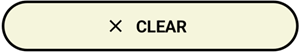


Add the clear.png icon file to the Resources/Images folder.
Use the following properties to adjust the button’s appearance and handle the Clicked event to clear label on button tap:
<dx:DXButton
            ButtonType="Accent"
            Content="CLEAR"
            TextColor="Black"
            DisabledTextColor="DarkGray"
            PressedTextColor="White"

            Icon="clear"
            IconColor="Black"
            DisabledIconColor="DarkGray"
            PressedIconColor="White"

            BorderThickness="2"
            BorderColor="Black"
            DisabledBorderColor="DarkGray"
            PressedBorderColor="DarkOrange"
            CornerRadius="25"

            BackgroundColor="Beige"
            DisabledBackgroundColor="Brown"
            PressedBackgroundColor="Gray"

            Clicked="Button_Clicked"/>
You can also handle the Tap event to specify an action that occurs when a user taps a DXButtonBase descendant. The Tap event allows you to pass additional event data.