DXToggleButton Class
A toggle button control.
Namespace: DevExpress.Maui.Core
Assembly: DevExpress.Maui.Core.dll
NuGet Package: DevExpress.Maui.Core
Declaration
[DXLicenseMAUI]
public class DXToggleButton :
    DXButton
Remarks
DXToggleButton performs assigned actions when a user switches it to the checked or unchecked state. The control can display a caption string (Content), icon (Icon), or both.

The following example adds a DXToggleButton to the page and sets its content to match the animation above:
<ContentPage ...
    xmlns:dx="clr-namespace:DevExpress.Maui.Core;assembly=DevExpress.Maui.Core">
    <Grid>
      <dx:DXToggleButton
                        Content="Bookmark"
                        Icon="bookmark"/>
    </Grid>
</ContentPage>
Group Toggle Buttons
You can group several DXToggleButton controls to implement exclusive selection (a radio group). When a user selects a DXToggleButton, the action deselects all other controls in the group.
Specify the same GroupName property value for all DXToggleButton within the group. The following code sample illustrates the Layout group of DXToggleButton with exclusive selection:
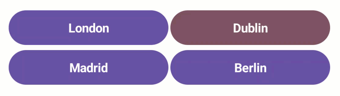
<dx:DXStackLayout Orientation="Vertical">
  <dx:DXStackLayout Orientation="Horizontal">
    <dx:DXToggleButton x:Name="toggle_button_1"
                      GroupName="1"
                      Content="London"/>
    <dx:DXToggleButton x:Name="toggle_button_2"
                      GroupName="1"
                      Content="Dublin"/>
  </dx:DXStackLayout>
  <dx:DXStackLayout Orientation="Horizontal">
    <dx:DXToggleButton x:Name="toggle_button_2"
                      GroupName="1"
                      Content="Madrid"/>
    <dx:DXToggleButton x:Name="toggle_button_2"
                      GroupName="1"
                      Content="Berlin"
                      IsChecked="True"/>
  </dx:DXStackLayout>
</dx:DXStackLayout>
You can create multiple independent “radio groups” if toggle buttons are separated into different containers even when all toggle buttons have the same GroupName. To do this, set IsGroupScopeProperty to true for each container that should act as a separate “radio group”.
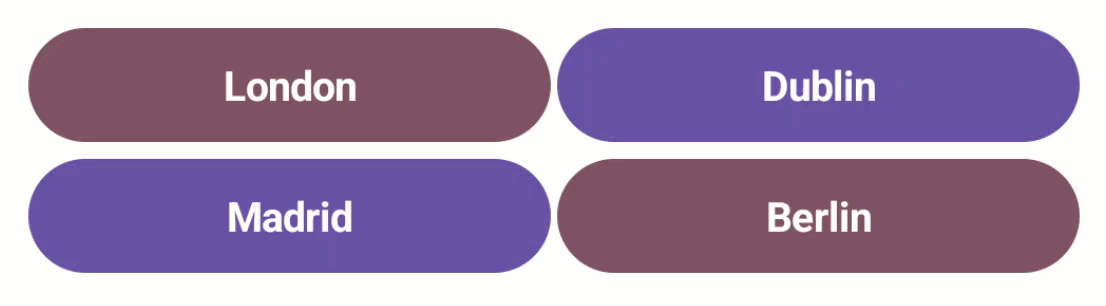
<dx:DXStackLayout Orientation="Vertical">
  <dx:DXStackLayout dx:DXToggleButton.IsGroupScope="True" Orientation="Horizontal">
    <dx:DXToggleButton x:Name="toggle_button_1"
                      GroupName="1"
                      Content="London"/>
    <dx:DXToggleButton x:Name="toggle_button_2"
                      GroupName="1"
                      Content="Dublin"/>
  </dx:DXStackLayout>
  <dx:DXStackLayout dx:DXToggleButton.IsGroupScope="True" Orientation="Horizontal">
    <dx:DXToggleButton x:Name="toggle_button_3"
                      GroupName="1"
                      Content="Madrid"/>
    <dx:DXToggleButton x:Name="toggle_button_4"
                      GroupName="1"
                      Content="Berlin"/>
  </dx:DXStackLayout>
</dx:DXStackLayout>
Use the AllowUncheckInGroup to specify whether all DXToggleButton within a group can be unchecked at the same time.
Handle Tap and Check Items
Use the following events to define how the DXToggleButton control should respond to taps:
- Clicked
- Fires when a user taps the toggle button.
- Tap
- Fires when a user taps the toggle button. This event allows you to pass additional event data.
- TapPressed
- Fires when a user taps the toggle button and a finger is not released.
- TapReleased
- Fires when a user taps the toggle button and a finger is released.
- CheckedChanged
- Fires after the IsChecked property is changed.
- CheckedChanging
- Fires when a user clicks the toggle button to change the IsChecked property.
When the item is checked, you can use the Checked*Color properties to customize the colors of button elements (text, background, icon, and more).
You can also use the Command property to specify a command that is invoked when a user taps a DXToggleButton. You can define the CommandParameter property to specify a command’s parameter.
<ContentPage ...
    xmlns:dx="clr-namespace:DevExpress.Maui.Core;assembly=DevExpress.Maui.Core"
    <Grid>
      <dx:DXToggleButton x:Name="bookmark_button"
                        Content="Bookmark"
                        Icon="bookmark"
                        Command="{Binding TapButtonCommand}"
                        CommandParameter="{Binding ButtonType, Source={x:Reference bookmark_button}}"/>
    </Grid>
</ContentPage>
You can customize button appearance in pressed state. Use Pressed*Color properties to specify colors for various button elements (text, background, icon, and more).
Button Types
The DXToggleButton control includes the ButtonType property. The list below contains the available button types and corresponding button appearance in different states:
- Accent (default)
State Image Default 
Pressed 
Checked 
CheckedPressed 
Disabled 
CheckedDisabled 
- Filled
State Image Default 
Pressed 
Checked 
CheckedPressed 
Disabled CheckedDisabled 
- Outlined
State Image Default 
Pressed 
Checked 
CheckedPressed 
Disabled 
CheckedDisabled 
- Text
State Image Default 
Pressed 
Checked 
CheckedPressed 
Disabled 
CheckedDisabled 
- ToolButton
State Image Default 
Pressed 
Checked 
CheckedPressed 
Disabled 
CheckedDisabled 
Button Availability
Use the IsEnabled property to specify whether the DXToggleButton is enabled. You can customize button appearance in the disabled state. Use the Disabled*Color property to change the colors of button elements (text, background, icon, and so on).
Content and Template
You can use the following properties to specify the DXToggleButton‘s content, visibility, and template:
- ShowContent
- Gets or sets whether to show content within the toggle button. This is a bindable property.
- Content
- Gets or sets an object that the toggle button displays. This is a bindable property.
- ContentTemplate
- Gets or sets a template that configures the toggle button appearance. This is a bindable property.
Customize Appearance
You can use the following properties to customize DXToggleButton appearance settings:
- ThemeSeedColor
- Gets or sets the primary key color of the applied theme. This is a bindable property.
- CornerRadius
- Gets or sets the corner radius of the toggle button. This is a bindable property.
- Padding
- Gets or sets the amount of space around the toggle button. This is a bindable property.
Alignment
You can use the following properties to customize DXToggleButton alignment settings:
- TextHorizontalAlignment
- Gets or sets the text horizontal alignment within the toggle button content. This is a bindable property.
- TextVerticalAlignment
- Gets or sets the text vertical alignment within the toggle button content. This is a bindable property.
- VerticalContentAlignment
- Gets or sets the vertical alignment of the toggle button content (icon and text). This is a bindable property.
- HorizontalContentAlignment
- Gets or sets the horizontal alignment of the toggle button content (icon and text). This is a bindable property.
- IconPlacement
- Gets or sets the icon position within the toggle button content. This is a bindable property.
Background
You can use the following properties to change the background color for a DXToggleButton:
- CheckedBackgroundColor
- Gets or sets the background color of the toggle button in the checked state. This is a bindable property.
- PressedBackgroundColor
- Gets or sets the background color of the button in the pressed state. This is a bindable property.
- CheckedPressedBackgroundColor
- Gets or sets the background color of the toggle button in checked and pressed states. This is a bindable property.
- DisabledBackgroundColor
- Gets or sets the background color of the button in the disabled state. This is a bindable property.
- CheckedDisabledBackgroundColor
- Gets or sets the background color of the toggle button in checked and disabled states. This is a bindable property.
Border
You can use the following properties to customize the border for a DXToggleButton:
- BorderColor
- Gets or sets the border color of the toggle button. This is a bindable property.
- BorderThickness
- Gets or sets the border thickness of the toggle button. This is a bindable property.
- CheckedBorderColor
- Gets or sets the border color of the toggle button in the checked state. This is a bindable property.
- PressedBorderColor
- Gets or sets the border color of the button in the pressed state. This is a bindable property.
- CheckedPressedBorderColor
- Gets or sets the border color of the toggle button in checked and pressed states. This is a bindable property.
- DisabledBorderColor
- Gets or sets the border color of the button in the disabled state. This is a bindable property.
- CheckedDisabledBorderColor
- Gets or sets the border color of the toggle button in checked and disabled states. This is a bindable property.
Icon
You can use the following properties to display and customize an icon within a DXToggleButton:
- Icon
- Gets or sets the icon image within the toggle button’s content. This is a bindable property.
- ShowIcon
- Gets or sets whether to show an icon within the toggle button’s content. This is a bindable property.
- IconAspect
- Gets or sets the icon scale within the toggle button’s content. This is a bindable property.
- IconColor
- Gets or sets the icon color within the toggle button’s content. This is a bindable property.
- CheckedIconColor
- Gets or sets the icon color of the toggle button in the checked state. This is a bindable property.
- PressedIconColor
- Gets or sets the icon color of the button in the pressed state. This is a bindable property.
- CheckedPressedIconColor
- Gets or sets the icon color of the toggle button in checked and pressed states. This is a bindable property.
- DisabledIconColor
- Gets or sets the icon color of the button in the disabled state. This is a bindable property.
- CheckedDisabledIconColor
- Gets or sets the icon color of the toggle button in checked and disabled states. This is a bindable property.
- IconColorizationEnabled
- Gets or sets whether to change the icon color within the toggle button’s content. This is a bindable property.
- IconHeight
- Gets or sets the icon height within the toggle button’s content. This is a bindable property.
- IconWidth
- Gets or sets the icon width within the toggle button’s content. This is a bindable property.
- IconIndent
- Gets or sets the distance between icon and text within the toggle button’s content. This is a bindable property.
- IconPlacement
- Gets or sets the icon position within the toggle button’s content. This is a bindable property.
Text and Font Settings
You can use the following properties to display and customize font settings for a DXToggleButton:
- FontFamily
- Gets or sets the toggle button’s text font. This is a bindable property.
- FontSize
- Gets or sets the text font size within the toggle button’s content. This is a bindable property.
- FontAttributes
- Gets or sets whether the toggle button’s text font style is bold, italic, or unmodified. This is a bindable property.
- FontAutoScalingEnabled
- Gets or sets whether the toggle button’s text reflects font scaling preferences set in the operating system. This is a bindable property.
- TextColor
- Gets or sets the text color within the toggle button’s content. This is a bindable property.
- CheckedTextColor
- Gets or sets the text color of the toggle button in the checked state. This is a bindable property.
- PressedTextColor
- Gets or sets the text color of the button in the pressed state. This is a bindable property.
- CheckedPressedTextColor
- Gets or sets the text color of the toggle button in checked and pressed states. This is a bindable property.
- DisabledTextColor
- Gets or sets the text color of the button in the disabled state. This is a bindable property.
- CheckedDisabledTextColor
- Gets or sets the text color of the toggle button in checked and disabled states. This is a bindable property.
- TextCharacterSpacing
- Gets or sets the distance between text characters within the toggle button’s content. This is a bindable property.
- TextDecorations
- Gets or sets whether the text decoration within the toggle button’s content is strikethrough, underline, or unmodified. This is a bindable property.
- TextHorizontalAlignment
- Gets or sets the text horizontal alignment within the toggle button’s content. This is a bindable property.
- TextVerticalAlignment
- Gets or sets the text vertical alignment within the toggle button’s content. This is a bindable property.
- TextLineBreakMode
- Gets or sets the line breaking mode for text within the toggle button’s content. This is a bindable property.
- TextLineHeight
- Gets or sets the vertical distance between lines of text within the toggle button’s content. This is a bindable property.
- TextMaxLines
- Gets or sets the maximum number of text lines within the toggle button’s content. This is a bindable property.
Customize Animation
The DXToggleButton displays the animation when you tap it. You can use the following properties to customize this animation:
- AnimationDuration
- Gets or sets the duration of the button click animation. This is a bindable property.
- PressedScale
- Gets or sets the scale for the button in the pressed state.