DXButton Class
A button control.
Namespace: DevExpress.Maui.Core
Assembly: DevExpress.Maui.Core.dll
NuGet Package: DevExpress.Maui.Core
Declaration
[DXLicenseMAUI]
public class DXButton :
    DXButtonBase
Related API Members
The following members return DXButton objects:
Remarks
DXButton performs the assigned action when a user taps it. The control can display a caption string (Content), icon (Icon), or both.

Use the following events to define how the button should respond to taps:
- Clicked
- Fires when a user taps a DXButtonBase descendant.
- Tap
- Fires when a user taps a DXButtonBase descendant. This event allows you to pass additional event data.
- TapPressed
- Fires when a user taps a DXButtonBase descendant and a finger is not released.
- TapReleased
- Fires when a user taps a DXButtonBase descendant and a finger is released.
Button Types
You can use the ButtonType property to specify one of the following appearance types:
Button Type | Appearance |
|---|---|
|
|
|
|
|
|
|
|
|
|


Visual States
The button has a different appearance in each state and you can use the following properties to customize its colors:
Default

- BorderColor
- Gets or sets the border color of the button. This is a bindable property.
- TextColor
- Gets or sets the text color within the button’s content. This is a bindable property.
- IconColor
- Gets or sets the icon color within the button’s content. This is a bindable property.
Pressed

- PressedBorderColor
- Gets or sets the border color of the button in the pressed state. This is a bindable property.
- PressedBackgroundColor
- Gets or sets the background color of the button in the pressed state. This is a bindable property.
- PressedTextColor
- Gets or sets the text color of the button in the pressed state. This is a bindable property.
- PressedIconColor
- Gets or sets the icon color of the button in the pressed state. This is a bindable property.
Disabled
- DisabledBorderColor
- Gets or sets the border color of the button in the disabled state. This is a bindable property.
- DisabledBackgroundColor
- Gets or sets the background color of the button in the disabled state. This is a bindable property.
- DisabledTextColor
- Gets or sets the text color of the button in the disabled state. This is a bindable property.
- DisabledIconColor
- Gets or sets the icon color of the button in the disabled state. This is a bindable property.
Font Settings
- FontFamily
- Gets or sets the button’s text font. This is a bindable property.
- FontSize
- Gets or sets the text font size within the button’s content. This is a bindable property.
- FontAttributes
- Gets or sets whether the button’s text font style is bold, italic, or unmodified. This is a bindable property.
- FontAutoScalingEnabled
- Gets or sets whether the button’s text reflects font scaling preferences set in the operating system. This is a bindable property.
Icons
- Icon
- Gets or sets the icon image within the button’s content. This is a bindable property.
- ShowIcon
- Gets or sets whether to show an icon within the button’s content. This is a bindable property.
- IconAspect
- Gets or sets the icon scale within the button’s content. This is a bindable property.
- IconColor
- Gets or sets the icon color within the button’s content. This is a bindable property.
- PressedIconColor
- Gets or sets the icon color of the button in the pressed state. This is a bindable property.
- DisabledIconColor
- Gets or sets the icon color of the button in the disabled state. This is a bindable property.
- IconColorizationEnabled
- Gets or sets whether to change the icon color within the button’s content. This is a bindable property.
- IconHeight
- Gets or sets the icon height within the button’s content. This is a bindable property.
- IconWidth
- Gets or sets the icon width within the button’s content. This is a bindable property.
- IconIndent
- Gets or sets the distance between icon and text within the button’s content. This is a bindable property.
- IconPlacement
- Gets or sets the icon position within the button’s content. This is a bindable property.
Alignment
- TextHorizontalAlignment
- Gets or sets the text horizontal alignment within the button’s content. This is a bindable property.
- TextVerticalAlignment
- Gets or sets the text vertical alignment within the button’s content. This is a bindable property.
- VerticalContentAlignment
- Gets or sets the vertical alignment of the button’s content (icon and text). This is a bindable property.
- HorizontalContentAlignment
- Gets or sets the horizontal alignment of the button’s content (icon and text). This is a bindable property.
- IconPlacement
- Gets or sets the icon position within the button’s content. This is a bindable property.
Ripple Effects
- UseRippleEffect
- Gets or sets whether to show ripple effects when a users taps the button. This is a bindable property.
- RippleEffectPosition
- Gets or sets whether to show ripple effects in front of button content or behind it. This is a bindable property.
Example
This example shows how to customize button appearance and handle the button click event.
Button State | Default Appearance | Custom Appearance |
|---|---|---|
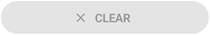
Default |
|
|
Pressed |
|
|
Disabled |
|
|
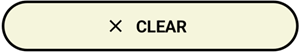


Add the clear.png icon file to the Resources/Images folder.
Use the following properties to adjust the button’s appearance and handle the Clicked event to clear label on button tap:
<dx:DXButton ButtonType="Accent" Content="CLEAR" TextColor="Black" DisabledTextColor="DarkGray" PressedTextColor="White" Icon="clear" IconColor="Black" DisabledIconColor="DarkGray" PressedIconColor="White" BorderThickness="2" BorderColor="Black" DisabledBorderColor="DarkGray" PressedBorderColor="DarkOrange" CornerRadius="25" BackgroundColor="Beige" DisabledBackgroundColor="Brown" PressedBackgroundColor="Gray" Clicked="Button_Clicked"/>private void Button_Clicked(object sender, EventArgs e) { label.Text = ""; }
You can also handle the Tap event to specify an action that occurs when a user taps a DXButtonBase descendant. The Tap event allows you to pass additional event data.
Related Scenarios
The following featured scenarios show how you can use the DXButton class:


Master-Detail View with BottomSheet Control

Infinite Collection View Scrolling
Display Filtering UI Elements in a BottomSheet