Cell Appearance Customization
- 2 minutes to read
The Blazor Scheduler calculates cell size based on the number of appointments and their size. You can customize cell size and appearance in different Scheduler views.
Cell Properties Available for All Views
The following settings are available in multiple Scheduler views:
CellMinWidth- Specifies the base cell width.
TimeCellTemplate,DateHeaderCellTemplate,ResourceHeaderCellTemplate, and others- Allow you to customize time cells, date headers, and resource headers. Refer to the following topic for the list of supported templates for each view: Templates - Time Cells, Date Headers, Resource Headers.
SnapToCellsMode- Specifies how appointments snap to cell boundaries. Use SchedulerSnapToCellsMode enumeration values (
Never,Always, orAuto) to specify the snap mode. Refer to Appointment Snap Modes. - HtmlCellDecoration
- Handle this event to customize cell appearance using custom CSS classes and styles.
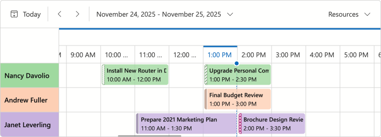
Timeline View Specific Properties
You can also use the following properties to adjust appointment cell size, resource cell size/captions, and related indents in a Timeline view.
- CellMinHeight
- Specifies the minimum cell height in the timeline view.
- LastAppointmentIndent
- Specifies the indent from the last appointment to the cell border in the timeline view.
- ResourceCaptionOrientation
- Arranges resource captions horizontally or vertically when appointments are grouped.
- VerticalResourceCellWidth
- Specifies the resource cell width when appointments are grouped and captions are aligned horizontally.
The following code snippet creates a compact Timeline view:
<DxScheduler @bind-StartDate="@StartDate"
             DataStorage="@DataStorage"
             GroupType="@SchedulerGroupType.Date">
    <DxSchedulerTimelineView Duration="@TimeSpan.FromHours(48)"
                             CellMinHeight="50"
                             LastAppointmentIndent="3"
                             ResourceCaptionOrientation="@Orientation.Horizontal"
                             VerticalResourceCellWidth="120">
        <Scales>
            <DxSchedulerTimeScale Unit="@SchedulerTimeScaleUnit.Day" UnitCount="1" />
        </Scales>
    </DxSchedulerTimelineView>
</DxScheduler>
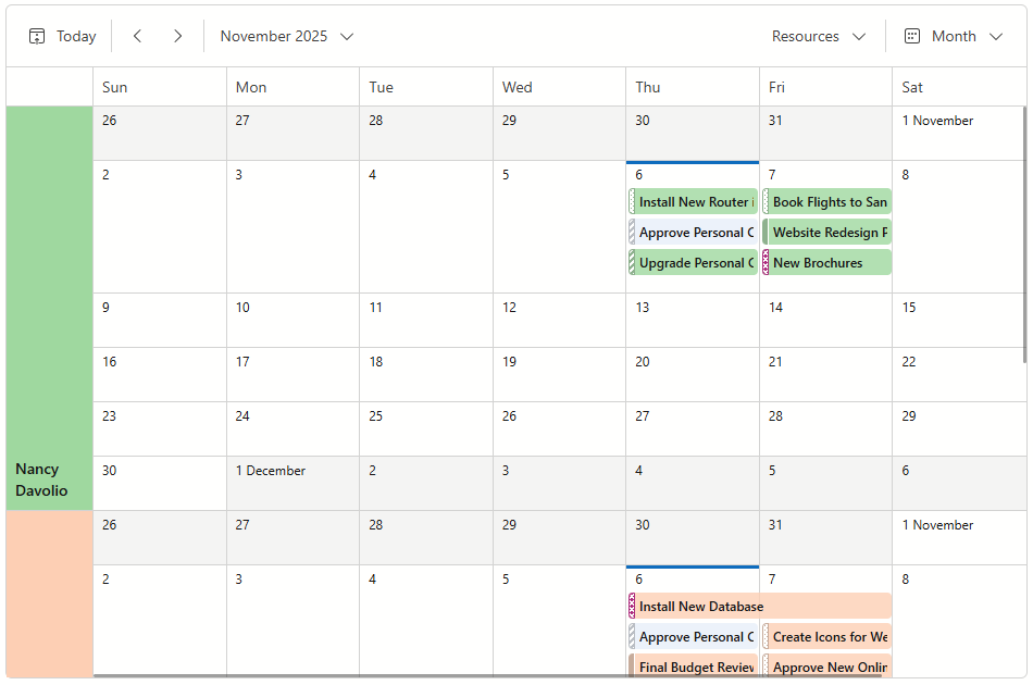
Month View Specific Properties
You can also use the following properties to adjust appointment cell size, resource cell size/captions, and related indents in a Month view.
- CellMinHeight
- Specifies the minimum cell height in the month view.
- LastAppointmentIndent
- Specifies the indent from the last appointment to the cell border in the month view.
- ResourceCaptionOrientation
- Arranges resource captions horizontally or vertically when appointments are grouped by date.
- VerticalResourceCellWidth
- Specifies the resource cell width when appointments are grouped by date and resource captions are aligned horizontally.
The following code snippet customizes cells in the Month view:
<DxScheduler @bind-StartDate="@StartDate"
             DataStorage="@DataStorage"
             GroupType="SchedulerGroupType.Date">
    <DxSchedulerMonthView CellMinWidth="120"
                          CellMinHeight="50"
                          ResourceCaptionOrientation="Orientation.Horizontal"
                          VerticalResourceCellWidth="80" />
</DxScheduler>