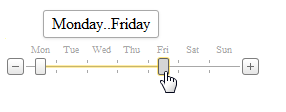
Track Bar
- 2 minutes to read
The ASPxTrackBar control is a slider that allows users to select a numeric value.

ASPxTrackBar offers the following features:
Various Orientations and Directions
ASPxTrackBar supports two orientation modes that you can specify with the ASPxTrackBar.Orientation property: horizontal and vertical.

You can display ASPxTrackBar in normal (with numbers in ascending order from left to right) or reversed mode (with numbers in ascending order from right to left).

See the following help topic to learn more: Orientation and Direction.
Single and Range Value Selection Modes
ASPxTrackBar can display two drag handles, which allow users to select a range of values instead of a single value. See the following topic to learn more: Single and Range Value Selection.

Items Mode Support
ASPxTrackBar allows you to display custom items instead of automatically generated decimal scale marks. Populate the ASPxTrackBar.Items collection to activate ASPxTrackBar’s items display mode.

See the following help topic to learn more: Items Mode Overview.
Full Scale and Layout Customization
ASPxTrackBar supports full scale customization. You can customize value selection, look-and-feel, scale layout and appearance. See this topic to learn more about all customization possibilities and affected properties: Scale Settings.
Value Selection
Users can select a value within the ASPxTrackBar by positioning the handle within a range of values that you limit with the MinValue and MaxValue properties. See the following topic for details on different ways to change drag handle position: Value Selection.
Full-Featured Client-Side API
The ASPxClientTrackBar object is the client-side equivalent of the ASPxTrackBar control. This object exposes the control’s comprehensive client-side API.
Client-side API concepts: Client-Side API