XRCheckBox Class
A Checkbox control.
Namespace: DevExpress.XtraReports.UI
Assembly: DevExpress.XtraReports.v26.1.dll
Declaration
[DefaultBindableProperty("CheckBoxState")]
public class XRCheckBox :
    XRFieldEmbeddableControl,
IEditOptionsContainerRemarks
The CheckBoxState property specifies the checkbox state:

The Checked property indicates whether the checkbox is checked (displays a check mark) or not (is empty). This property returns true for the Indeterminate state.
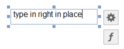
The Text property specifies the checkbox caption. Double-click the checkbox to invoke its in-place editor and type the caption text.
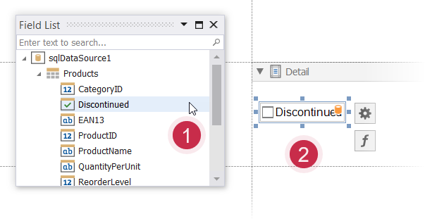
Bind to Data
Drag a Boolean field from the Field List (Visual Studio Report Designer) onto your report. This adds a new checkbox to your report and binds its CheckState property to the dragged field.
If you added a checkbox from the Toolbox, click the control’s smart tag, expand the CheckBoxState property’s Expression drop-down list and select a data field. This binds your control’s CheckBoxState property to a data source field.
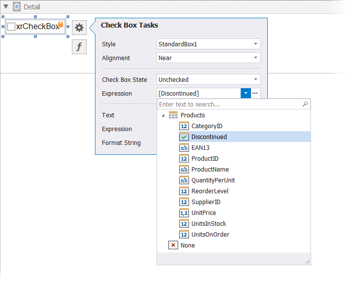
The data field value determines the checkbox state:
- True or 1 - activates the Checked state;
- False or 0 - activates the Unchecked state;
- Any other value - activates the Indeterminate state.
You can bind the checkbox caption to a data source field. Click the control’s smart tag, expand the Text property’s Expression drop-down list and select the data field.
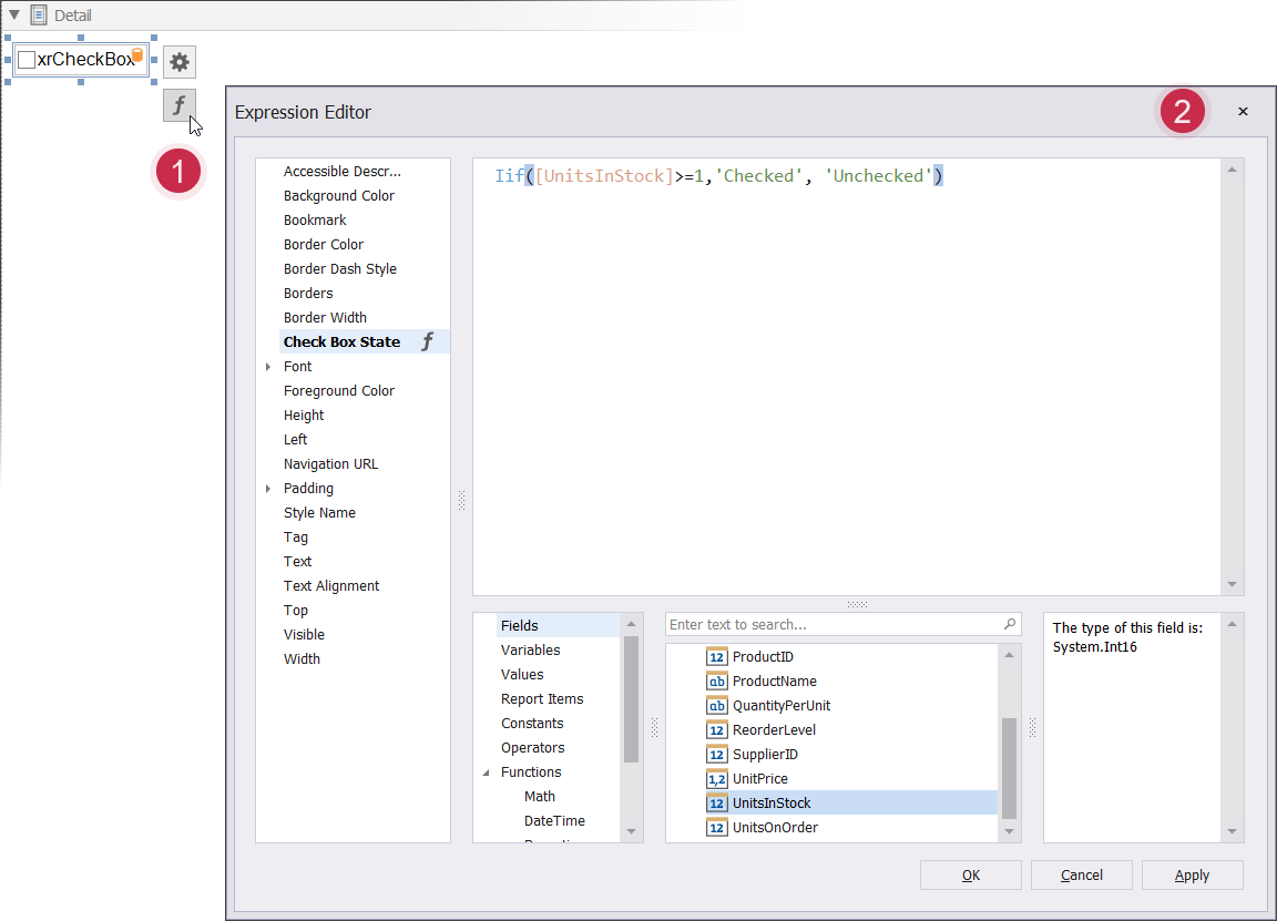
The f-button invokes the Expression Editor. This Editor allows you to construct a complex expression with two or more fields.
Refer to the Bind Report Controls to Data topic for more information about the available data binding modes and how to create data-aware controls.
Interactivity
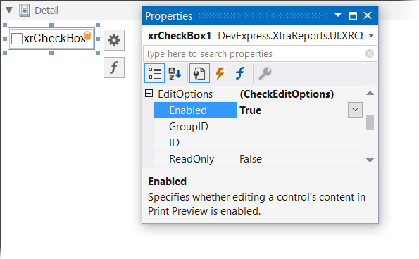
Change the EditOptions.Enabled option to specify if users can change the checkbox state in Print Preview.
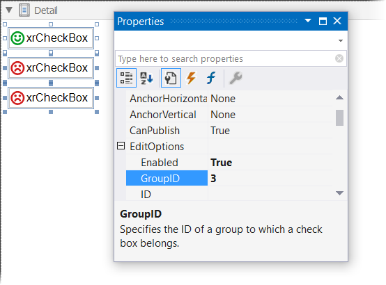
You can create checkbox groups to make them behave like radio lists. To group checkboxes, set their CheckEditOptions.GroupID properties to a group ID value.
Customization
The XRCheckBox.GlyphOptions property provides access to glyph settings.
Style - specifies a predefined glyph style.

Glyph Alignment - specifies the glyph alignment within the control.

Size - specifies the glyph size.
CustomGlyphs - specifies a custom glyph image for each checkbox state (Checked/Unchecked/Indeterminate).
Example
The following code sample creates the XRCheckBox control and binds its state to a data field.
using DevExpress.XtraReports.UI;
// ...

public XRCheckBox CreateXRCheckBox()
{
    // Creates the XRCheckBox control.
    XRCheckBox xrCheckBox1 = new XRCheckBox();

    xrCheckBox1.ExpressionBindings.AddRange(new ExpressionBinding[] {
    // Binds the CheckBoxState property to the UnitsInStock data field.
    new ExpressionBinding("BeforePrint", "CheckBoxState", "Iif([UnitsInStock]>=1,\'Checked\', \'Unchecked\')"),
    // Changes the control's text depending on the UnitsInStock data field value.
    new ExpressionBinding("BeforePrint", "Text",
                          "Iif([UnitsInStock]>0,\'Units in Stock: \' + [UnitsInStock], \'None\')")});

    // Set the control size.
    xrCheckBox1.SizeF = new SizeF(150F, 20F);

    return xrCheckBox1;
}