Look and Feel
- 2 minutes to read
The GanttControl‘s look and feel depends on the skin applied to the application.
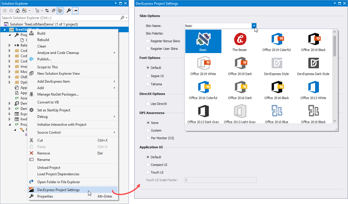
To specify the application skin, use the DevExpress Project Settings window:
- in the Solution Explorer, right-click the project
- in the context menu, invoke the DevExpress Project Settings command
- use the Skin Name combo box to select a skin
- use the Skin Palette combo box to select a color palette (for vector-image-based skins only)

See the following help topic for more information about application settings: Project Settings Page.
Visual Elements and Appearances
The control consists of multiple visual elements — columns, rows, cells, column headers, buttons, etc. The skin specifies each visual element’s appearance settings — background and foreground colors, font face, size and style, etc. For example, cells are filled with white, column headers — with gray. You can use the GanttControl.Appearance property to access and customize appearance settings for each visual element.

The figure below shows the Gantt control with custom background colors for work and non-work dates.

ganttControl1.Appearance.ChartWorkTime.BackColor = Color.AliceBlue;
ganttControl1.Appearance.ChartNonWorkTime.BackColor = Color.Green;
See the following help topic for more information about skins and appearance settings: Application Appearance and Skin Colors.
Skin Editor
You can also use the Skin Editor to customize a specific visual element’s appearance.

Tip
To identify a visual element, hold Ctrl and click it.
See the following help topic for more information on how to create a custom skin and apply it to an application: WinForms Skin Editor.


