Ribbon Control
- 3 minutes to read
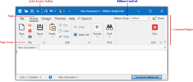
The Ribbon Control replaces traditional toolbars and menus with tabbed pages. Each Page splits into Groups that contain various command buttons (bar item links).
Note
Regular bars (a BarManager component) and Ribbon Controls may conflict with each other when used in the same form or user control.
Ribbon UI
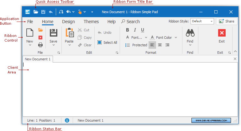
To build a Ribbon UI, add RibbonControl and RibbonStatusBar objects to a form. However, the Ribbon Form is the best choice, as this form is optimized to display the Ribbon Control. The following image shows a Ribbon Form painted in the Office2010 style:

Compared to an XtraForm, the Ribbon Form provides the following advantages:
- The Quick Access Toolbar is displayed within the Ribbon Form title.
- When the Application Button is painted using the Office 2007 style, it partially overlaps the Ribbon Form’s title bar.
- The Ribbon Form supports Form Title Bar Skinning, window transparency (see RibbonForm.AllowFormGlass), and maintains two captions (RibbonControl.ApplicationCaption and RibbonControl.ApplicationDocumentCaption) separated by a dash.
Ribbon Elements
The Ribbon Control consists of two regions.
- Command Region - Displays various commands combined into Groups and Pages.
- Quick Access Toolbar - Displays frequently used commands. End-users can add commands to this bar at runtime.
Main elements:

For details on each individual Ribbon element, see the corresponding topics.
Ribbon Layout
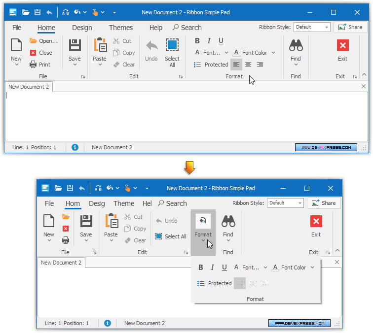
A Ribbon Control provides a smart layout to maximize space utilization. For instance, if there is not enough space to display a Page Group, the Group collapses and displays its commands in a drop-down list (see the figure below).

End-users can customize a Ribbon Control and its Quick Access Toolbar at runtime. For more information, see the Runtime Customization and Quick Access Toolbar topics.
Ribbon Appearance
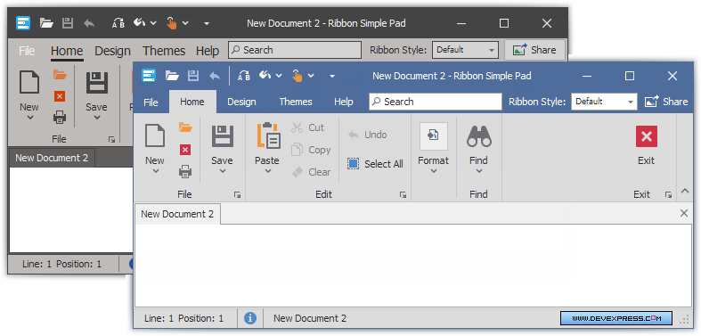
The Ribbon Control supports several paint styles, which can be applied via the RibbonControl.RibbonStyle property. A paint style primarily controls the appearance and behavior of tabs and the Application Button:
| Ribbon Style | Image |
|---|---|
| Office Universal |  |
| Office 2019 |  |
| Office 2013 |  |
| Office 2010 |  |
| Office 2007 |  |
| Tablet Office |  |
| MacOffice |  |
Ribbon Control is always painted using skins. Other paint themes such as Flat, Style3D, WindowsXP are not supported.

Use the bar and dock controller to adjust the appearance (foreground colors and fonts of Ribbon elements) and look-and-feel (e.g., a skin) settings. The Ribbon Control’s RibbonControl.Controller property is set to null by default. This means that it uses the DefaultBarAndDockingController’s settings. To customize them, use the BarAndDockingController.Default property or the DefaultBarAndDockingController component.
To provide custom appearance settings, drop the BarAndDockingController component onto a form, assign it to the Ribbon Control’s RibbonControl.Controller property and customize its settings as required.
To get the current ribbon controller, use the RibbonControl.GetController method.