Hints and Super Tooltips
- 14 minutes to read
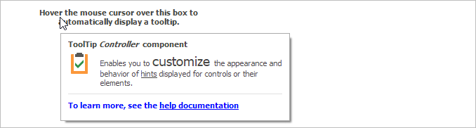
A tooltip automatically pops up when a user hovers over a control or its child element. Most of DevExpress WinForms controls use the same mechanism to display tooltips (hints) - the ToolTipController component. This component manages hints for all controls in an application, and allows you to customize the tooltip behavior and appearance. For example, you can customize the foreground color, position, time interval passed before a tooltip is shown or hidden. The controller also allows you to assign tooltips to standard or third-party controls.
Tip
Run the Tooltip Controller demo to try out tooltips.
Default Tooltip Controller
The default controller manages tooltips for all controls in the application. The DefaultToolTipController component is a toolbox component that allows you to access the default controller in the designer — drop the DefaultToolTipController component onto the component tray. Use the Properties window to customize tooltips.

You can use the static (Shared in VB) ToolTipController.DefaultController property to access the default controller in code.
Note
You do not necessarily need to place the default controller to the form in order to enable tooltips. You can do it to access the controller — customize settings, add event handlers, etc.
Custom Tooltip Controller
DevExpress controls that support tooltips expose the ToolTipController property. The property specifies the controller that manages tooltips for that particular control. If you assign a custom controller to this property, it is used instead of the default controller. You can assign a single controller to multiple controls — the controller manages tooltips for all these controls. Drop the ToolTipController component from the toolbox onto the component tray and assign it to a control.

Note
You do not necessarily need to assign a custom controller to a control. You can do it to customize settings for that particular control. If the control is not bound to a custom controller, the default controller manages tooltips.
Tooltip Types
The tooltip controller supports different tooltip types: regular, flyout, and super tooltips. The ToolTipController.ToolTipType property allows you to specify the type of shown tooltips:
SuperTip — a tooltip that consists of a title, content, separator, and footer. You can also display a custom icon in the content area.
This type supports skins — tooltips have the same look and feel as the owner control.

See Super Tooltips below for more information.
Standard — a regular tooltip that consists of a title and content. You can also display one of the predefined icons, or a custom icon.

Regular tooltips do not support skins. To display tooltips according to the current skin, you can change the tooltip type from Standard to SuperTip. The controller automatically converts the tooltips.
See Regular Tooltips below for more information.
Flyout — a tooltip that can display any control in a flyout window.

See Flyout Tooltips below for more information.
Super Tooltips
DevExpress controls expose the SuperTip property that allows you to assign a super tooltip to a control. The SuperToolTip Editor allows you to create super tooltips in the designer. To invoke the editor, click a control’s SuperTip ellipsis button in the Properties window.
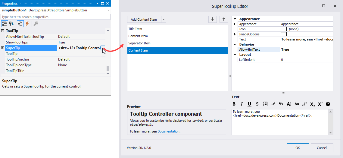
The editor allows you to add tooltip items: title, content, and separators. You can also remove/reorder the added items. When an item is selected, you can set its properties. The text editor allows you to enter the item’s content and format it using HTML tags (note that the AllowHtmlText option should be enabled).
Create a Super Tooltip in Code
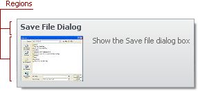
The SuperToolTip class represents a super tooltip. A super tooltip consists of multiple regions (items): title, content, separator, and footer. Items are arranged one under another, each item can display an image and text. A tooltip can contain any combination of items.
Use the SuperToolTip.Items property to access/add/remove regions in the super tooltip:
- ToolTipItem — the main region in a super tooltip that displays text and/or image.
- ToolTipTitleItem — a region displayed at the top (title) or bottom (footer) of a tooltip. This region differs from the main region in default appearance settings.
- ToolTipSeparatorItem — a horizontal line in a tooltip.

Text
Use the ToolTipItem object’s following properties to specify the text:
- Text — a string value that specifies the item’s text.
- AllowHtmlText — whether to parse HTML tags in the text. HTML tags allow you to format the text: size, style, hyperlinks, etc. This property overrides the SuperToolTip.AllowHtmlText property.
Image
ToolTipItem.ImageOptions allow you to display the image in the item:
- Image — a raster image.
- ImageIndex — an index of the image in the Images collection.
- ImageKey — a name of the image in the Images collection.
- ImageUri — a universal resource identifier of an image in the DX Image Gallery.
- SvgImage — a vector image.
- ImageToTextDistance — the indentation of the text from the image.
- Alignment — whether the image is aligned at the left or right.
You can also use the ToolTipItem.Icon property to specify the item’s icon. The Icon property has priority over ImageOptions.
Layout
Use the ToolTipItem.LeftIndent property to specify the indentation of the content from the tooltip’s left edge.
You can also use the SuperToolTip.FixedTooltipWidth, MaxWidth, Padding, and DistanceBetweenItems properties to customize the layout.
Appearance
The item’s Appearance property provides access to appearance settings that specify the font, border and foreground colors. The default settings depend on the current skin. This property allows you to change the skin’s appearance settings.
Example: Create a Super Tooltip in Code
Create a SuperToolTip object and populate the Items collection with ToolTipItem, ToolTipTitleItem, and ToolTipSeparatorItem objects.
The code below displays the following tooltip.

using DevExpress.Utils;
// The component used to load images from a form's resources.
System.ComponentModel.ComponentResourceManager resources =
new System.ComponentModel.ComponentResourceManager(typeof(Form1));
// The image to display within a super tooltip.
Image resImage = ((System.Drawing.Image)(resources.GetObject("resource.Image1")));
// Create an object that represents a super tooltip.
SuperToolTip sTooltip1 = new SuperToolTip();
// Create an object that represents the title.
ToolTipTitleItem titleItem1 = new ToolTipTitleItem();
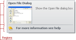
titleItem1.Text = "Edit Popup Menu";
// Create an object that represents the content.
ToolTipItem item1 = new ToolTipItem();
item1.ImageOptions.Image = resImage;
item1.Text = "Show the Edit popup menu";
// Add the items to the SuperTooltip.Items collection.
sTooltip1.Items.Add(titleItem1);
sTooltip1.Items.Add(item1);
// Assign the created SuperToolTip to a BarItem.
barItem1.SuperTip = sTooltip1;
You can also use the SuperToolTip.Setup method to create a super tooltip in code.
using DevExpress.Utils;

// Create an object that represents a super tooltip.
SuperToolTip sTooltip2 = new SuperToolTip();
// Create an object that initializes tooltip regions.
SuperToolTipSetupArgs args = new SuperToolTipSetupArgs();
args.Title.Text = "Edit Popup Menu";
args.Contents.Text = "Show the Edit popup menu";
args.Contents.ImageOptions.Image = resImage;
sTooltip2.Setup(args);

// Assign the created SuperToolTip to a BarItem.
barItem2.SuperTip = sTooltip2;
Example: Show a Super Tooltip for Items/Values Displayed in a Checked ComboBox
This example assigns a ToolTipController component to the CheckedComboBoxEdit control and handles the ToolTipController.GetActiveObjectInfo event to show a custom super tooltip for items/values displayed in the edit box.

Regular Tooltips
A DevExpress control allows you to display a regular tooltip. The regular tooltip can contain the main message, title, and one of the predefined icons.
You can also handle the BeforeShow event to update a tooltip dynamically. For example, you can display the current time instead of the static text, or display a custom vector image.
Assign a Regular Tooltip to a Control
DevExpress controls expose the following properties that allow you to specify a regular tooltip:
Text
- ToolTip — a regular tooltip’s content. If the content is not specified, the tooltip is not displayed even if the title is specified. You can use line breaks in regular tooltips.
- ToolTipTitle — a regular tooltip’s title. If the title is not specified, it is not displayed.
AllowHtmlTextInToolTip — whether to parse HTML tags in the text. HTML tags allow you to format the text: size, style, hyperlinks, etc. This property overrides the controller’s AllowHtmlText setting.

Image
- ToolTipIconType — a regular tooltip’s predefined image. To specify the image size, use the controller’s IconSize property.
To display a custom image in a particular regular tooltip, handle the BeforeShow event. Use the ImageOptions event argument to assign a raster or vector image to the processed tooltip.
Change Tooltip Type from Regular to Super
Super tooltips are painted according to the current skin, while regular tooltips look the same in all paint schemes.

To replace regular tooltips with super tooltips, set the ToolTipController.ToolTipType property to SuperTip. The controller automatically converts regular tooltips to super tooltips.
Flyout Tooltips
To display a flyout tooltip, do the following:
- Handle the ToolTipController.GetActiveObjectInfo event.
- Set the Info.ToolTipType event argument to Flyout.
- Use the Info.FlyoutControl event argument to specify the tooltip content. If the content is not specified, the tooltip is drawn and behaves as a regular tooltip.
- Set the ToolTipController.CloseOnClick property to False to prevent the tooltip from being hidden when users interact with the tooltip’s content.
- Set the ToolTipController.KeepWhileHovered property to True to prevent the tooltip from being hidden when users move the mouse cursor over the tooltip.
using DevExpress.Utils;

ToolTipController.DefaultController.CloseOnClick = DefaultBoolean.False;
ToolTipController.DefaultController.KeepWhileHovered = true;

private void OnGetActiveObjectInfo(object sender, ToolTipControllerGetActiveObjectInfoEventArgs e) {
   if(e.Info == null) {
       e.Info = new ToolTipControlInfo() { Object = e.SelectedControl, ToolTipType = ToolTipType.Flyout };
       if(radioGroupExamples.SelectedIndex == 0)
           e.Info.FlyoutControl = ClockLabelControl;
       else
           e.Info.FlyoutControl = TimerControl;
    }
}
Important
If a flyout tooltip displays a focusable control, use the XtraForm or RibbonForm as a parent. Otherwise, the tooltip will be immediately hidden when the control is focused.
Tooltip Positioning
The ToolTipController.ToolTipLocation property specifies the alignment of tooltips relative to the anchor point, which is the mouse cursor or the owning control. Use the ToolTipAnchor property to specify the default anchor point for all tooltips controlled by the ToolTipController.
HTML & CSS Templates
Use the ToolTipController.HtmlTemplate property to specify a HTML & CSS template to render regular hints and Super ToolTips.
The following example does the following:
- Creates a Super ToolTip for the Settings button.
- Creates an HTML & CSS template to render tooltips.
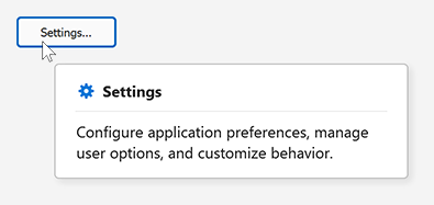
using DevExpress.Utils;
using DevExpress.XtraEditors;
using System.Drawing;

namespace DXDemoApplication {
    public partial class Form1 : XtraForm {
        public Form1() {
            InitializeComponent();

            // Create SuperToolTip.
            SuperToolTip superToolTip = new SuperToolTip();

            // Title (bold header)
            ToolTipTitleItem titleItem = new ToolTipTitleItem() { Text = "Settings" };
            titleItem.ImageOptions.SvgImage = svgImageCollection1["properties"];
            titleItem.ImageOptions.SvgImageSize = new Size(16, 16);

            // Description (main content)
            ToolTipItem contentItem = new ToolTipItem() {
                Text = "Configure application preferences, manage user options, and customize behavior."
            };

            // Optional separator
            ToolTipSeparatorItem separatorItem = new ToolTipSeparatorItem();

            // Add items to SuperToolTip.
            superToolTip.Items.Add(titleItem);
            superToolTip.Items.Add(separatorItem);
            superToolTip.Items.Add(contentItem);

            // Assign SuperToolTip to the 'Settings' button.
            buttonSettings.SuperTip = superToolTip;

            buttonSettings.ToolTipController = toolTipController1;
        }
    }
}
Drop the ToolTipController component onto a Form, select its HtmlTemplate property, and click the ellipsis button to open the HTML Template Editor. Specify the following HTML and CSS markup.
<template id="item-container">
  <div dx-class="{IsSeparator: hidden-element }">
    <div class="item" dx-class="{VAlignment}">
      <div dx-class="{HasImage: , hidden-element }">
        <img src="${Image}" class="image" dx-class="{IconSize: image-large, image-small, image-custom }" />
      </div>
      <div class="text" dx-class="{ItemType}">${Text}</div>
    </div>
  </div>
  <div class="separator" dx-class="{IsSeparator: , hidden-element }"></div>
</template>

<div class="container">
    <dx-collection Items="${Items}" ItemTemplate="item-container"></dx-collection>
</div>
body{
    padding: 10px;
    font-family: 'Segoe UI';
}
.container {
    padding: 10px;
    background-color: @Window;
    border: 1px solid @ControlText/0.3;
    box-shadow: 3px 3px 7px 0px rgba(0, 0, 0, 0.1);
    border-radius: 4px;
    max-width: 300px;
}
.item {
    display: flex;
    margin: 4px;
}
.image {
    margin: 2px 2px 2px 6px;
    fill: @Control;
}
.image-small {
    width: 16px;
    height: 16px;
}
.image-large {
    width: 24px;
    height: 24px;
}
.image-custom{
    width: auto;
    height: auto;
}
.text {
    font-size: 14px;
    margin: 0px 5px;
}
.separator {
    height: 1px;
    background-color: @ControlText/0.1;
    margin: 4px 8px;
}
.hidden-element { display: none; }
.Title { font-weight: bold; }
.Default { align-items: flex-start; }
.Top { align-items: flex-start; }
.Center { align-items: center; }
.Bottom { align-items: flex-end; }
Assign a Tooltip to a Third-Party Control
The tooltip controller is an IExtenderProvider object and provides the following extending properties for third-party controls:
- SuperTip — a super tooltip.
- Title — a regular tooltip’s title.
- ToolTip — a regular tooltip’s content.
- ToolTipIconType — a regular tooltip’s icon.
- AllowHtmlText — specifies whether to parse HTML tags in the tooltip’s text. HTML tags allow you to format the text: size, style, hyperlinks, etc. See How to: Display a Hyperlink in a Tooltip for an example.
Specify Tooltips in the Visual Studio Designer
To access the extending properties in the Visual Studio designer, drop the DefaultToolTipController or ToolTipController component onto the component tray. Select a control on the form — the properties are accessible in the Properties window.

You can also use the controller’s properties and events to customize the content, appearance, and behavior.
Specify Tooltips in Code
To assign tooltips to third-party controls in code, use the DefaultToolTipController or ToolTipController component’s following methods:
- DefaultToolTipController.SetSuperTip, ToolTipController.SetSuperTip — set a super tooltip.
- DefaultToolTipController.SetTitle, ToolTipController.SetTitle — set a regular tooltip’s title.
- DefaultToolTipController.SetToolTip, ToolTipController.SetToolTip — set a regular tooltip’s content.
- DefaultToolTipController.SetToolTipIconType, ToolTipController.SetToolTipIconType — set a regular tooltip’s icon.
- DefaultToolTipController.SetAllowHtmlText, ToolTipController.SetAllowHtmlText — set whether to parse HTML tags in the tooltip’s text. HTML tags allow you to format the text: size, style, hyperlinks, etc.
The following code snippet assigns a regular tooltip to the standard text box and specifies tooltip properties.

using DevExpress.Utils;

// Access the default tooltip controller.
ToolTipController defController = ToolTipController.DefaultController;
// Customize the controller's settings.
defController.Appearance.BorderColor = Color.Red;
defController.ShowBeak = true;
// Set a tooltip for the TextBox control.
defController.SetToolTip(textBox1, "Enter the full name");
Tooltips in Bar Sub-Menus
Items inside bar sub-items do not display their tooltips when users hover over them. To enable sub-menu hints, set the BarManager.ShowScreenTipsInMenus property to true.

Cheat Sheets and Best Practices
DevExpress WinForms UI controls (Data Grid, Tree List, Vertical Grid, Gantt Control, etc.) use the same mechanism to display tooltips and hints. Read the following quick-reference guide for general information and examples:
Tooltips and Hints - DevExpress WinForms Cheat Sheet
Examples
- How to: Display a Tooltip for a Particular Visual Element
- How to: Display a Hyperlink in a Tooltip
- Display tooltips for grid cells if cell content is completely visible
- Customize cell tooltips (hints) in the WinForms TreeList
- WinForms ComboBoxEdit - Show item tooltips
- WinForms LixtBoxControl - Display item tooltips
- WinForms RadioGroup - Display item tooltips using ToolTipController
- WinForms Scheduler - Display custom tooltips for appointments, resource and day headers
- WinForms Lookup - Display custom tooltips
- Display super tooltips for disabled controls