Lesson 4 - Implement Input Validation using ValidationRules
- 6 minutes to read
Open the previously created project or RegistrationForm.Lesson3 to follow along.
The RegistrationForm.Lesson4 project contains the results of this part.
The goal is a registration form which behaves like the Google registration form. When the form is first displayed, its “Register” button should be enabled; the editors do not indicate any input errors. Typing into the First Name editor field, clearing the input and leaving the editor should display the First Name editor in an error state.
In this lesson, you will implement this behavior.
The best approach for implementing this behavior is the Binding Validation Rules – a standard approach provided by the WPF platform. Before moving on, review the following MSDN documentation topic: How to: Implement Binding Validation.
You will create a validation rule to indicate an input error for each empty editor field by adding a Common folder in the project with a new file, ValidationRules.cs, and defining the following class.
public class RequiredValidationRule : ValidationRule {
    public static string GetErrorMessage(string fieldName, object fieldValue, object nullValue = null) {
        string errorMessage = string.Empty;
        if(nullValue != null && nullValue.Equals(fieldValue))
            errorMessage = string.Format("You cannot leave the {0} field empty.", fieldName);
        if(fieldValue == null || string.IsNullOrEmpty(fieldValue.ToString()))
            errorMessage = string.Format("You cannot leave the {0} field empty.", fieldName);
        return errorMessage;
    }
    public string FieldName { get; set; }
    public override ValidationResult Validate(object value, CultureInfo cultureInfo) {
        string error = GetErrorMessage(FieldName, value);
        if(!string.IsNullOrEmpty(error))
            return new ValidationResult(false, error);
        return ValidationResult.ValidResult;
    }
}
The RequiredValidationRule class checks the inputted value from the overridden Validate method. For a null or empty edit value, the method returns an appropriate error message.
To make use of this validation rule, place a RequiredValidationRule instance in the Binding.ValidationRules collection as follows.
<UserControl xmlns:Common="clr-namespace:RegistrationForm.Common" ... >
    ...
    <dxe:TextEdit NullText="FIRST">
        <dxe:TextEdit.EditValue>
            <Binding Path="FirstName" UpdateSourceTrigger="PropertyChanged" Mode="TwoWay">
                <Binding.ValidationRules>
                    <Helpers:RequiredValidationRule FieldName="First Name"/>
                </Binding.ValidationRules>
            </Binding>
        </dxe:TextEdit.EditValue>
    </dxe:TextEdit>
    ...
</UserControl>
The Binding.UpdateSourceTrigger property is set to PropertyChanged – the default value is LostFocus. Under the LostFocus value, the validation process is invoked only when the end-user leaves the editor.
To illustrate the binding mechanism on the EditValue property available on any of the DXEditors, consider the following simple binding: EditValue=”{Binding FirstName, Mode=TwoWay}”.
EditValue is the target property where binding is applied. By requirement, the target property is always a DependencyProperty.
The FirstName property is the source property. The binding binds the target property to the source property. The source can be a DependencyProperty, a regular property or a property which triggers the INotifyPropertyChanged.PropertyChanged event when a new value is set. The source, however, cannot be a field – a property is necessary.
The binding makes use of the Two-Way binding mode to also passes input data at the target to the underlying data encapsulated by the source property. The Two-Way binding behavior is, by default, to update the source property when the bound control loses focus. This update behavior can be specified from the UpdateSourceTrigger binding parameter. For instance, setting the UpdateSourceTrigger parameter to PropertyChanged, updates the source property as the target property is updated. Please see the following article for details: Binding.UpdateSourceTrigger.
Now, turn your attention to how DXEditors modify the BaseEdit.EditValue property.
DXEditors support a validation mechanism which avoids posting invalid values to the underlying data source while providing the capability to inform the end-user of invalid input data. Importantly, the validation mechanism is invoked before the EditValue is changed. Only after validation succeeds, the editor posts the input value to its EditValue property. DXEditors provide two properties for invoking the validation mechanism: BaseEdit.ValidateOnEnterKeyPressed, and BaseEdit.ValidateOnTextInput.
The ValidateOnEnterKeyPressed property controls whether the EditValue property is updated when the Enter key is pressed. The ValidateOnTextInput property determines whether the EditValue property is updated as the end-user types in the editor.
For the FirstName editor, it is necessary to show an error only after an end-user has typed, cleared the editor and left the editor empty. You have already added this check using a Binding Validation Rule. What remains is to customize the editors to handle this logic. You don’t need to validate the editor while the user is typing, so set the editor ValidateOnTextInput property to False. To validate the editor when the user presses the Enter key, set the ValidateOnEnterKeyPressed property to True.
<UserControl xmlns:Common="clr-namespace:RegistrationForm.Common" ... >
    ...
    <dxe:TextEdit NullText="FIRST" ValidateOnEnterKeyPressed="True" ValidateOnTextInput="False">
        <dxe:TextEdit.EditValue>
            <Binding Path="FirstName" UpdateSourceTrigger="PropertyChanged" Mode="TwoWay">
                <Binding.ValidationRules>
                    <Helpers:RequiredValidationRule FieldName="First Name"/>
                </Binding.ValidationRules>
            </Binding>
        </dxe:TextEdit.EditValue>
    </dxe:TextEdit>
    ...
</UserControl>
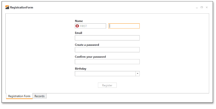
The results of the code you created are below.

Use the same approach to customize the LastName, Email, Password, Birthday editor fields.
It is not necessary to check if the ConfirmPassword editor field is non-empty, because the validation here implies checking if the ConfirmPassword box matches the string in the Password box. However, for the ConfirmPassword, it makes sense to validate input values as the end-user types. Set the editor’s ValidateOnTextInput property to True.
<dxlc:LayoutItem Label="Confirm your password">
        <dxe:PasswordBoxEdit EditValue="{Binding ConfirmPassword}"
                             ValidateOnEnterKeyPressed="True" ValidateOnTextInput="True"/>
    </dxlc:LayoutItem>
It is also necessary to have the Register button disabled when validation errors are present. It is easy to implement this behavior with DXEditors. The ValidationService class supports catching validation errors within a specified visual container. To use this feature, set the ValidationService.IsValidationContainer attached property to True on the parent LayoutControl visual element for the editors. After doing so, bind the IsEnabled property of the Register button to the ValidationService.HasValidationError attached property.
<UserControl ... >
    ...
    <dxlc:LayoutControl ... x:Name="container" dxe:ValidationService.IsValidationContainer="True">
        ...
        <Button Content="Register" HorizontalAlignment="Center" VerticalAlignment="Bottom" Width="80"
                    Command="{Binding AddEmployeeCommand}"
                    IsEnabled="{Binding ElementName=container, Path=(dxe:ValidationService.HasValidationError), Converter={dxmvvm:BooleanNegationConverter}}" />
    </dxlc:LayoutControl>
</UserControl>
When the validation fails, the ValidationService.HasValidationError attached property returns the True value, which is assigned to the Button.IsEnabled property as False by the BooleanNegationConverter.