Accordion Items
Accordion Items are main elements within the AccordionControl.
This topic contains the following sections:
Accordion Item Overview
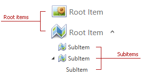
AccordionItem objects represent two types of accordion items:
- Root items are top-level accordion items.
- Subitems are nested within other items.

See the Adding Accordion Items topic to learn how to add accordion items at design time and in code.
Accordion Item Elements
The image below shows accordion item elements:

- Header - text or content displayed within the accordion item.
- Glyph - an image displayed within the accordion item.
- Expand-Collapse Button - button that allows expanding and collapsing the accordion item.
Accordion Item Customization
The following topics describe how to customize an accordion item:
-
Describes how to change an accordion item’s header.
-
Describes how to change an accordion item’s glyph.
-
Describes how to change an accordion item’s content.