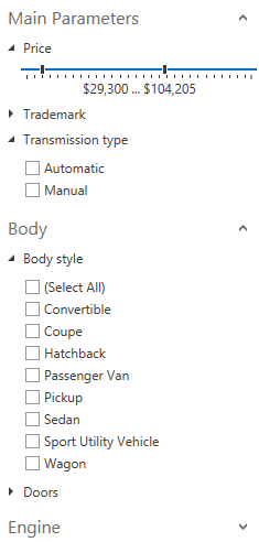
Accordion Control
- 2 minutes to read
The AccordionControl is an advanced navigation control that allows you to create hierarchical user interfaces that are compact and easy to navigate.
Its features include:
An unlimited number of hierarchy levels
Accordion items can contain any number of subitems.
Multiple selection modes
You can specify which items an end-user can select.
Data binding support
You can define accordion items in a View model.
Multiple expanding modes
You can specify how many items can be expanded at the same time.
Expand/collapse animation
Optional animations ensure a smooth user experience.
Glyph support
You can easily assign icons to accordion items.
Custom item content
Accordion items can store any content, including editors and images.
Integrated search field
End-users can quickly search for accordion items and item contents.
Keyboard navigation
End-users can navigate accordion items using the keyboard.

Main Features
Topics in this section help you get started with the AccordionControl.
-
Provides step-by-step instructions on how to create a simple application with the AccordionControl.
-
Describes the basic concept behind the AccordionControl.
-
Describes the AccordionControl‘s data binding capabilities.
-
Describes how to expand and collapse Accordion Items.
-
Describes the item filtering capabilities.
-
Describes how to select Accordion Items.
-
Describes the navigation pane view mode and integration with the OfficeNavigationBar.
-
Describes the compact display mode.
-
Lists the AccordionControl‘s visible UI elements. Each topic contains a description of the element’s purpose and a list of settings that affect its appearance.
-
Provides a list of examples contained in this help.