Wait Indicator
- 4 minutes to read
Overview
The Wait Indicator is a popup panel used to indicate the progress of operations during your application run.

Some DevExpress WPF Controls (the GridControl,LoadingDecorator, etc.) use this panel to provide visual feedback during data/content/etc. loading.
Note
The Wait Indicator works within the main application’s UI thread. The UI freezes may affect the Wait Indicator animation.
To display an indicator that works in a separate UI thread, use the Splash Screen Manager.
Customization Capabilities
The Wait Indicator‘s appearance depends on the applied theme. Here are examples of a Wait Indicator shown in different themes.
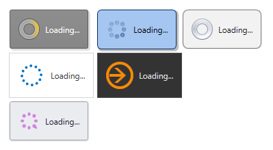
The default layout of the Wait Indicator consists of the animated image and the label.
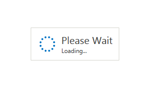
You can customize the Wait Indicator‘s layout using the ContentTemplate property. The code snippet below illustrates how to set the custom Wait Indicator content.
<dx:WaitIndicator Content="Loading...">
    <dx:WaitIndicator.ContentTemplate>
        <DataTemplate>
            <StackPanel Orientation="Vertical">
                <TextBlock Text="Please Wait" FontSize="20"/>
                <TextBlock Text="{Binding}"/>
            </StackPanel>
        </DataTemplate>
    </dx:WaitIndicator.ContentTemplate>
</dx:WaitIndicator>
The image below illustrates the result.
Displaying Wait Indicator
To use the WaitIndicator control in your application, add it to your form and control its visibility using the DeferedVisibility property.
<Grid>
        <UserControl Background="LightGray"/>
        <dx:WaitIndicator DeferedVisibility="True" Content="Loading...">
            <dx:WaitIndicator.ContentTemplate>
                <DataTemplate>
                    <StackPanel Orientation="Vertical">
                        <TextBlock Text="Please Wait" FontSize="20"/>
                        <TextBlock Text="{Binding}"/>
                    </StackPanel>
                </DataTemplate>
            </dx:WaitIndicator.ContentTemplate>
        </dx:WaitIndicator>
    </Grid>
Example
To control the WaitIndicator control’s visibility, use the DeferedVisibility property. As for changing WaitIndicator’s properties, it is a common WPF control and you can change its properties in code behind or using bindings. You can read more about the bindings here: Data Binding(WPF).
<Window
    xmlns="http://schemas.microsoft.com/winfx/2006/xaml/presentation"
    xmlns:x="http://schemas.microsoft.com/winfx/2006/xaml"
    xmlns:local="clr-namespace:dxSampleGrid"
    xmlns:dx="http://schemas.devexpress.com/winfx/2008/xaml/core"
    xmlns:dxg="http://schemas.devexpress.com/winfx/2008/xaml/grid"
    xmlns:dxb="http://schemas.devexpress.com/winfx/2008/xaml/bars"
    xmlns:dxe="http://schemas.devexpress.com/winfx/2008/xaml/editors"
    xmlns:dxmvvm="http://schemas.devexpress.com/winfx/2008/xaml/mvvm"
     xmlns:dxr="http://schemas.devexpress.com/winfx/2008/xaml/ribbon"
    xmlns:dxgt="http://schemas.devexpress.com/winfx/2008/xaml/grid/themekeys"
    xmlns:dxet="http://schemas.devexpress.com/winfx/2008/xaml/editors/themekeys"
      xmlns:dxc="http://schemas.devexpress.com/winfx/2008/xaml/core"
    xmlns:dxlc="http://schemas.devexpress.com/winfx/2008/xaml/layoutcontrol"
    x:Class="dxSampleGrid.MainWindow"
    Title="DXApplication" Height="700" Width="1100"
    SnapsToDevicePixels="True" UseLayoutRounding="True">
    <Window.Resources>

    </Window.Resources>
    <Grid>
        <Grid.RowDefinitions>
            <RowDefinition Height="9*"/>
            <RowDefinition Height="2*"/>
        </Grid.RowDefinitions>
        <Grid Grid.Row="0">
            <UserControl Background="LightGray"/>
            <dx:WaitIndicator DeferedVisibility="{Binding IsWaitIndicatorVisible}" Content="{Binding WaitIndicatorText}">
                <dx:WaitIndicator.ContentTemplate>
                    <DataTemplate>
                        <StackPanel Orientation="Vertical">
                            <TextBlock Text="Please Wait" FontSize="20"/>
                            <TextBlock Text="{Binding}"/>
                        </StackPanel>
                    </DataTemplate>
                </dx:WaitIndicator.ContentTemplate>
            </dx:WaitIndicator>

    </Grid>
        <Grid Grid.Row="3">
                <StackPanel>
            <Button Content="Start/stop indicator" Click="Button_Click" />
                <Button Content="Change text" Click="Button_Click_1"/>
            </StackPanel>

        </Grid>

    </Grid>

</Window>
using System;
using System.ComponentModel;

namespace dxSampleGrid {
    public partial class MyViewModel : INotifyPropertyChanged{

        public MyViewModel() {
            WaitIndicatorText = "Loading...";
        }

        bool _isWaitIndicatorVisible;
        string _waitIndicatorText;

        public bool IsWaitIndicatorVisible {
            get {
                return _isWaitIndicatorVisible;
            }

            set {
                _isWaitIndicatorVisible = value;
                RaisePropertyChanged("IsWaitIndicatorVisible");
            }
        }

        public string WaitIndicatorText {
            get {
                return _waitIndicatorText;
            }

            set {
                _waitIndicatorText = value;
                RaisePropertyChanged("WaitIndicatorText");
            }
        }

        public event PropertyChangedEventHandler PropertyChanged;
        private void RaisePropertyChanged(String propertyName) {
            if (PropertyChanged != null) {
                PropertyChanged(this, new PropertyChangedEventArgs(propertyName));
            }
        }
    }
}
using DevExpress.Xpf.Grid;

using System;
using System.Windows;

namespace dxSampleGrid {
    public partial class MainWindow : Window {
        public MainWindow() {
            InitializeComponent();
            vm = new MyViewModel();
            DataContext = vm;
        }
        MyViewModel vm;

        private void Button_Click(object sender, RoutedEventArgs e) {
            vm.IsWaitIndicatorVisible = !vm.IsWaitIndicatorVisible;
        }

        private void Button_Click_1(object sender, RoutedEventArgs e) {
            vm.WaitIndicatorText = "Initializing... " + DateTime.Now.Millisecond;
        }
    }
}