Lesson 4 - Create a State Indicator
- 2 minutes to read
This lesson demonstrates how to create a State Indicator and adjust its common settings.
Step 1. Create a New Project and Add a State Indicator
In this step we will perform the common actions that are required when you add a Gauge control to your application.
- Run Microsoft Visual Studio.
- Create a new WPF Application project.
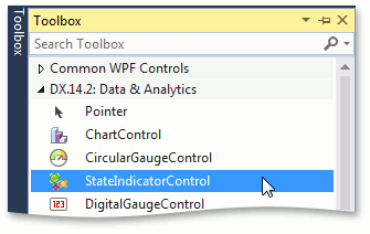
Add the StateIndicatorControl component to your project. To do this, locate the StateIndicatorControl item in a Visual Studio toolbox on the DX.26.1: Data & Analytics tab and drop it onto the main window.
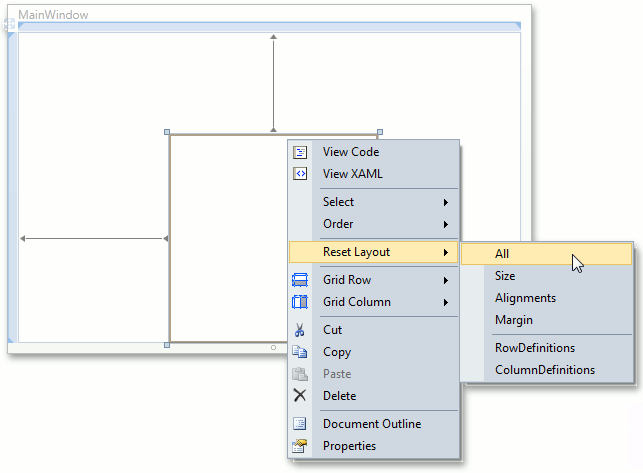
Right-click the StateIndicatorControl object and choose the Reset Layout | All option in the context menu. This will stretch the Gauge control to fill the whole window.
After this, your XAML may look like the following. If it doesn’t, you can overwrite your code with the following.
<Window x:Class="DXGauges_StateIndicator.MainWindow"
        xmlns="http://schemas.microsoft.com/winfx/2006/xaml/presentation"
        xmlns:x="http://schemas.microsoft.com/winfx/2006/xaml"
        xmlns:dxga="http://schemas.devexpress.com/winfx/2008/xaml/gauges"
        Title="MainWindow" Height="350" Width="525" >
    <Grid>
        <dxga:StateIndicatorControl Name="stateIndicatorControl1" />
    </Grid>
</Window>
Step 2. Select a Model
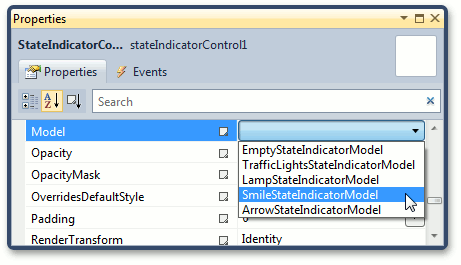
A State Indicator provides a large number of built-in models that can be used for different purposes.
In this lesson, we’ll use SmileStateIndicatorModel to create a smile indicator, which can change its state depending on the mouse position.
To add a model to the state indicator, set the StateIndicatorControl.Model property to SmileStateIndicatorModel.
After that the MainWindow may look like the following.

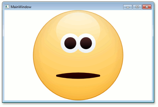
Step 3. Change the Indicator Default State
SmileIndicatorModel contains several predefined states that can be used to show different object states.
Let’s change the default state of the smile indicator.
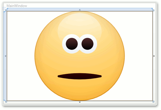
To do this, set the StateIndicatorControl.StateIndex to 2, as shown below.
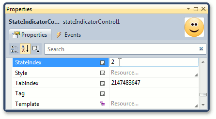
The state indicator control will be similar to the following.
Step 4. Animate the State Indicator
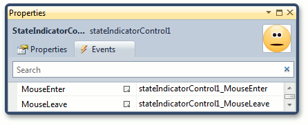
If you want the state indicator to change its image when a mouse pointer hovers it, handle the stateIndicatorControl1_MouseEnter and stateIndicatorControl1_MouseLeave events of the control.
For this, double-click the MouseEnter and MouseLeave events in the Properties window, as shown below.
After that, your XAML should look like the following.
<Window x:Class="DXGauges_StateIndicator.MainWindow"
        xmlns="http://schemas.microsoft.com/winfx/2006/xaml/presentation"
        xmlns:x="http://schemas.microsoft.com/winfx/2006/xaml"
        xmlns:dxga="http://schemas.devexpress.com/winfx/2008/xaml/gauges"
        Title="MainWindow" Height="350" Width="525" >
    <Grid>
        <dxga:StateIndicatorControl Name="stateIndicatorControl1" StateIndex="2"
                                    MouseEnter="stateIndicatorControl1_MouseEnter"
                                    MouseLeave="stateIndicatorControl1_MouseLeave">
            <dxga:StateIndicatorControl.Model>
                <dxga:SmileStateIndicatorModel />
            </dxga:StateIndicatorControl.Model>
        </dxga:StateIndicatorControl>
    </Grid>
</Window>
Add the following code to the MainWindow.xaml.cs file.
private void stateIndicatorControl1_MouseEnter(object sender, MouseEventArgs e) {
    stateIndicatorControl1.StateIndex = 0;
}

private void stateIndicatorControl1_MouseLeave(object sender, MouseEventArgs e) {
    stateIndicatorControl1.StateIndex = 2;
}