TcxGridLevel Class
A grid level.
Declaration
TcxGridLevel = class(
    TcxComponent,
    IdxScaleFactor
)
Remarks
Grid levels are designed to arrange and display data in the TcxGrid control. To display data in a grid View, associate the View with an existing grid level.
Main API Members
The list below outlines key members of the TcxGridLevel class. These members allow you to configure the grid level hierarchy and customize related settings.
Appearance Settings
- ImageIndex
- Allows you to associate an icon with the grid level. The specified index specifies an icon within an image list assigned to the LevelTabs.Images property of the parent TcxGrid control.
- MaxDetailHeight
- Allows you to limit the maximum height for an associated grid detail View.
- Options | Styles
- Allow you to customize appearance for detail grid Views and corresponding tabs in master-detail relationships.
Hierarchy-Related API Members
- Add
- Adds a new nesting grid level to the collection accessible through the Items property.
- Count
- Returns the number of nested grid levels accessible through the Items property.
- IsMaster
- Identifies if the grid level has visible nested levels.
- IsRoot
- Identifies if the grid level is a root for the parent TcxGrid control.
- Items
- Provides access to the collection of nested grid levels.
- Parent
- Provides access to the parent grid level.
- VisibleCount
- Returns the number of visible nested grid levels accessible through the VisibleItems property.
- VisibleItems
- Provides access to the collection of visible nested grid levels.
General-Purpose API Members
- Active
- Specifies if the grid level is active. This property always returns
Truefor a root grid level. - ActuallyVisible
- Identifies if the grid level is visible at the current hierarchy level.
- Control
- Provides access to the parent TcxGrid control.
- GridView
Specifies the associated grid View.
Note
You need to associate a grid View with the grid level to display data.
- MakeVisible
- Displays the grid level (expands all parent levels).
- Visible
- Specifies if the grid level is visible.
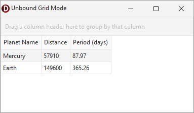
Code Example: Create and Populate Unbound Grid Views
The code example in this section creates an unbound grid Table View (TcxGridTableView) with three columns and populates them. To display data in the TcxGrid control, the code example also creates a root grid level and associates it with the created grid View.
uses
  cxGrid,  // Declares the TcxGrid control
  cxGridLevel,  // Declares the TcxGridLevel class
  cxGridTableView,  // Declares TcxGridTableView and TcxGridColumn classes
  cxTextEdit,  // Declares the TcxTextEditProperties class
  cxSpinEdit;  // Declares the TcxSpinEditProperties class
// ...

var
  AGrid: TcxGrid;
  AGridLevel: TcxGridLevel;
  ATableView: TcxGridTableView;
  AColumn: TcxGridColumn;
begin
  AGrid := TcxGrid.Create(Self); // Creates a TcxGrid control
  AGrid.Parent := Self;  // Associates the TcxGrid control with the application form
  AGrid.Align := alClient;
  AGridLevel := AGrid.Levels.Add;  // Creates a root grid level
  // Create and configure a Table View
  ATableView := AGrid.CreateView(TcxGridTableView) as TcxGridTableView;
  AGridLevel.GridView := ATableView;  // Associates the Table View with the root grid level
  // Configure and populate the created Table View
  ATableView.BeginUpdate;  // Initiates the following batch operation
  try
    AColumn := ATableView.CreateColumn;  // Creates the first column
    AColumn.Caption := 'Planet Name';
    AColumn.PropertiesClass := TcxTextEditProperties;  // Assigns a single-line text editor
    (AColumn.Properties as TcxTextEditProperties).ReadOnly := True;  // Enables read-only mode
    (AColumn.Properties as TcxTextEditProperties).HideSelection := True;  // Disables selection
    AColumn := ATableView.CreateColumn;  // Creates the second column
    AColumn.PropertiesClass := TcxSpinEditProperties;  // Assigns a spin editor
    (AColumn.Properties as TcxSpinEditProperties).Increment := 10;
    AColumn.Caption := 'Distance';
    AColumn := ATableView.CreateColumn;  // Creates the third column
    AColumn.Caption := 'Period (days)';
    ATableView.DataController.RecordCount := 2;  // Creates two empty records in a data controller
    // Populate the first record
    ATableView.DataController.Values[0, 0] := 'Mercury';
    ATableView.DataController.Values[0, 1] := 57910;
    ATableView.DataController.Values[0, 2] :=  87.97;
    // Populate the second record
    ATableView.DataController.Values[1, 0] := 'Earth';
    ATableView.DataController.Values[1, 1] := 149600;
    ATableView.DataController.Values[1, 2] := 365.26;
  finally
    ATableView.EndUpdate;  // Calls EndUpdate regardless of the batch operation's success
    ATableView.ApplyBestFit;  // Adjusts column width to fit captions and content (once data is displayed)
  end;
end;
Direct TcxGridLevel Class References
The following public API members reference a TcxGridLevel object:
- TcxGridLevel.Add
- Adds a new child (detail) level.
- TcxGridLevel.Items
- Specifies the collection of child (detail) levels for the current grid level.
- TcxGridLevel.VisibleItems
- Specifies the collection of child (detail) levels which can be displayed.
- TcxCustomGrid.ActiveLevel
- Specifies the root grid level which is currently active.
- TcxCustomGrid.Levels
- Provides access to the collection of root grid levels within a grid control.