VCL Wizard Control
- 3 minutes to read
The VCL Wizard Control (the TdxWizardControl component) is designed to create configuration wizards, installers, etc.
View Styles
The control ships with Aero and Wizard 97 styles. Use the control’s ViewStyle to switch its display style. You can change appearance settings of wizard UI elements to create a custom style.
- Aero
Microsoft Windows-inspired Aero theme. This style includes support for titles and Aero Glass theme effects.
The Aero style requires that your form is inherited from the
TdxWizardControlForm. The Wizard Application and Form templates (shipped as part of the VCL Template Kit) automatically create aTdxWizardControlFormdescendant. Derive your form from theTdxWizardControlFormclass if you need to use the Aero style.- Wizard 97
A classic wizard design. Wizard 97 differs from Aero Wizard in that it supports watermarks.
Refer to the following help topic for information on Wizard UI elements common to these view styles: Page Layout.
Buttons
Built-in Buttons
- Back | Next
- A user can click these buttons to switch the active page. The
Backbutton is placed in the title area in theAeroview style. - Cancel | Finish | Help
- These buttons have no predefined functionality. You can handle the control’s OnButtonClick event to implement commands associated with these buttons.
Custom Buttons
These buttons have no predefined functionality. You can use the control’s Buttons.CustomButtons property to add custom buttons. Handle the button‘s OnClick event to implement a command associated with this button.
Animation
The control supports page transition animation effects. Use the control’s OptionsAnimate property to adjust animation settings. You can disable animation effects or apply one of the following animation effects:
- Fade
-
- Slide
-
VCL Template Kit: Wizard App & Form Templates
You can create Wizard application projects and Wizard forms using corresponding templates shipped with the VCL Template Kit.
Tip
All Wizard control forms generated by the VCL Template Kit are derived from the TdxWizardControlForm class required for the Aero View Style.
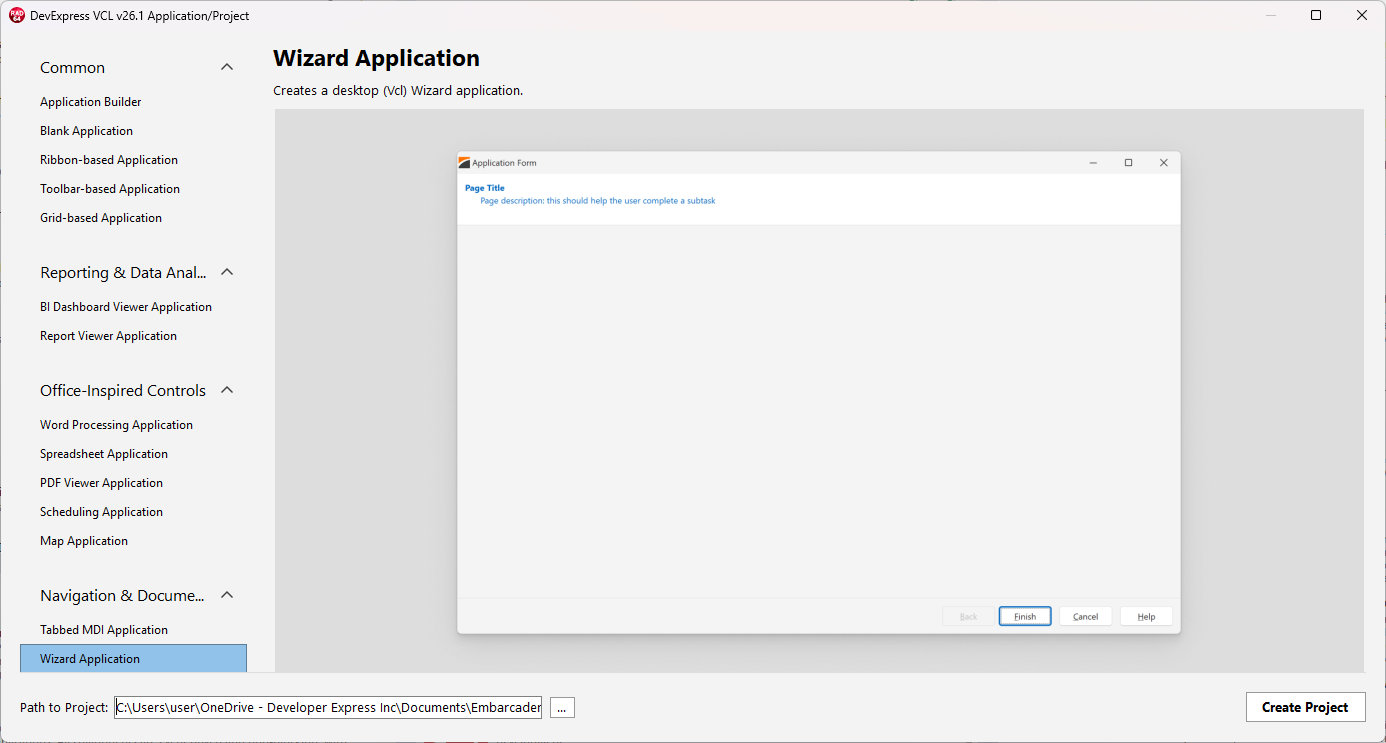
Wizard Application Template
To create a new Wizard application project, click File | New → DevExpress VCL v26.1 Application/Project. Select Wizard Application in the Navigation & Document Layout category and click Create Project.
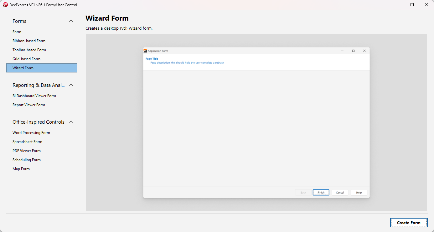
Wizard Form Template
To add a Wizard Control form to an existing project, click File | New → DevExpress VCL v26.1 Form/User Control. Select Wizard Form in the Form category and click Create Form.
Related Compiled Demo
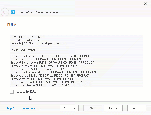
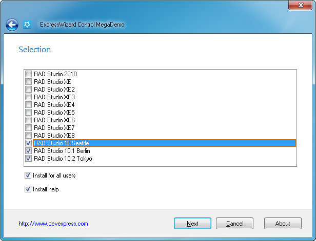
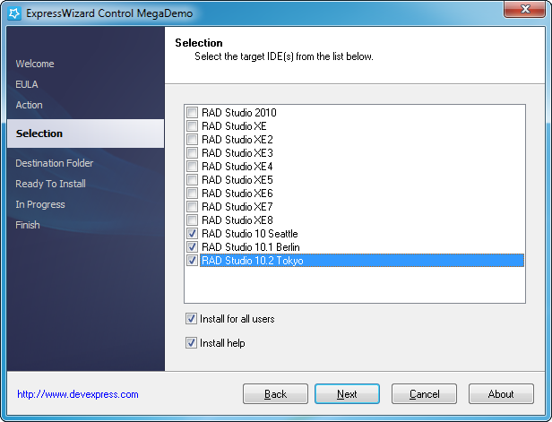
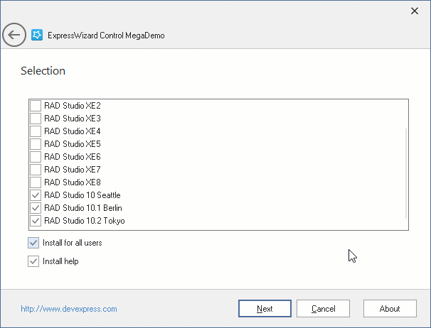
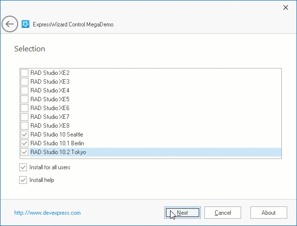
To see the TdxWizardControl component in action, run the Wizard Control demo in the VCL Demo Center installed with compiled DevExpress VCL Demos.
Tip
You can find full source code for the installed compiled Wizard Control demo in the following folder:
%PUBLIC%\Documents\DevExpress VCL Demos\MegaDemos\Product Demos\ExpressWizardControl\