Wizard Pages
- 3 minutes to read
A Wizard Page is a minimum content unit in the VCL Wizard Control (TdxWizardControl) component. You can display these pages in a specific order and allow users to navigate between individual pages using predefined and custom buttons.
Active Page Appearance
The TdxWizardControl component can contain any number of pages, and only one page can be visible (active) at a time. Page appearance depends on the following settings:
- View style
- Common and UI element-specific layout settings
- Page-specific settings – page content, appearance, size, and header layout, and watermark
To manage and configure individual wizard pages, use the Pages property. The order of collection items determines the display order of the corresponding pages. In addition, you can re-arrange pages within the collection or hide individual pages depending on certain conditions in your application.
Page Layout
A wizard page includes the following UI elements:

Wizard Page Elements
- Header
Displays the page title, an optional description and/or image. A wizard page allows you to assign a background image to the header, customize its title and description, font settings, and description offsets.
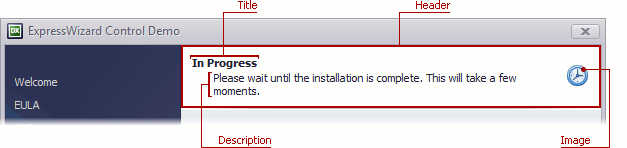
- Content Area
- Displays UI elements added as child controls to a wizard page. You can access all child controls using the page’s Controls property.
- Command Area
- Includes wizard buttons and an optional information panel that can display text or a hyperlink.
- Watermark
- Available only for the Wizard 97 style. Displays a side image that can include additional page-specific information.
- Title
- Available only for the Aero Wizard style. Displays the wizard title common to all pages, the Back button, and an optional image.
Default page layout and visibility settings for both the header and watermark are based on the active View Style. You can adjust these settings as required and restore initial settings using the AssignedValues flags.
Design-Time Experience
You can navigate and manage page settings stored within the Wizard Control’s Pages collection using the wizard control context menu.
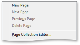
In addition, you can use this context menu to display the page collection editor.
You can click Back and Next buttons to switch between wizard pages. The Object Inspector displays properties and events for the active wizard page.
To access active page settings, click within the page content area or click the green page selector. The active page selector changes its color to red.
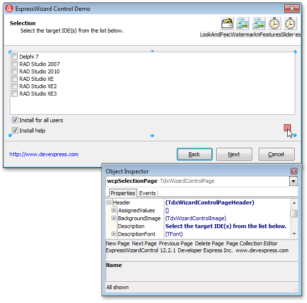
To define the selected page layout, you can drag and drop any controls from the Component Palette of your RAD Studio IDE. All added controls are accessible through the page’s Controls property.
Wizard Page Settings
Refer to the TdxWizardControlPage class description for detailed information on all available options.