Wizard Control
- 4 minutes to read
The ExpressWizard Control (Wizard Control for short) allows you to easily create multi-step wizard dialogs, just like well-known installation wizards.

To get acquainted with the Wizard Control and see its capabilities in action, run the WizardControlDemo shipped with the ExpressWizardControl Suite.
View Styles
The Wizard Control provides two built-in view styles that are pre-configured to conform to Wizard 97 and Aero Wizard standards:
- Wizard 97. This style is the classic standard for wizard design.

- Aero Wizard. Introduced with Microsoft Windows Vista, this style incorporates updates to the visual layout and functionality, and provides full support for Aero Glass theme effects.

With a single option, you can apply one of these styles to your wizard. You can customize the default settings of wizard UI elements to create a hybrid style based on a built-in one.
Active Page
With the Wizard Control, you can create as many pages as you like and display them in a specific order. Only one of these pages can be active (shown) within the Wizard Control at one time. The Wizard Control provides the methods that allow you to sequentially activate pages, emulating end-user navigation with buttons.
Buttons
Buttons are the main interactive visual elements of the Wizard Control. The table below describes the available buttons and their functionality in detail.
| Button | Description |
|---|---|
| Back and Next | These buttons navigate to the previous/next page by activating it. |
| Cancel, Finish, and Help | These buttons have no predefined functionality. You can handle the OnButtonClick event to implement the required functionality for them. |
| Custom Buttons | These buttons have no predefined functionality. You can handle their OnClick event to implement the required functionality for them. |
The Wizard Control automatically switches the visibility and enabled state of the Back, Next, and Finish buttons based on the currently active page and its position in the page collection. For instance, the first page always disables the Back button, while the last page replaces the Next button with Finish. You can handle the OnPageChanging event to dynamically switch button states, and initialize or update page contents in response to page activation. In addition, you can optionally display the Finish button on any page to allow end-users to complete the wizard without completing all the steps.
Animation
You can allow the Wizard Control to accompany page transitions with animation. Animation is enabled by default only for the Aero Wizard view style. You can adjust animation options and specify the transition animation effect via the OptionsAnimate property set.
Design-Time Experience
To help you get started with the Wizard Control, we provide IDE templates that help you create Wizard applications and Wizard forms from scratch. Click File | New > Other… in the IDE to open the New Items dialog and browse the corresponding folders for the available templates.
- Application Template.

- Form Template.

The form template creates a Wizard form (a TdxWizardControlForm object) with a Wizard Control on it. The application template creates an empty project prior to adding the Wizard form to it. Note that since a Wizard form implements Aero standard-compliant form sizing and positioning on screen, as well as proper form painting for Aero Glass theme effects, we recommend that you use these IDE templates when creating Aero wizards. Alternatively, you can always switch your form class to TdxWizardControlForm.
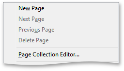
You can navigate and manage wizard pages at design time via the wizard control context menu.

Click “Page Collection Editor…” in the context menu to invoke the collection editor. This editor allows you to create, delete, and reorder pages within the collection.

On a form, you can easily navigate between pages by clicking the Back or Next button.
The Wizard Control is implemented by the TdxWizardControl component. The table below lists TdxWizardControl members that affect main Wizard Control characteristics.
Characteristic | Description |
|---|---|
Contents | The Pages, Watermark, Buttons, Header, InfoPanel, and Title properties. To manage wizard pages, call the AddPage and DeletePage methods. Use the ActivePage and ActivePageIndex properties to activate (show) a specific page within the wizard control. To switch to the next or previous page relative to the currently active page, call the GoToNextPage or GoToPrevPage method, respectively. |
Appearance | The ViewStyle, Align, and OptionsViewStyleAero properties. Use the inherited LookAndFeel property to apply specific look & feel settings to the wizard control. |
Behavior | Page Activation and Navigation The OnPageChanged and OnPageChanging events. Button Clicks The OnButtonClick and OnInfoPanelClick events. |
Animation | The OptionsAnimate property. |
HitTest Information | The HitTest property. |