DataFormView Class

An edit form for a data object.

Namespace: DevExpress.Maui.DataForm

Assembly: DevExpress.Maui.Editors.dll

NuGet Package: DevExpress.Maui.Editors

Declaration

[ContentProperty("Items")]
public class DataFormView :
    View,
    IDXViewController,
    IAppearanceOwner,
    IVisualTreeElement

Remarks

The DataFormView is a component that allows your users to review and edit business objects. The DataObject property allows you to specify the data object to be edited. The view automatically generates data editors for each field in the bound business object. To disable automatic editor generation, set the IsAutoGenerationEnabled property to false.
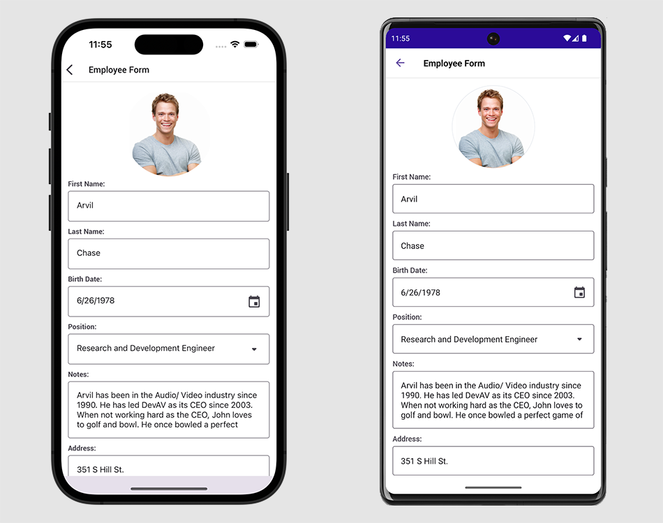
The following image shows a sample Data Form that allows users to edit person data:

Data Form

Download and install the DevExpress.Maui.DataForm package from the DevExpress NuGet Gallery to obtain the DataFormView component.

Review our demo apps on GitHub to try out the DataFormView:

View Example

For a step-by-step tutorial on how to set up a Data Form, refer to the following topic: Get Started with DevExpress Data Form for .NET MAUI.

Specify Editor Properties in Styles

If a DataFormItem‘s descendant and the target editor have the same property, you should use the DataFormItem descendant’s property to customize the editor’s properties. For example, the IsReadOnly property is available both in the DataFormItem‘s descendant and target editor. In this case, you should define an implicit style for the DataFormItem.

The following code sample enables read-only mode for the DataFormTextItem control:

<ContentPage ...
    xmlns:dxdf="clr-namespace:DevExpress.Maui.DataForm;assembly=DevExpress.Maui.Editors">
    <ContentPage.Resources>
        <Style TargetType="dxdf:DataFormTextItem">
            <Setter Property="IsReadOnly" Value="True"/>
        </Style>
    </ContentPage.Resources>
    <ScrollView>
        <StackLayout>
            <dxdf:DataFormView x:Name="dataform" >
                <dxdf:DataFormTextItem FieldName="FirstName" LabelText="Name"/>
            </dxdf:DataFormView>
    </StackLayout>
    </ScrollView>
</ContentPage>

Customize Appearance

The DataFormView class includes the APIs that allow you to customize appearance of its elements. The tables below list these APIs.

Data Form View’s Appearance

Property

Description

ContentPadding

Gets or sets the distance between editors and the data form’s borders or group headers.This is a bindable property.

EditorBottomTextFontAttributes

Gets or sets whether an editor’s help and error text is bold or italic. This is a bindable property.

EditorBottomTextFontFamily

Gets or sets the font family name for an editor’s help and error text. This is a bindable property.

EditorBottomTextFontSize

Gets or sets the font size of an editor’s help and error text. This is a bindable property.

EditorErrorColor

Gets or sets the color of editor borders, in-place labels, error icons, and error messages if there are input errors. This is a bindable property.

EditorHelpTextColor

Gets or sets the color of help text displayed below editors. This is a bindable property.

EditorHorizontalSpacing

Gets or sets the distance between editors in a row. This is a bindable property.

EditorLabelColor

Gets or sets the color of editor labels (text or icons). This is a bindable property.

EditorLabelFontAttributes

Gets or sets the font style for editor text labels. This is a bindable property.

EditorLabelFontFamily

Gets or sets the font family name for editor text labels. This is a bindable property.

EditorLabelFontSize

Gets or sets the font size for editor text labels. This is a bindable property.

EditorLabelHorizontalAlignment

Gets or sets the horizontal alignment of labels displayed above editors. This is a bindable property.

EditorLabelIndent

Gets or sets the distance between editors and their labels. This is a bindable property.

EditorLabelMaxWidth

Gets or sets the maximum width of the data form’s editor labels. This is a bindable property.

EditorLabelMinWidth

Gets or sets the minimum width of the data form’s editor labels. This is a bindable property.

EditorPadding

Gets or sets the distance between edges of the data form’s items and their content (editors and labels). This is a bindable property.

EditorWidth

Gets or sets the width of the data form’s editors. This is a bindable property.

EditorMaxWidth

Gets or sets the maximum width of the data form’s editors. This is a bindable property.

EditorMinWidth

Gets or sets the minimum width of the data form’s editors. This is a bindable property.

GroupHeaderBackgroundColor

Gets or sets the background color for headers of editor groups. This is a bindable property.

GroupHeaderFontAttributes

Gets or sets the font style for header captions of editor groups. This is a bindable property.

GroupHeaderFontFamily

Gets or sets the font family name for header captions of editor groups. This is a bindable property.

GroupHeaderFontSize

Gets or sets the font size for header captions of editor groups. This is a bindable property.

GroupHeaderPadding

Gets or sets the distance between the edges of the data form’s group headers and their content. This is a bindable property.

GroupHeaderTextColor

Gets or sets the text color for header captions of editor groups. This is a bindable property.

RowSeparatorColor

Gets or sets the color of lines that separate rows of editors on the data form. This is a bindable property.

RowSeparatorThickness

Gets or sets the thickness of lines that separate rows of editors on the data form. This is a bindable property.

Data Form View’s Groups

Property

Description

ContentPadding

Gets or sets the distance between editors and the data form’s borders or group headers. This is a bindable property.

EditorHorizontalSpacing

Gets or sets the distance between editors in a row. This is a bindable property.

HeaderBackgroundColor

Gets or sets the background color for the header of the editor group. This is a bindable property.

HeaderFontAttributes

Gets or sets the font style for the header caption of the editor group. This is a bindable property.

HeaderFontFamily

Gets or sets the font family name for the header caption of the editor group. This is a bindable property.

HeaderFontSize

Gets or sets the font size for the header caption of the editor group. This is a bindable property.

HeaderPadding

Gets or sets the distance between the edges of the group header and its content. This is a bindable property.

HeaderTextColor

Gets or sets the text color for the header caption of the editor group. This is a bindable property.

RowSeparatorColor

Gets or sets the color of lines that separate rows of editors in the group. This is a bindable property.

RowSeparatorThickness

Gets or sets the thickness of lines that separate rows of editors in the group. This is a bindable property.

Data Form View’s Items

Common Appearance Properties

Appearance properties that are listed in the table below are applicable to the following classes:

Property

Description

BackgroundColor

Gets or sets the background color of the data form’s item. This is a bindable property.

BottomTextFontAttributes

Gets or sets whether the editor’s help and error text is bold or italic. This is a bindable property.

BottomTextFontFamily

Gets or sets the name of the font for the editor’s help and error text. This is a bindable property.

BottomTextFontSize

Gets or sets the font size of the editor’s help and error text. This is a bindable property.

DisplayFormat

Gets or sets the pattern used to format the editor’s value.

DisplayFormat

Gets or sets the pattern used to format the editor’s value.

EditorMaxWidth

Gets or sets the maximum width of the edit box. This is a bindable property.

EditorMinWidth

Gets or sets the minimum width of the edit box. This is a bindable property.

EditorWidth

Gets or sets the width of the edit box. This is a bindable property.

ErrorColor

Gets or sets the color of the editor’s borders, in-place label, error icon, and error message. This is a bindable property.

HelpTextColor

Gets or sets the color of help text displayed below the editor. This is a bindable property.

LabelColor

Gets or sets the color of the editor’s label (text or icon). This is a bindable property.

LabelFontAttributes

Gets or sets the font style for the editor’s text label. This is a bindable property.

LabelFontFamily

Gets or sets the font family name for the editor’s text label. This is a bindable property.

LabelFontSize

Gets or sets the font size for the editor’s text label. This is a bindable property.

LabelHorizontalAlignment

Gets or sets the horizontal alignment of a label displayed above the editor. This is a bindable property.

LabelIcon

Gets or sets an image used as the editor’s label. This is a bindable property.

LabelIndent

Gets or sets the distance between the editor and its label. This is a bindable property.

LabelMaxWidth

Gets or sets the maximum width of the editor’s label. This is a bindable property.

LabelMinWidth

Gets or sets the minimum width of the editor’s label. This is a bindable property.

LabelWidth

Gets or sets the width of the editor’s label. This is a bindable property.

Padding

Gets or sets the distance between the data form item’s edges and content (editor and label). This is a bindable property.

RowSpan

Gets or sets the number of layout rows that this item spans. This is a bindable property.

Item-Specific Appearance Properties

Property

Description

DataFormAutoCompleteItem.ItemTemplate

Gets or sets the drop-down list item template. This is a bindable property.

DataFormAutoCompleteItem.SubmitIconVisibility

Gets or sets whether the submit icon is displayed. This is a bindable property.

DataFormCheckBoxItem.EditorHorizontalAlignment

Gets or sets a CheckEdit‘s horizontal alignment within the data form. This is a bindable property.

DataFormComboBoxItem.ItemTemplate

Gets or sets the drop-down list item template. This is a bindable property.

DataFormDateItem.PickerCustomDayCellAppearance

Allows you to customize the appearance of day cells in the default picker.

DataFormDateItem.PickerCustomDayOfWeekCellAppearance

Allows you to customize the appearance of day of the week cells in the default picker.

DataFormDateItem.PickerCustomMonthCellAppearance

Allows you to customize the appearance of the month cells in the default picker.

DataFormDateItem.PickerCustomYearCellAppearance

Allows you to customize the appearance of the year cells in the default picker.

DataFormNumericItem.UpDownIconAlignment

Gets or sets the alignment of the up and down icons that increase and decrease the editor’s value. This is a bindable property.

DataFormSwitchItem.EditorHorizontalAlignment

Gets or sets a SwitchItem’s horizontal alignment within the data form. This is a bindable property.

DataFormSwitchItem.ThumbColor

Gets or sets the color of the DataFormSwitchItem thumb. This is a bindable property.

The following featured scenarios show how you can use the DataFormView class:

Contact Edit Form Search Bar Featured Scenario

Populate E-Forms in PDF Files Search Bar Featured Scenario

CRUD Operations CRUD Operations Featured Scenario

See Also