DXButtonBase.DisabledIconColor Property
Gets or sets the icon color of the button in the disabled state. This is a bindable property.
Namespace: DevExpress.Maui.Core
Assembly: DevExpress.Maui.Core.dll
NuGet Package: DevExpress.Maui.Core
Declaration
public Color DisabledIconColor { get; set; }Property Value
| Type | Description |
|---|---|
| Color | The icon color of the button in the disabled state. |
Remarks
The button in the disabled state gets its icon color from the applied theme or ThemeSeedColor. Use the DisabledIconColor property to apply a custom color, or set the DisabledIconColor property to null to use the original icon color:
<dx:DXButton ...
            Icon="cross"
            DisabledIconColor="{x:Null}"/>
Example
This example shows how to customize button appearance and handle the button click event.
Button State | Default Appearance | Custom Appearance |
|---|---|---|
Default |
|
|
Pressed |
|
|
Disabled |
|
|

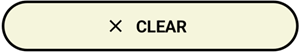


Add the clear.png icon file to the Resources/Images folder.
Use the following properties to adjust the button’s appearance and handle the Clicked event to clear label on button tap:
<dx:DXButton ButtonType="Accent" Content="CLEAR" TextColor="Black" DisabledTextColor="DarkGray" PressedTextColor="White" Icon="clear" IconColor="Black" DisabledIconColor="DarkGray" PressedIconColor="White" BorderThickness="2" BorderColor="Black" DisabledBorderColor="DarkGray" PressedBorderColor="DarkOrange" CornerRadius="25" BackgroundColor="Beige" DisabledBackgroundColor="Brown" PressedBackgroundColor="Gray" Clicked="Button_Clicked"/>private void Button_Clicked(object sender, EventArgs e) { label.Text = ""; }
You can also handle the Tap event to specify an action that occurs when a user taps a DXButtonBase descendant. The Tap event allows you to pass additional event data.