ShimmerView.LoadingView Property
Gets or sets the view displayed with shimmer effects while main content is being loaded. This is a bindable property.
Namespace: DevExpress.Maui.Controls
Assembly: DevExpress.Maui.Controls.dll
NuGet Package: DevExpress.Maui.Controls
Declaration
public View LoadingView { get; set; }Property Value
| Type | Description |
|---|---|
| View | A view that specifies the loading view. |
Remarks
You can show a custom shimmer layout during a loading operation (IsLoading is True). To do this, specify the ShimmerView.LoadingView property. The ShimmerView draws the component shapes you add to the LoadingView. For example, use Ellipse or Rectangle objects to draw circles and rectangles:
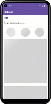
<dxco:ShimmerView .../>
    <!--...-->
    <dxco:ShimmerView.LoadingView>
        <Grid RowDefinitions="40,100,400,180" ColumnDefinitions="*,*,*" Padding="10">
            <Label Text="Content is being loaded..." Grid.Row="0" Grid.ColumnSpan="3" FontSize="16"/>
            <Ellipse Grid.Row="1" Grid.Column="0" Fill="LightGray" HeightRequest="80" WidthRequest="80"/>
            <Ellipse Grid.Row="1" Grid.Column="1" Fill="LightGray" HeightRequest="80" WidthRequest="80"/>
            <Ellipse Grid.Row="1" Grid.Column="2" Fill="LightGray" HeightRequest="80" WidthRequest="80"/>
            <Rectangle Grid.Row="2" Grid.ColumnSpan="3" Fill="LightGray" HeightRequest="380"/>
            <Rectangle Grid.Row="3" Grid.ColumnSpan="3" Fill="LightGray" HeightRequest="150"/>
        </Grid>
    </dxco:ShimmerView.LoadingView>
</dxco:ShimmerView>
Related GitHub Examples
The following code snippet (auto-collected from DevExpress Examples) contains a reference to the LoadingView property.
Note
The algorithm used to collect these code examples remains a work in progress. Accordingly, the links and snippets below may produce inaccurate results. If you encounter an issue with code examples below, please use the feedback form on this page to report the issue.