ComboBox - Templates
- 8 minutes to read
ComboBox templates are RenderFragment<TValue> type properties. These render fragments can contain both markup and other Razor components. A template’s Razor markup can access an implicit parameter named context. This parameter is derived from the TValue type and contains template-related members.
You can use the Context attribute to change the parameter name. This name change is essential when you nest components that contain RenderFragment<TValue> properties, otherwise, the following error can occur: The child content element ‘ChildContent’ of component ‘X’ uses the same parameter name (‘context’) ….
Item Display Template
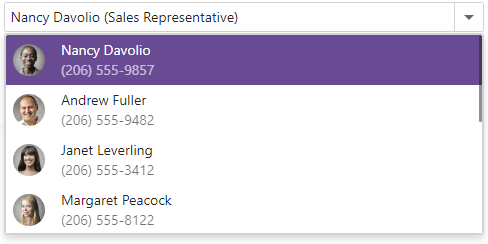
The ItemDisplayTemplate property allows you to customize the appearance of ComboBox items. The property accepts a ComboBoxItemDisplayTemplateContext<TData> object as the context parameter. You can use the parameter’s members to obtain item information:
The following code snippet uses the ItemDisplayTemplate property to display ComboBox items in a card-like view. Each item shows an employee’s first name, last name, photo, and phone number.
@inject NwindDataService NwindDataService

<DxComboBox Data="@Data"
            @bind-Value="@Value"
            CssClass="cw-480"
            InputId="cbItemTemplate">
    <ItemDisplayTemplate>
        <div class="combobox-item-template">
            <img src="@GetImageFileName(context.DataItem)" alt="@context.DataItem.FullName" />
            <div class="combobox-item-template-text">
                <span>@context.DataItem.FullName</span>
                <span class="combobox-item-template-employee-phone">@context.DataItem.HomePhone</span>
            </div>
        </div>
    </ItemDisplayTemplate>
</DxComboBox>

@code {
    IEnumerable<Employee> Data { get; set; }
    Employee Value { get; set; }
    protected override async Task OnInitializedAsync() {
        Data = await NwindDataService.GetEmployeesAsync();
        Value = Data.FirstOrDefault();
    }
    string GetImageFileName(Employee employee) {
        return $"employees/item-template{employee.EmployeeId}.jpg";
    }
}
Edit Box Display Template
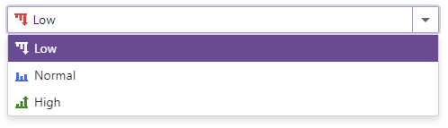
The EditBoxDisplayTemplate property allows you to customize the appearance of a ComboBox item displayed in the edit box.
The most popular usage scenario for the EditBoxDisplayTemplate property is to show item icons in the edit box.
<DxComboBox Data="@Items"
            @bind-Value="@Value"
            CssClass="cw-480" >
    <EditBoxDisplayTemplate>
        @GetTemplateContent(context.DataItem)
    </EditBoxDisplayTemplate>
    ...
</DxComboBox>

@code {
    string Value { get; set; } = "Low";
    IEnumerable<string> Items = new List<string>() {"Low", "Normal", "High"};
    RenderFragment GetTemplateContent(string item) {
        return @<div class="template-container">
                   <svg class="@GetIconCssClass(item)" role="img">
                       <use href="@GetIconHref(item)"/>
                   </svg>
                   @item
               </div>;
    }
    string GetIconHref(string item) {
        return item != null ? StaticAssetUtils.GetImagePath($"icons/levels.svg#dx-{item.ToLower()}-level") : string.Empty;
    }
    string GetIconCssClass(string item) {
        var cssClass = "template-icon";
        if (item != null)
            cssClass += $" {item.ToLower()}-level";
        return cssClass;
    }
}
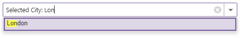
You can also create an edit box template that supports user input and filter mode:
- Add
<EditBoxDisplayTemplate>…</EditBoxDisplayTemplate>to the ComboBox markup. - Declare a DxInputBox object within the
EditBoxTemplatemarkup. - Optional. Use the
DxComboBox‘s InputCssClass to customize input box appearance. - Optional. Set the DxComboBox.AllowUserInput to
true. - Optional. Use the SearchMode property to enable search mode.
- Optional. Use the NullText property to display the prompt text in the edit box when the editor’s Value is
null.
<DxComboBox Data="@Cities"
            @bind-Value="@CurrentCity"
            AllowUserInput="true"
            SearchMode="ListSearchMode.AutoSearch"
            SearchFilterCondition="ListSearchFilterCondition.StartsWith"
            NullText="Select City ..."
            ClearButtonDisplayMode="DataEditorClearButtonDisplayMode.Auto">
    <EditBoxDisplayTemplate>
        @if (context != null) {
            <span class="content">Selected City: </span>
        }
        <DxInputBox/>
    </EditBoxDisplayTemplate>
</DxComboBox>

@code {
    string CurrentCity { get; set; } = "London";
    IEnumerable<string> Cities = new List<string>() { "New York", "London", "Berlin", "Paris" };
}
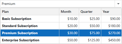
Cell Display Templates
Use the following properties to customize cell appearance in a multi-column ComboBox.
| Property | Container | Scope |
|---|---|---|
| ColumnCellDisplayTemplate | DxComboBox |
All cells in a ComboBox |
| CellDisplayTemplate | DxListEditorColumn |
Cells in the current column |
These properties can be combined within a single ComboBox. If both templates are defined, the column-specific CellDisplayTemplate takes precedence over the global ColumnCellDisplayTemplate for cells in that particular column. This functionality allows you to set a common template for all columns and then override it for individual columns that require different formatting.
The following code snippet customizes the appearance of different columns in a ComboBox control.
<DxComboBox Data="Subscriptions.Plans"
            @bind-Value="SelectedPlan"
            EditFormat="{0}">
    <Columns>
        <DxListEditorColumn FieldName="Name" Caption="Plan">
            <CellDisplayTemplate>
                <div class="text-left">
                    <b>@context.Value Subscription</b>
                </div>
            </CellDisplayTemplate>
        </DxListEditorColumn>
        <DxListEditorColumn FieldName="PriceMonth" Caption="Month" />
        <DxListEditorColumn FieldName="PriceQuarter" Caption="Quarter" />
        <DxListEditorColumn FieldName="PriceYear" Caption="Year" />
    </Columns>
    <ColumnCellDisplayTemplate>
        <div class="text-right">
            @($"{context.Value:C}")
        </div>
    </ColumnCellDisplayTemplate>
</DxComboBox>

@code {
    SubscriptionPlan SelectedPlan { get; set; }
}
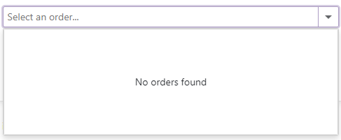
Empty Data Area Template
The ComboBox displays an empty data area in the following cases:
- The Data property is unset.
- The specified data source is empty.
- None of the ComboBox items matches the current search and filter condition.
- You use the DataAsync property or the CustomData property to bind the ComboBox to a data source. The component sends the first request to a remote data source and waits for a response.
Use the EmptyDataAreaTemplate to customize content displayed in this empty region. The template’s context parameter includes the IsDataLoading property that allows you to determine whether the ComboBox is still loading data.
@inject NwindDataService NwindDataService

<DxComboBox Data="@DataItems"
            @bind-Value="@Item"
            CssClass="combo-box"
            NullText="Select an order...">
    <EmptyDataAreaTemplate>
        @if (!context.IsDataLoading) {
            <div class="empty-data-area-template">
                <div class="empty-string">
                    No orders found
                </div>
            </div>
        }
    </EmptyDataAreaTemplate>
</DxComboBox>

@code {
    IEnumerable<string> DataItems { get; set; }
    string Item { get; set; }
}