ComboBox - Data Shaping
- 6 minutes to read
Group Data
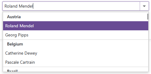
The Blazor ComboBox allows you to organize list items into groups. This enhance user experience by allowing users to locate required values faster. To group data, specify the GroupFieldName property. Values from the specified field appear within group headers.
Note the following specifics:
- The ComboBox supports only one group level.
- Users cannot collapse groups.
- Group headers do not take part in search operations.
- Multi-column ComboBox controls also support groups.
- You can use the GroupHeaderDisplayTemplate property to customize group headers.
The following code organizes data items into groups based on the Country data source field:
@inject NwindDataService NwindDataService

<DxComboBox Data="@Data"
            @bind-Value="Value"
            TextFieldName="@nameof(Customer.ContactName)"
            GroupFieldName="@nameof(Customer.Country)"
            SearchMode="@ListSearchMode.AutoSearch"
            SearchFilterCondition="@ListSearchFilterCondition.Contains"
            InputId="cbGrouping"/>

@code {
    IEnumerable<Customer> Data { get; set; }
    Customer Value { get; set; }
    protected override async Task OnInitializedAsync() {
        Data = await NwindDataService.GetCustomersAsync();
        Value = Data.FirstOrDefault(x => x.Country == "Argentina");
    }
}
Search and Filter Data
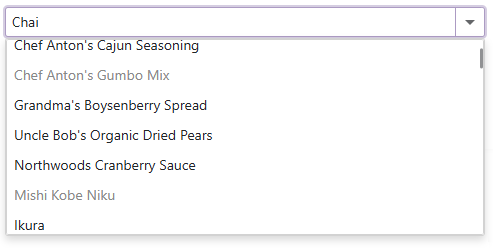
When a user enters text in the edit box, the ComboBox searches for this text, filters items based on the search string, and highlights matches. Users can use special characters to create composite criteria. Refer to the following section for additional information: Search Syntax. All visible columns take part in search operations.
You can use the following API members to configure search and filter capabilities:
- SearchMode — Specifies the search mode. You can set this property to Disabled to prevent users from text searching.
- SearchFilterCondition — Specifies the search and filter condition (Contains/Default, Equals, or StartsWith).
- SearchTextParseMode — Specifies how the component combines words in the search query. If the search text contains multiple words separated by spaces, words can be treated as single or individual conditions. The GroupWordsByAnd, GroupWordsByOr, and ExactMatch modes are available.
- SearchEnabled - Specifies whether the component can search text in cells of the current column.
- SearchDelay - Specifies the delay between a user’s last input in the edit box and the initiation of the search.
<DxComboBox Data="Staff.DataSource"
            @bind-Value="@Value"
            SearchMode="ListSearchMode.AutoSearch"
            SearchFilterCondition="ListSearchFilterCondition.Contains">
    <Columns>
        <DxListEditorColumn FieldName="FirstName"></DxListEditorColumn>
        <DxListEditorColumn FieldName="LastName"></DxListEditorColumn>
        <DxListEditorColumn FieldName="Department" SearchEnabled="false"></DxListEditorColumn>
    </Columns>
</DxComboBox>

@code {
    string Value { get; set; }
}
When a user types text into the edit box, the ComboBox filters and highlights search results.

Note
If you use the EditBoxDisplayTemplate property and need to enable filter mode, you should add a DxInputBox object to the template markup.
Disabled Items
You can disable individual items in the ComboBox’s drop-down list. To do this, use the DisabledFieldName property. The property specifies a Boolean field that stores each item’s enabled or disabled state. Disabled items are grayed out and cannot be selected.
Note
Disabled items can improve component usability, but cannot replace adequate security measures. Users may still be able to select disabled items on the client side, so you should implement appropriate security checks in your code.
@inject NwindDataService NwindDataService

<DxComboBox Data="@Products"
            @bind-Value="@SelectedProduct"
            NullText="Select a product without discount..."
            TextFieldName="@(nameof(Product.ProductName))"
            DisabledFieldName="@(nameof(Product.Discontinued))">
</DxComboBox>

@code {
    IEnumerable<Product> Products { get; set; }
    Product SelectedProduct { get; set; }
    protected override async Task OnInitializedAsync() {
        Products = await NwindDataService.GetProductsAsync();
        SelectedProduct = Products.FirstOrDefault();
    }
}