Appearance Customization in Blazor Grid
- 2 minutes to read
The DevExpress Blazor Grid allows you to customize cell content and the appearance of UI elements. This topic lists the available customization options.
Command Display Mode
The Grid displays command column actions as icons. Use DxGridCommandColumn.DisplayMode to replace icons with captions or display both.

Display Text
The Grid generates element content based on the specified data source. You can customize how the component displays text in data cells, column headers, group rows, and summaries. Display text can affect element appearance and data shaping operations.

For additional information, review the following help topic: Display Text in Blazor Grid.
Text Alignment
The Blazor Grid aligns content in data cells and column footers based on the data type of column values. Column captions are always left-aligned. Use the following properties to change content alignment:
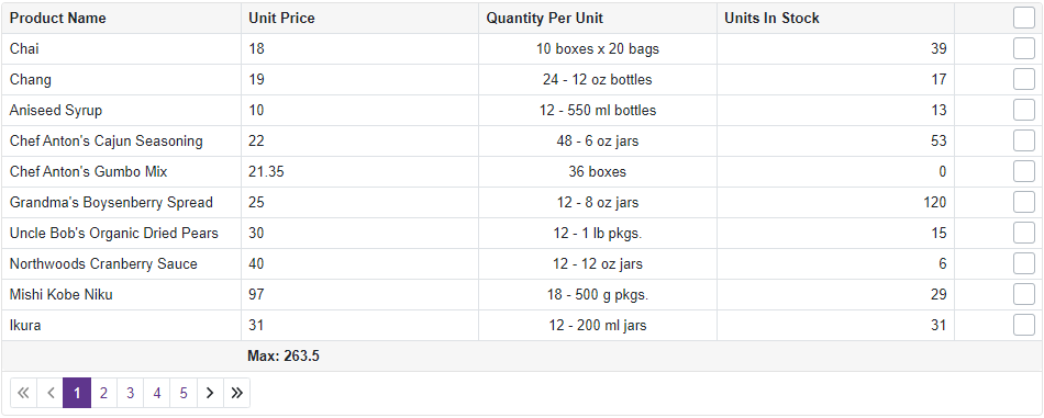
Gridline Visibility
The Grid component displays gridlines (vertical, horizontal, and borders). You can use the DxGrid.GridlinesVisible property to specify which gridlines are visible.
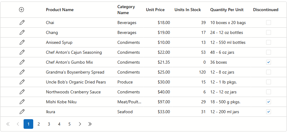
Size Mode
The DevExpress Blazor Grid supports size modes that specify the size of Grid elements (for example, text, spacing, and row height) and built-in components (such as the pager and buttons). You can choose one of three options: small, medium, or large.
For additional information, review the following help topic: Size Modes.
Row Highlight
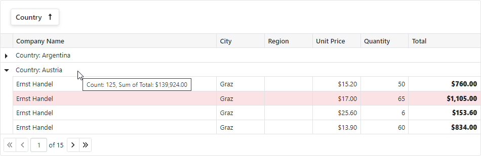
Enable the HighlightRowOnHover option to highlight a row when a user hovers the mouse pointer over it.

Custom Styles and Attributes
Like other Blazor components, the Grid supports custom CSS classes. For some Grid elements, you can assign classes directly:
| Grid Element | Property |
|---|---|
| DxGrid | CssClass |
| PopupEditForm | PopupEditFormCssClass |
| DxEditSettings | CssClass |
| DxEditorButton | CssClass |
| DxDropDownEditSettings | DropDownCssClass |
| DxDropDownEditSettings | DropDownBodyCssClass |
To customize other elements, handle the CustomizeElement event. In the event handler, you can implement any conditions of how custom styles are applied to specific components.
Templates
Grid templates are RenderFragment<TValue> properties. They replace default content area rendering and allow you to arrange custom content in various Grid elements.
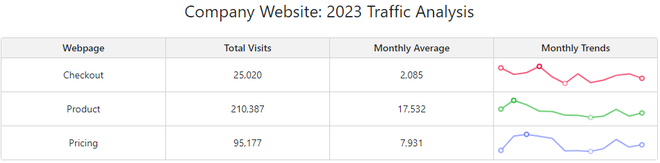
For additional information in this regard, review the following help topic: Templates in Blazor Grid.