DevExpress Blazor UI Kit on Figma
- 2 minutes to read
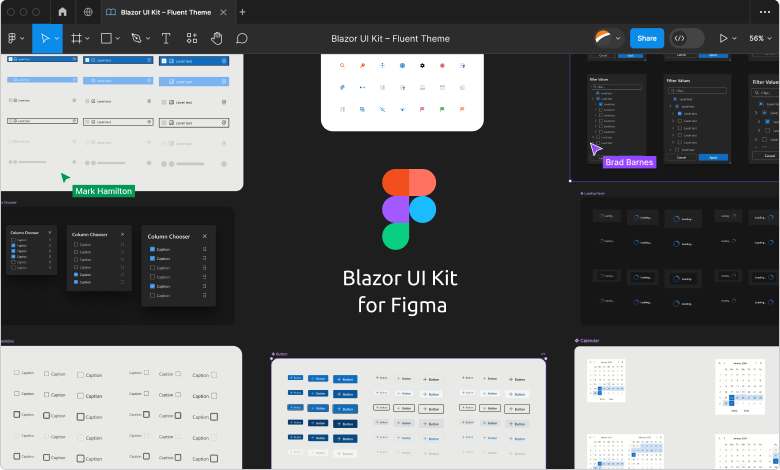
We published a UI Kit on Figma so that developers can collaborate with application designers before active application development. DevExpress Blazor UI Kit include ready-to-use components that replicate the look and feel of runtime controls. Different design files conform to different available visual themes and contain additional design elements (such as icons). Note that the UI Kit may slightly differ from the actual product.
Review and download DevExpress Blazor UI Kit from the DevExpress Community Page on Figma.
Note
You need a Figma account to view UI Kit files.
Advantages of UI Kit Usage
Application prototypes built in Figma with the help of DevExpress Blazor UI Kit offer a number of advantages:
- Promote efficient communication between design and development teams to ensure that design requirements can be implemented.
- Build prototypes and check concepts before the application development stage.
- Reduce development costs through fewer design-related changes.
What’s Included
The DevExpress community page on Figma contains design files. In these files, you can find Figma components that replicate DevExpress Blazor components. Each file contains the following components:
AI IntegrationData VisualizationChart (Line, Area, and Bar Series) SchedulingData ManagementFile Viewers & Editors | Dialogs and WindowsButtonsProgress Indication | File ManagementNavigationLayout | Data Editors |
The Icon Library file stores icons used within components. Refer to the following topic for additional information on how to incorporate these icons into your application: Blazor & XAF Icon Library.
Your Feedback Matters
We would like to know what you think about the usability of our Figma design artifacts. If you have any suggestions, please create a new ticket in the DevExpress Support Center and share your feedback.