CSS Isolation
- 2 minutes to read
The Blazor CSS isolation feature allows you to create component-specific styles and avoid styling conflicts between components and libraries.
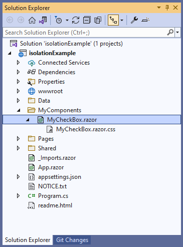
DevExpress Blazor components support CSS isolation, except for popup-based components (DxPopup, DxDropDown, DxFlyout, DxMessageBox, DxToast, and DxWindow) – they are always rendered in the page root. To enable the isolation feature, create a folder for your custom components that use DevExpress components. In this folder, create the following items:
- A Razor component, for example,
MyCheckBox. - A
.razor.cssfile for isolated styles. The stylesheet should have the same name as the component.
In the MyCheckBox.razor markup, specify the DevExpress component. Blazor generates the b-{string} attribute at build time and uses it to target HTML markup elements in the current component, where {string} is a 10-character string. Blazor cannot generate attributes for child components such as DevExpress Blazor. Wrap DevExpress components in a markup element, for example, <div> or <span>, to ensure that they are treated as HTML elements.
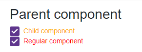
<h2>Parent component</h2>

<div>
    <DxCheckBox Checked="true"
                CssClass="my-checkbox">Child component</DxCheckBox>
</div>
In the MyCheckBox.razor.css file, specify component-specific styles. Use the ::deep combinator to apply styles.
::deep .my-checkbox {
    color: orange;
}
Add the MyCheckBox component to your application. You can add the DxCheckBox component with the same CSS class to ensure that MyCheckBox styles are isolated.
Note: if you enabled CSP protection, the following snippet will throw an exception in the browser console. To try CSS isolation in action, you need to add the .my-checkbox rule to an application-wide stylesheet (for example, site.css).
@using isolationExample.MyComponents

<style>
    .my-checkbox {
        color: red;
    }
</style>

<MyCheckBox />

<DxCheckBox Checked="true" CssClass="my-checkbox">Regular component</DxCheckBox>