BootstrapRibbon Class
The ribbon control.
Namespace: DevExpress.Web.Bootstrap
Assembly: DevExpress.Web.Bootstrap.v25.2.dll
NuGet Package: DevExpress.Web.Bootstrap
Declaration
[DXClientDocumentationProviderWeb("BootstrapRibbon")]
[ToolboxTabName("DX.25.2: Bootstrap Controls")]
public class BootstrapRibbon :
    ASPxRibbon,
    ISimpleRenderControl,
IControlDesignerRemarks
Add a Bootstrap Ribbon control to your web application to provide it with the ribbon functionality, i.e., a set of toolbars placed on several tabs.
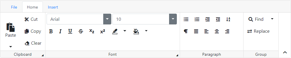
The BootstrapRibbon control supports the following common features:
- Data binding that allows the control tabs, groups, and items to be bound to hierarchal data sources.
- The responsive control layout is changed while resizing ribbon.
- Customizable appearance through themes, user-defined images, styles, and user-defined templates.
Configure from code
<dx:BootstrapRibbon runat="server" AutoGenerateAccessKeys="true">
    <Tabs>
        <dx:BootstrapRibbonTab Text="Home" Name="Home" AccessKey="H">
            <Groups>
                <dx:BootstrapRibbonGroup Text="Clipboard" ShowDialogBoxLauncher="true" Name="Clipboard"
                    DialogBoxLauncherAccessKey="FO" IconCssClass="fa fa-cut">
                    <Items>
                        <dx:BootstrapRibbonDropDownButtonItem Text="Paste" Name="paste" Size="Large" AccessKey="V" IconCssClass="fa fa-paste">
                            <Items>
                                <dx:BootstrapRibbonDropDownButtonItem Text="Plain text" IconCssClass="fa fa-paste">
                                </dx:BootstrapRibbonDropDownButtonItem>
                            </Items>
                        </dx:BootstrapRibbonDropDownButtonItem>
                        <dx:BootstrapRibbonButtonItem Text="Cut" Name="Cut" AccessKey="X" IconCssClass="fa fa-cut"></dx:BootstrapRibbonButtonItem>
                        <dx:BootstrapRibbonButtonItem Text="Copy" Name="Copy" AccessKey="C" IconCssClass="fa fa-copy"></dx:BootstrapRibbonButtonItem>
                    </Items>
                </dx:BootstrapRibbonGroup>
          </Groups>
        </dx:BootstrapRibbonTab>
    </Tabs>
</dx:BootstrapRibbon>
Tabs
A BootstrapRibbon control is made up of a collection of tabs represented by BootstrapRibbonTab objects. The collection can be accessed using the Tabs property. A tab header displays a text specified by the Text property. In order to hide the tab headers, set the ShowTabs property to false.
The first tab in the header is the File tab. Note that it is not maintained in the Tabs. Clicking the tab raises the FileTabClicked event. You can hide the file tab by setting the ShowFileTab property to false.
Groups
A BootstrapRibbonTab owns a collection of groups that are represented by the BootstrapRibbonGroup objects. The collection can be accessed by the Groups property. A group label displays a text specified by the Text property. In order to hide the group labels, set the ShowGroupLabels property to false.
A BootstrapRibbonGroup owns a collection of items. The item collection can be accessed by the Items property. When an end-user executes an action on a ribbon item (e.g., clicks a button, changes an editor value), the CommandExecuted event is raised. To learn more about ribbon item types, see the Item Types topic.
Binding to a data source
The BootstrapRibbon control can be bound to a data source by its DataSourceID or DataSource property. You can specify data source fields to which the tabs, groups and items properties are mapped using the TabDataFields, GroupDataFields, and ItemDataFields properties respectively.
Client-side API
The BootstrapRibbon control provides you with a comprehensive client-side functionality implemented using JavaScript code:
- The control’s client-side equivalent is represented by the BootstrapClientRibbon object.
- On the client side, the client object can be accessed directly by the name specified via the ClientInstanceName property.
- The available client events can be accessed by using the ClientSideEvents property.
Online Demos
To see the Bootstrap control and its features in action, refer to Online Demos - Ribbon.