BootstrapDropDownEditModalCommandButton Class
The BootstrapDropDownEdit drop-down window’s command buttons.
Namespace: DevExpress.Web.Bootstrap
Assembly: DevExpress.Web.Bootstrap.v26.1.dll
Declaration
Related API Members
The following members return BootstrapDropDownEditModalCommandButton objects:
Remarks
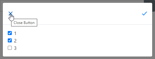
In modal mode, the BootstrapDropDownEdit can display the drop-down window’s Apply and Close command buttons that are instances of the BootstrapDropDownEditModalCommandButton class.
To display the corresponding button, set its Visible property to true. You can use the Text property to change the button’s tooltip text.
<dx:BootstrapDropDownEdit ID="BootstrapDropDownEdit1" runat="server">
    <SettingsAdaptivity Mode="OnWindowInnerWidth" SwitchToModalAtWindowInnerWidth="1000" />
    <DropDownApplyButton Visible="true" Text="Apply Button" />
    <DropDownCloseButton Visible="true" Text="Close Button" />
    <DropDownWindowTemplate>
        <dx:BootstrapCheckBoxList ID="test" runat="server">
            <Items>
                <dx:BootstrapListEditItem Text="1"></dx:BootstrapListEditItem>
                <dx:BootstrapListEditItem Text="2"></dx:BootstrapListEditItem>
                <dx:BootstrapListEditItem Text="3"></dx:BootstrapListEditItem>
            </Items>
        </dx:BootstrapCheckBoxList>
    </DropDownWindowTemplate>
</dx:BootstrapDropDownEdit>
Inheritance
Object
StateManager
PropertiesBase
DropDownEditBaseCommandButton
DropDownEditCommandButton
BootstrapDropDownEditModalCommandButton
See Also