XY-Diagram
- 4 minutes to read
This topic lists the series view types associated with the ASP.NET Chart Control’s XY-Diagram type. It also explains how to access specific options (both at design time and runtime), and briefly describes these options. Before reading this section, you may wish to review the following topic on diagram fundamentals: Diagram Overview.
The topic consists of the following sections.
Associated Series View Types
The XY-Diagram is the most common diagram type, since it is used to plot series that are displayed using both axes: the axis of arguments (X-axis) and the axis of values (Y-axis). There are many such series view types available in the WebChartControl (see the list of series below). You can plot multiple series of different view types in the same diagram as shown in the following image:
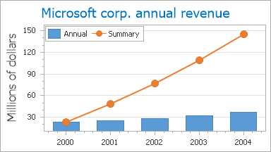
The XY-Diagram is used to plot series of the following view types:
- Area;
- Bubble;
- Candle Stick;
- Full-Stacked Area;
- Full-Stacked Bar;
- Full-Stacked Spline Area;
- Line;
- Overlapped Range Bar;
- Point;
- Scatter Line;
- Side-by-Side Bar;
- Side-by-Side Full-Stacked Bar;
- Side-by-Side Range Bar;
- Side-by-Side Stacked Bar;
- Spline;
- Spline Area;
- Stacked Area;
- Stacked Bar;
- Stacked Spline Area;
- Step Line;
- Stock.
Accessing a Diagram
You can access the XY-Diagram’s options at design time. Click the chart to select it, and in the Properties window, expand the WebChartControl.Diagram property.
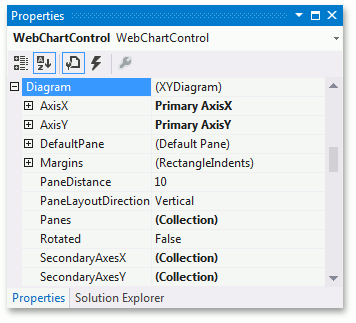
At runtime, cast your instance of the Diagram object to the XYDiagram type.
// Create a new WebChartControl instance.
WebChartControl chart = new WebChartControl();

// Create a series of a compatible view type,
// and add it to the chart's collection,
// so that the diagram object cannot be equal to null.
Series series1 = new Series("Line Series 1", ViewType.Line);
chart.Series.Add(series1);

// Create a diagram, and cast it to the XYDiagram type.
XYDiagram diagram = (XYDiagram)chart.Diagram;

// Access the diagram's options.
diagram.Rotated = true;
diagram.DefaultPane.BackColor = Color.Aqua;
Specific Options
The available options specific to the XY-Diagram type are briefly described below. For more detailed information, refer to their property descriptions.
The XYDiagram.AxisX and XYDiagram.AxisY properties allow access to options related to the diagram’s primary axes.
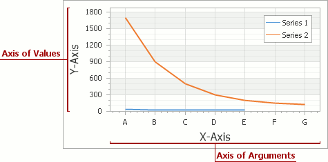
These properties allow you to adjust the appearance and layout of axes, and access axis elements such as axis titles, axis labels, strips and constant lines.
The XYDiagram.SecondaryAxesX and XYDiagram.SecondaryAxesY properties allow access to the diagram’s collections of secondary axes.
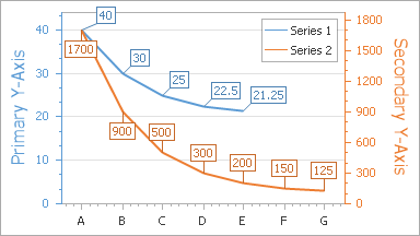
Like primary axes, secondary axes also support axis titles, axis labels, strips and constant lines.
The XYDiagram2D.DefaultPane and XYDiagram2D.Panes properties allow access to the diagram’s default and additional panes. The XYDiagram2D.PaneDistance and GridPaneLayout.Direction properties determine the pane layout.
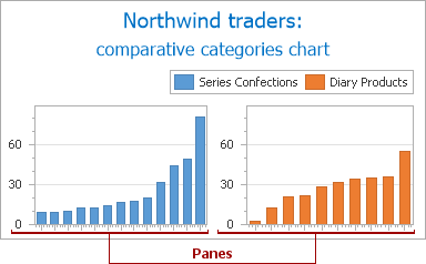
- The XYDiagram2D.Margins property determines the indents between the diagram’s body and its edges.
- The XYDiagram.Rotated property allows you to swap the diagram’s X and Y-axes.
In addition, it is possible to control the diagram’s appearance. Since XY-Diagram supports panes, there is a difference on how the appearance properties of this diagram are accessed. The property used to specify a pane’s appearance depends on whether it is a default or an additional pane. Default panes can be accessed from the XYDiagram2D.DefaultPane property (see the image below), and additional panes can be accessed from the XYDiagram2D.Panes property.
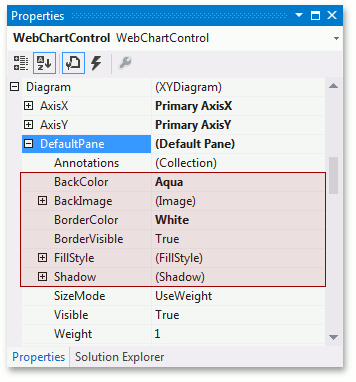
- The XYDiagramPaneBase.BackColor, XYDiagramPaneBase.BackImage and XYDiagramPaneBase.FillStyle properties determine the background settings of the diagram’s default pane.
- The XYDiagramPaneBase.BorderColor and XYDiagramPaneBase.BorderVisible properties determine the default pane’s borders settings.
- The XYDiagramPaneBase.Shadow property determines the default pane’s shadow appearance.