GridColumn.ToolTip Property
Gets or sets a column hint.
Namespace: DevExpress.XtraGrid.Columns
Assembly: DevExpress.XtraGrid.v19.1.dll
Declaration
[DXCategory("Appearance")]
[DefaultValue("")]
[XtraSerializableProperty]
public virtual string ToolTip { get; set; }Property Value
| Type | Default | Description |
|---|---|---|
| String | String.Empty | A custom tooltip for the column. |
Remarks
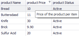
When the View’s GridOptionsHint.ShowColumnHeaderHints option is set to true, column headers can show tooltips. The default tooltip is equal to the column’s caption (GridColumn.Caption). It shows non-trimmed, even if the caption itself is trimmed. To see a tooltip, users need to position their mouse pointer over the column’s header.
The code sample below illustrates how to add a custom tooltip to a grid column.
Related GitHub Examples
The following code snippet (auto-collected from DevExpress Examples) contains a reference to the ToolTip property.
Note
The algorithm used to collect these code examples remains a work in progress. Accordingly, the links and snippets below may produce inaccurate results. If you encounter an issue with code examples below, please use the feedback form on this page to report the issue.