RepositoryItemCheckEdit.AllowGrayed Property
Gets or sets a value specifying whether a check editor should support three check states rather than two.
Namespace: DevExpress.XtraEditors.Repository
Assembly: DevExpress.XtraEditors.v19.1.dll
Declaration
Property Value
| Type | Default | Description |
|---|---|---|
| Boolean | **false** | true if the CheckEdit is able to display three check states; otherwise, false. |
Remarks
Use the AllowGrayed property to determine whether a check editor supports two or three check states.
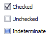
If this property is set to false, only two states - Unchecked and Checked are available. You can use the Checked property to get or set the value of a two-state check edit control.

If the AllowGrayed property is true, a check editor can take one of the three check states: Unchecked, Checked and Indeterminate. In the indeterminate (also called “grayed”) state, the editor’s check box is displayed with a dimmed appearance to indicate that the option is unavailable. The value of a three-state check edit control can be get or set by using the CheckState property.
checkEdit1.Properties.AllowGrayed = true;
checkEdit1.CheckState = CheckState.Indeterminate;

checkEdit1.Properties.ValueGrayed = "Indeterminate";
checkEdit1.EditValue = "Indeterminate";
A check editor enables you to restore its indeterminate state after the AllowGrayed property is temporarily switched off and is then restored to true. To switch a check editor sequentially between the available check states, you can call the Toggle() method.
Assigning a new value for the AllowGrayed property raises the PropertiesChanged event.
Related GitHub Examples
The following code snippets (auto-collected from DevExpress Examples) contain references to the AllowGrayed property.
Note
The algorithm used to collect these code examples remains a work in progress. Accordingly, the links and snippets below may produce inaccurate results. If you encounter an issue with code examples below, please use the feedback form on this page to report the issue.