RepositoryItem.DefaultBorderStyleInBars Property
This member supports the internal infrastructure, and is not intended to be used directly from your code.
Namespace: DevExpress.XtraEditors.Repository
Assembly: DevExpress.XtraEditors.v19.1.dll
Declaration
Property Value
| Type |
|---|
| BorderStyles |
Available values:
| Name | Description |
|---|---|
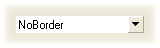
| NoBorder | There are no borders. The image below demonstrates the NoBorder style applied to the ButtonEdit control.
|
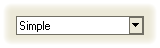
| Simple | Borders are flat. The image below demonstrates the Simple style applied to the ButtonEdit control.
|
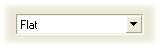
| Flat | Borders are flat. The image below demonstrates the Flat style applied to the ButtonEdit control.
|
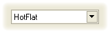
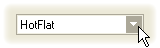
| HotFlat | Borders are flat. Borders and the client area are highlighted when the mouse pointer is positioned over them. The image below demonstrates the HotFlat style applied to the ButtonEdit control.
|
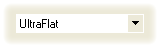
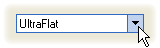
| UltraFlat | Borders have an Office XP style. Borders and the client area are highlighted when the mouse pointer is positioned over them or they are focused. Otherwise, there are no borders. The image below demonstrates the UltraFlat style applied to the ButtonEdit control.
|
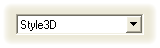
| Style3D | Borders are three-dimensional. The image below demonstrates the Style3D style applied to the ButtonEdit control.
|
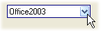
| Office2003 | Borders have an Office 2003 style. The image below demonstrates the Office2003 style applied to a ButtonEdit control.
|
| Default | The border style is determined by the current Look-and-Feel settings. For example, text editors’ borders are painted according to the RepositoryItem.LookAndFeel object’s settings. |