Editor Buttons
- 3 minutes to read
ButtonEdit editors and descendants can display a number of buttons within their edit boxes. The ButtonEdit class introduces properties and events for management editor buttons. This topic provides general information on creating, customizing and using editor buttons.
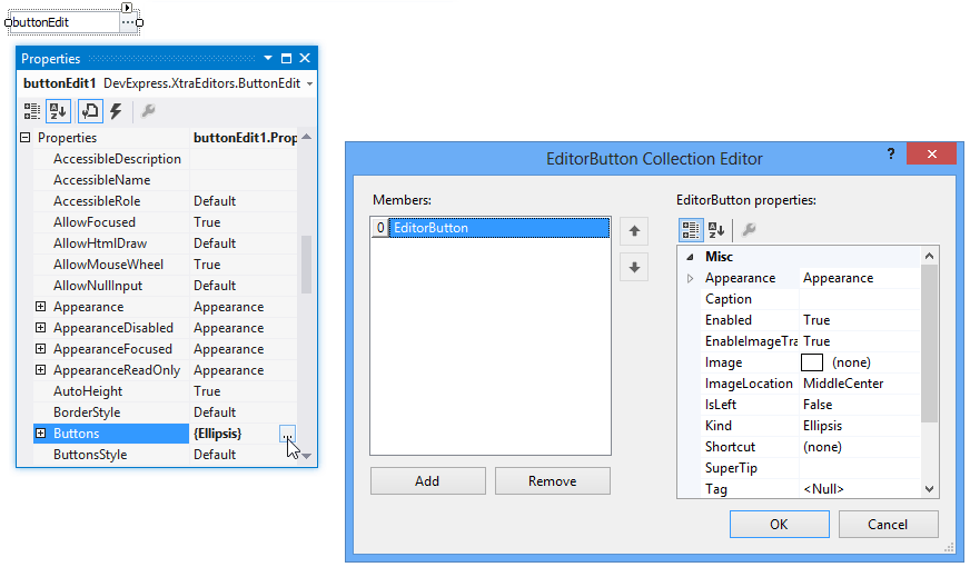
Once a button editor (or descendant) has been placed on a form, you can access its button collection via the RepositoryItemButtonEdit.Buttons property. Clicking the ellipsis button corresponding to the Buttons property invokes the EditorButton Collection Editor dialog. This dialog manages the editor’s button collection (i.e. add, remove buttons). Each button is represented by an EditorButton object and its properties can be accessed using the property grid.
The next image shows various editor button settings.
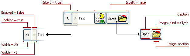
The table below lists all button settings illustrated and describes them briefly.
| Property | Description |
|---|---|
| EditorButton.Caption | Specifies the text displayed by the editor button. |
| EditorButton.Enabled | Specifies whether the editor button responds to user actions. |
| EditorButton.Image | Specifies the image to be displayed in the button. |
| EditorButton.ImageLocation | Specifies the image’s alignment relative to the button’s caption. |
| EditorButton.IsLeft | Specifies the button’s alignment within the edit box. |
| EditorButton.Kind | Specifies the button’s kind (the type of image to display in the button). |
| EditorButton.Width | Specifies the button’s width. If it is set to -1, the button width is calculated automatically based on the caption and image size. |
You can hide a button by setting its EditorButton.Visible property to false.
In addition, the button’s appearance can be customized using the EditorButton.Appearance property.
The editor buttons’ paint style is specified by the repository item’s RepositoryItemButtonEdit.ButtonsStyle property. This property value can be overridden by the style controller assigned to the editor. Please refer to the Border and Button Styles and Style Controller topics for additional information.
To respond to clicking buttons, handle the RepositoryItemButtonEdit.ButtonClick and RepositoryItemButtonEdit.ButtonPressed events. These events are also raised when pressing a button’s associated shortcut. Please refer to the Editor Button Shortcuts topic for additional information.
Example - Creating a Button Editor at Runtime
The code below shows how to create and customize a button editor via code.
using DevExpress.Utils;
using DevExpress.XtraEditors;
using DevExpress.XtraEditors.Controls;
// ...
private void CreateButtonEditor (){
    // creating a new button editor
    ButtonEdit buttonEdit = new ButtonEdit();
    Controls.Add(buttonEdit);
    // specifying the editor's width and text
    buttonEdit.Width = 250;
    buttonEdit.Text = "Text";
    // modifying the editor's button collection
    buttonEdit.Properties.Buttons.Clear();
    buttonEdit.Properties.Buttons.Add(new EditorButton(ButtonPredefines.Redo, "", -1,
      true, true, true, HorzAlignment.Default, null, null, null, null));
    buttonEdit.Properties.Buttons.Add(new EditorButton(ButtonPredefines.Undo, "", 20,
      true, true, true, HorzAlignment.Default, null, null, null, null));
    buttonEdit.Properties.Buttons.Add(new EditorButton(ButtonPredefines.Glyph, "Assign", -1,
      true, true, false, HorzAlignment.Far, null, null, null, null));
    Image buttonImage = Image.FromFile("c:\\picture.bmp");
    ((Bitmap)buttonImage).MakeTransparent();
    buttonEdit.Properties.Buttons.Add(new EditorButton(ButtonPredefines.Glyph, "", -1,
      true, true, false, HorzAlignment.Default, buttonImage, null, null, null));
}
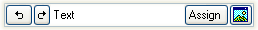
The following image shows the button editor created and customized using the code above.