Editors and Simple Controls
- 5 minutes to read
This section contains documentation for simple UI controls from DevExpress - from tiny buttons and text editors to controls capable of displaying complex breadcrumb hierarchy or custom tokens.
Simple Editors | |
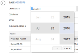
| A powerful collection of over 35 data edit and multi-purpose controls. The Editors Library contains editors for any task: simple text boxes, various push and check buttons, drop-down menus, color pickers, image-containing editors, track bars, rating controls, progress bars, etc. Editors from this library are available in both unbound and data-aware modes. You can simply drop any editor onto a form to provide a way for your end-users to modify their values as required. By doing so, you do not bind your editors to any data and thus, this mode is called unbound. In data-aware mode, editors are used for editing data within data-aware controls. For instance, the DateEdit control that displays dates in a handy way (a simple text box that invokes a drop-down calendar on demand) can be used to display and edit values within cells of a Grid Control’s column, bound to the data field that holds data of the DateTime type. |
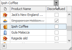
LookUp Editors | |
| These editors provide lookup functionality in a lightweight tabular format, or using a powerful grid control or tree list. Bind them to simple data types or business objects. |
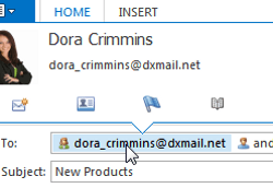
Token Edit Control | |
| Also a part of the Editors library, the TokenEdit control is a text box that converts blocks of text between separator characters into tokens. A token is a UI element that can be clicked or hovered. You can use this control to emulate address fields seen in many mail clients, such as Microsoft Outlook or Google Gmail, where the entered e-mail address transforms into contact tokens. The editor supports the drop-down menu that displays the list of pre-defined tokens. New text blocks, recognized as valid tokens, are automatically remembered and may be included in this list also. The Flyout Panel support allows for displaying detailed info for each token on hover. |
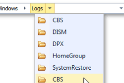
Breadcrumb Edit Control | |
| The BreadCrumbEdit control is a tool that can help you create complex navigation, seen in Microsoft Windows Explorer. The editor exposes a logical tree with rich and branchy nodes hierarchy. At runtime, end-users see a vertically aligned stack of elements that correspond to related hierarchy nodes. Thus, the current sequence of Breadcrumb elements reflects your actual location within this hierarchy. With each step deeper into the nodes tree, new elements are added to the end of the row. The editor operates in two modes, switching between them automatically depending on end-user actions. In Select mode, end-users invoke drop-down menus for each element, see the list of child nodes available and click the desired node to navigate to it. When an end-user focuses the editor’s text box, the Edit mode is activated. In this mode, it is possible to manually input the desired path you want to navigate to. The Breadcrumb Edit Control provides multiple useful features, such as persistent, constantly visible nodes, navigation history, dynamic nodes population, auto-complete, custom buttons, end-user menu, etc. |
Image Slider | |
| The ImageSlider is an image-browsing editor. Two scroll buttons, displayed on hover by default, provide smooth ‘sliding’ through the image collection using the built-in animation effect. If running in the Virtual Mode, the editor can be populated dynamically at runtime. |
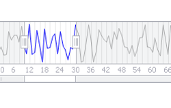
Range Control | |
| The RangeControl provides data range selection functionality - from simple numeric ranges to complex scenarios with calendars and graphs. The editor provides the following key features:
|
WindowsUI Button Panel | |
| The WindowsUIButtonPanel is a simple bar with Windows 10-styled buttons. The control provides such features as:
|
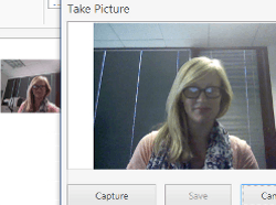
Camera Control | |
| The CameraControl object represents a control that displays a video steam from a video capture device, such as a webcam, and provides an end-user with the capability to operate the device and adjust the video qualities. The control includes the following features:
|