The Editors library contains over 35 editors for any task: simple text boxes, various push and check buttons, drop-down menus, color pickers, image-containing editors, track bars, rating controls, progress bars etc. Editors from this library are available in both unbound and data-aware modes. You can simply drop any editor onto a form to provide the way for your end-users to modify their values as required. By doing so, you do not bind your editors to any data and thus, this mode is called unbound or standalone. In data-aware mode, editors are used for editing data within data-aware controls. For instance, the DateEdit control that displays dates in a handy way (a simple text box that invokes a drop-down calendar on demand) can be used to display and edit values within cells of a Grid Control’s column, bound to the data field that holds data of the DateTime type.
Learn the Basics
|
This section will give you a brief description of what controls and components are included in this library.
Editors
Lists all editors that can be used as both standalone controls and in-place editors.
Controls
Enumerates all available controls that can be used as standalone UI elements only (e.g., buttons or labels).
Components
The Editors Library includes a set of multi-purpose components that add additional functionality to your applications.
Editor Hierarchy
This topic describes the class structure of the editors available for in-place editing in container controls or as standalone controls.
| 
|
Repositories and Containers
|
Beneath all DevExpress editors lies the common principle of storing all their settings and event handlers within a specifics object called Repository Items. Each editor is paired with the corresponding repository item. For instance, the RepositoryItemToggleSwitch object is related to the ToggleSwitch editor. Topics in this section describe this pattern in greater detail.
Editor Class Structure
This topic discusses how editors are organized internally. It describes the classes used and explains how editors can be used for in-place editing in container controls.
Repositories and Repository Items
Explains what are repository items and how they are used for in-place editing.
Editor Containers
Describes two container classes that allow controls and components derived from these classes to embed editors and manage their repositories.
| 
|
Editor Types
|
This section describes different types of editors grouped by their purpose: simple text editing editors, image-displaying editors and editors with drop-down menus.
Text Editing Overview
Most of the editors in the XtraEditors library are derived from the TextEdit class, and thus provide text boxes. This topic describes how to use text boxes, apply selections and work with the Clipboard.
Image Editing Menu
Describes editors that are designed to display images stored as bitmap, metafile, icon, JPEG, GIF or PNG files, or image types stored within a data field.
BLOB Editors
Editors that display binary large object data within their dropdown menus.
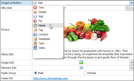
Combo Box Editors
Combo box editors are used to select a value from a fixed or dynamically changing list. Such editors provide an edit box and a dropdown window displaying a single column list.
Popup Container Editor
PopupContainerEdit editors allow you to display controls within their popup windows. You can place any combination of controls onto a specially designed panel control and use this panel as the editor’s popup window.
| 
|
|
|
Topics in this section are related to editing editor text at runtime. You will learn how to prevent end-users from entering unwanted symbols and apply various validation schemes.
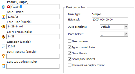
Input Mask
Masks let you specify the pattern used to input values so that an end-user cannot enter text that is not permitted by the mask.
Validation
Allows you to check the validity of the entered values, but does not limit end-user input like masks do.
Formatting and Parsing Values
Formatting translates the edit value into the display value (or display text for text editors).
| 
|
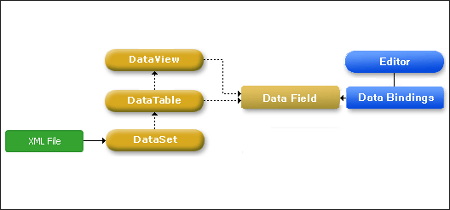
Data Binding
|
This section contains information about binding stand-alone editors to different types of data sources. For in-place editors, refer to the documentation of the control that embeds the editors.
| 
|
|
|
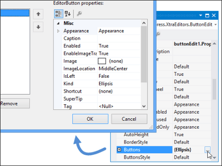
ButtonEdit editors and descendants can display a number of buttons within their edit boxes. Topics below provide detailed information on creating, customizing and using these editor buttons.
Editor Buttons Overview
This topic provides general information on creating, customizing and using editor buttons.
Spin Buttons
Buttons that show two arrows, which can be clicked to increment/decrement an edit value.
Editor Button Shortcuts
Explains how to implement editor button shortcuts that invoke these buttons’ functionality.
| 
|
Creating Custom Editors
|
Custom Editors
In case the large DevExpress editors pool does not contain the editor required for your specific needs, you can create your own editor that will be able to be used for both in-place and standalone edit modes. This help article provides detailed information on creating, customizing and registering custom editors.
| |
Appearance Customization
|
This section is dedicated to modifying editor appearance and painting them using DevExpress Skins.
Appearance Settings
The Appearance mechanism lets you modify the appearance settings (background and foreground colors, gradient mode, font settings and text alignment) of controls.
Look And Feel and Skin Support
All controls included in the Editors library support common Look&Feel options: you can apply a painting scheme or skin used by all controls and their elements.
Border and Button Styles
By default, the look and feel specifies how borders, buttons and dropdowns are painted. This topic shows how to override the default painting styles for these elements.
Style Controller
The StyleController component provides centralized management over the appearance and paint styles of editors and controls.
| |
Task-Based Help
|
|
| |
See Also
|
|
| |