EditorButton.Kind Property
Gets or sets the type of image to display within the button.
Namespace: DevExpress.XtraEditors.Controls
Assembly: DevExpress.XtraEditors.v19.1.dll
Declaration
[DefaultValue(ButtonPredefines.Ellipsis)]
public virtual ButtonPredefines Kind { get; set; }Property Value
| Type | Default | Description |
|---|---|---|
| ButtonPredefines | **Ellipsis** | A ButtonPredefines enumerator value that specifies the type of image to display within the button. |
Available values:
| Name | Description |
|---|---|
| Glyph | A custom bitmap is drawn on the button’s surface. |
| Down | A Down-arrow is drawn on the button’s surface.
|
| Up | An Up-arrow is drawn on the button’s surface.
|
| Left | A Left-arrow symbol is drawn on the button’s surface.
|
| Right | A Right-arrow is drawn the button’s surface.
|
| Ellipsis | An Ellipsis symbol is drawn on the button’s surface.
|
| Delete | A Delete symbol is drawn on the button’s surface.
|
| OK | An OK sign is drawn on the button’s surface.
|
| Plus | A Plus sign is drawn on the button’s surface.
|
| Minus | A Minus sign is drawn on the button’s surface.
|
| Redo | A Redo symbol is drawn on the button’s surface.
|
| Undo | An Undo symbol is drawn on the button’s surface.
|
| Combo | A Down-arrow for a combo box is drawn on the button’s surface.
|
| SpinUp | An up-arrow for a spin editor is displayed on the button’s surface.
|
| SpinDown | A down-arrow for a spin editor is displayed on the button’s surface.
|
| SpinLeft | A left-arrow for a spin editor is displayed on the button’s surface.
|
| SpinRight | A right-arrow for a spin editor is displayed on the button’s surface.
|
| Close | A Close symbol is displayed on the button’s surface.
|
| DropDown | A Down-arrow is drawn on the button’s surface. Unlike, the Down button, this kind of button allows text to be displayed next to the down-arrow.
|
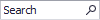
| Search | A Search symbol is drawn on the button’s surface.
|
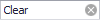
| Clear | A Clear symbol is drawn on the button’s surface.
|
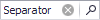
| Separator | A Separator.
|


Remarks
The Kind property allows you to specify the type of image to display within the button. The ButtonPredefines type enumerates possible image types. Setting the Kind property to Glyph allows you to display a custom image specified by the EditorButton.Image property. If Kind is set to a value other than Glyph, the button displays a predefined image. See the ButtonPredefines topic for sample screenshots.
If the Kind property is set to Glyph, Ellipsis, Delete, OK, Plus, Minus, Redo, Undo or DropDown, it is possible to display the button’s EditorButton.Caption near the image. To allow the display of the button’s caption and image at the same time, set the EditorButton.ImageLocation property to any value except for MiddleCenter. Otherwise, only the image is displayed.
Related GitHub Examples
The following code snippets (auto-collected from DevExpress Examples) contain references to the Kind property.
Note
The algorithm used to collect these code examples remains a work in progress. Accordingly, the links and snippets below may produce inaccurate results. If you encounter an issue with code examples below, please use the feedback form on this page to report the issue.