Context Buttons
- 5 minutes to read
Some DevExpress controls can display context buttons — push buttons, check boxes, rating scales, and track bars that appear upon user interaction with the control and allow the user to execute context-dependent tasks. For example, you can display a button that allows a user to rate an image.
Tip
Run the following demo application to see and try out the context buttons: Context Buttons for WinExplorerView module in the XtraGrid MainDemo. Click Open Solution in the ribbon for source codes.
Button Types
You can display the following context buttons:
- ContextButton — a push button.
- CheckContextButton — a check box.
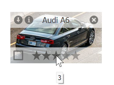
- RatingContextButton — a rating scale.
- TrackBarContextButton — a track bar.
How to Display Context Buttons in a Control
If a control supports context buttons, it exposes the following members:
- The ContextButtons property — populate this collection with buttons to display them in the control.
- The ContextButtonOptions property — allows you to specify settings for context buttons. For example, you can specify the background color for panels that contain context buttons, animation used to display the panels, and button indents.
- The ContextButtonClick event — allows you to handle button clicks. You can also handle a button’s Click event to respond to a click on a particular button.
In the Properties window, click the ContextButtons property ellipsis button to invoke a collection editor that allows you to add/remove buttons, specify their captions, alignment, etc.

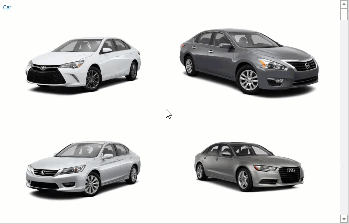
Context Buttons in a Control that Displays Multiple Items
If a control displays multiple items, the ContextButtons property contains buttons that should be displayed in each item. The collection specifies the same buttons for all items. You can handle the CustomizeContextItem (or ContextButtonCustomize) event to customize a button for each item. For example, use this event to specify a CheckContextButton‘s check state in a WinExplorerView.
Some controls allow you to add context buttons to their individual items. For example, you can use the AccordionControlElementBase.ContextButtons property to display context buttons in an AccordionControl‘s group or item.
Example
If the ShowCheckBoxes option is enabled, the view displays check boxes in each record (row). The CheckBoxColumn property specifies the data field (column) that contains values for the check boxes. The code below shows how to use context check buttons instead of check boxes in the view.

using DevExpress.Utils;
using DevExpress.XtraGrid.Views.WinExplorer;
using DevExpress.XtraGrid.Views.Base;

winExplorerView1.OptionsView.ShowCheckBoxes = false;

private void winExplorerView1_ContextButtonClick(object sender, ContextItemClickEventArgs e) {
    WinExplorerView view = sender as WinExplorerView;
    if (e.Item.Name == "itemCheck") {
        view.SetRowCellValue((int)e.DataItem, view.ColumnSet.CheckBoxColumn, ((CheckContextButton)e.Item).Checked);
    }
}

private void winExplorerView1_ContextButtonCustomize(object sender, WinExplorerViewContextButtonCustomizeEventArgs e) {
    WinExplorerView view = sender as WinExplorerView;
    if (e.Item.Name == "itemCheck") {
        ((CheckContextButton)(e.Item)).Checked = Convert.ToBoolean(view.GetRowCellValue(e.RowHandle, view.ColumnSet.CheckBoxColumn));
    }
}

private void winExplorerView1_CellValueChanged(object sender, CellValueChangedEventArgs e) {
    WinExplorerView view = sender as WinExplorerView;
    if (e.Column == view.ColumnSet.CheckBoxColumn) {
        view.RefreshContextButtons();
    }
}
Tooltips
Use a context button’s SuperTip property to assign a super tooltip to the button. To assign a regular tooltip, use the following properties:
- ToolTip — gets or sets the tooltip text.
- ToolTipTitle — gets or sets the title displayed above the text.
- ToolTipIconType — gets or sets the icon that indicates whether the tooltip contains an error, warning, question, or other information.
See the following topic for more information about regular and super tooltips: Hints and Tooltips.
Rating Scale and Track Bar
The RatingContextButton and TrackBarContextButton show the current rating and track value in the default tooltips.
You can handle the owner control’s CustomContextButtonToolTip or the button’s CustomToolTip event to specify custom tooltips. Use the Value event argument to obtain the current value and the Text event argument to specify the tooltip text.
Note
The owner control’s CustomContextButtonToolTip event fires after the button’s CustomToolTip event and overrides its tooltips. Also note that these events do not fire if a super or regular tooltip is assigned to the button.
Example
The code below handles the WinExplorerView.CustomContextButtonToolTip event to assign different tooltips to each of the five rating grades.
using DevExpress.XtraGrid.Views.WinExplorer;

private void winExplorerView1_CustomContextButtonToolTip(object sender, WinExplorerViewContextButtonToolTipEventArgs e) {
    if (e.Item.Name == "itemRating") {
        decimal rating = Convert.ToDecimal(e.Value);
        if (0 < rating && rating <= 1)
            e.Text = "Very Bad";
        else if (1 < rating && rating <= 2)
            e.Text = "Bad";
        else if (2 < rating && rating <= 3)
            e.Text = "Average";
        else if (3 < rating && rating <= 4)
            e.Text = "Good";
        else if (4 < rating && rating <= 5)
            e.Text = "Excellent";
        else
            e.Text = String.Empty;
    }
}
Disable Tooltips
You can also disable the owner control’s ShowToolTips option to hide tooltips. The button’s ShowToolTips property overrides this option for an individual button.
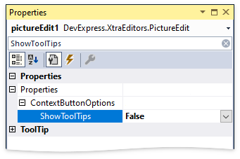
Note
If a context button’s Enabled property is set to false, tooltips are not displayed regardless of the owner control’s ShowToolTips option or the button’s ShowToolTips property.