Ribbon Status Bar
- 5 minutes to read
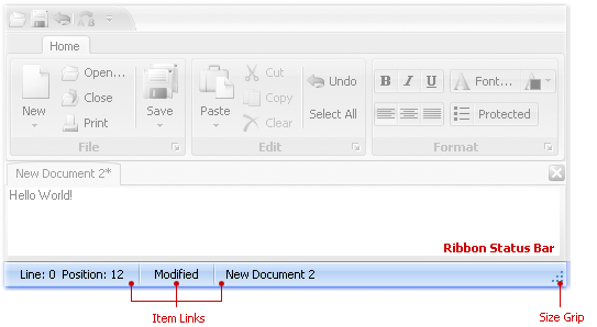
A Ribbon Status Bar (RibbonStatusBar) is displayed at the bottom of a parent window (form). It is typically used to display various kinds of status information, zoom controls, etc. All items displayed within a Ribbon Status Bar are item links.

The collection of item links that are owned by the status bar can be accessed using the RibbonStatusBar.ItemLinks property. This collection provides methods that can be used to add, delete, access individual link objects and perform other common collection management tasks.
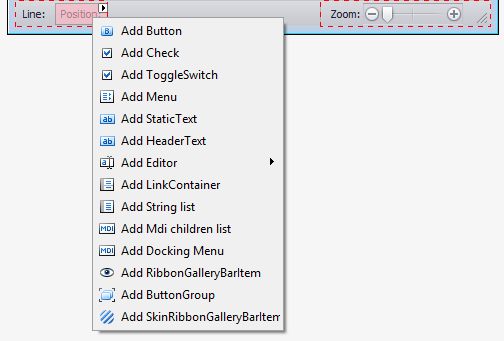
At design time, you can add items to the Ribbon Status Bar using a context menu.

The Ribbon Status Bar supports a built-in size grip, which allows an end-user to resize the window by dragging. The visibility of the size grip is controlled by the RibbonStatusBar.ShowSizeGrip property.
Note
The RibbonStatusBar must be associated with a RibbonControl. When you drop a RibbonStatusBar onto the form at design time, it is automatically linked to an existing RibbonControl using the RibbonStatusBar.Ribbon property. When you create a RibbonStatusBar at runtime, you need to manually set the RibbonStatusBar.Ribbon property to an existing RibbonControl.
Note
Using multiple Ribbon Status Bars within the same form is not recommended. If your form is derived from the RibbonForm class, only the Ribbon Status Bar added last is visible, while all the previously added Status Bars are hidden.
Example
This example creates DevExpress WinForms RibbonControl and RibbonStatusBar:
- The
RibbonControlcontains the “Home” page, “File” and “Print” groups, and four commands (bar items). - The
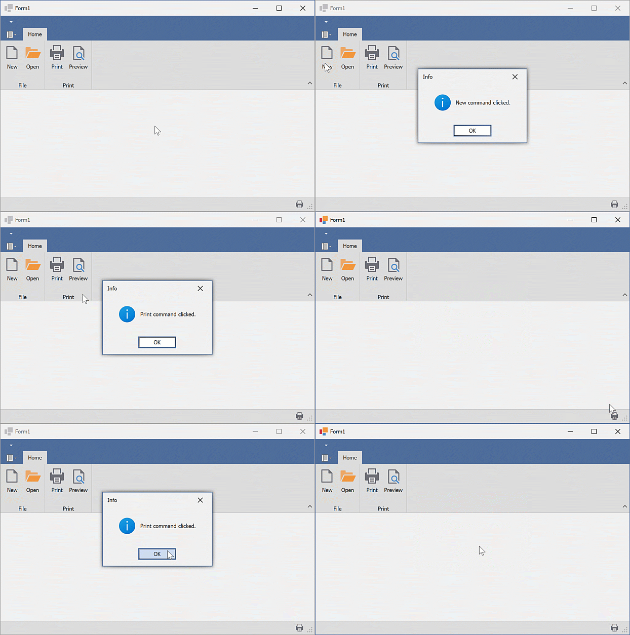
RibbonStatusBardisplays the “Print” command. The “Print” command is aligned to the right.
The following animation shows the result:

Prerequisites
In this example, the SvgImageCollection was created and populated with SVG images at design-time.
Note
When creating the Ribbon UI in code, ensure that the following requirements are met:
- All bar items are added to the RibbonControl.Items collection.
- All bar items have unique identifiers (the BarItem.Id property should be set to a unique value).
using System.Windows.Forms;
using DevExpress.XtraBars.Ribbon;
using DevExpress.XtraBars;
using DevExpress.XtraEditors;

namespace DXApplication
{
    public partial class Form1 : XtraForm
    {
        public Form1()
        {
            InitializeComponent();
            // Create the DevExpress RibbonControl
            RibbonControl ribbon = new RibbonControl();
            this.Controls.Add(ribbon);
            /* Assign the SVG image collection to display images/icons within bar items.
             * In this example, the svgImageCollection1 was created and populated with SVG images at design-time.
             */
            ribbon.Images = svgImageCollection1;

            // Create a Ribbon page.
            RibbonPage pageHome = new RibbonPage("Home");
            ribbon.Pages.Add(pageHome);
            // Create a Ribbon page group.
            RibbonPageGroup groupFile = new RibbonPageGroup("File");
            pageHome.Groups.Add(groupFile);
            // Create another Ribbon page group.
            RibbonPageGroup groupPrint = new RibbonPageGroup("Print");
            pageHome.Groups.Add(groupPrint);

            // Create button items and add them to the 'File' group.
            BarButtonItem itemNew = ribbon.Items.CreateButton("New");
            // Ensures correct runtime layout (de)serialization.
            itemNew.Id = ribbon.Manager.GetNewItemId();
            // Specifies the image.
            itemNew.ImageOptions.SvgImage = svgImageCollection1["new"];
            itemNew.RibbonStyle = RibbonItemStyles.Large;
            itemNew.ItemClick += ItemClick;

            BarButtonItem itemOpen = ribbon.Items.CreateButton("Open");
            itemOpen.Id = ribbon.Manager.GetNewItemId();
            itemOpen.RibbonStyle = RibbonItemStyles.Large;
            itemOpen.ImageOptions.SvgImage = svgImageCollection1["open"];
            itemOpen.ItemClick += ItemClick;

            groupFile.ItemLinks.AddRange(new BarItem[] { itemNew, itemOpen });

            /* Create a button item using its constructor and add the button item to the 'Print' group.
             * The constructor automatically adds the new item to the RibbonControl's Items collection.
             */
            BarButtonItem itemPrint = new BarButtonItem(ribbon.Manager, "Print")
            {
                Id = ribbon.Manager.GetNewItemId(),
                RibbonStyle = RibbonItemStyles.Large
            };
            itemPrint.ImageOptions.SvgImage = svgImageCollection1["print"];
            itemPrint.ItemClick += ItemClick;

            // Create a button item using the default constructor.
            BarButtonItem itemPreview = new BarButtonItem()
            {
                Caption = "Preview",
                RibbonStyle = RibbonItemStyles.Large,
                Id = ribbon.Manager.GetNewItemId(),
            };
            itemPreview.ImageOptions.SvgImage = svgImageCollection1["preview"];
            itemPreview.ItemClick += ItemClick;
            // Add the 'Preview' item to the RibbonControl's Items collection.
            ribbon.Items.Add(itemPreview);

            groupPrint.ItemLinks.AddRange(new BarItem[] { itemPrint, itemPreview });

            // Create a status bar with the 'Print' command.
            RibbonStatusBar ribbonStatusBar = new RibbonStatusBar(ribbon)
            {
                Parent = this
            };
            BarItemLink linkPrint = ribbonStatusBar.ItemLinks.Add(itemPrint);
            linkPrint.UserRibbonStyle = RibbonItemStyles.SmallWithoutText;
            linkPrint.UserAlignment = BarItemLinkAlignment.Right;
        }

        void ItemClick(object sender, ItemClickEventArgs e)
        {
            XtraMessageBox.Show(string.Format("{0} command clicked.", e.Item.Caption), "Info", MessageBoxButtons.OK, MessageBoxIcon.Information);
        }
    }
}