TreeView Style
- 2 minutes to read
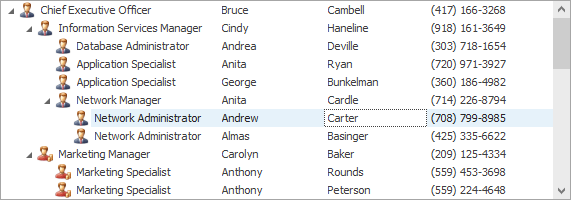
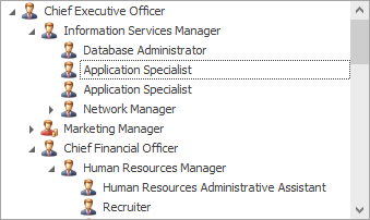
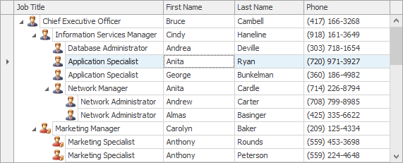
The TreeList control allows you to choose between the default TreeList and TreeView visual styles. The latter imitates the standard TreeView control’s appearance, which is characterized by the following features:
- No column headers
- No lines between cells
- No indicator panel
Unlike the standard TreeView control which can only display single-column data, the TreeList control can display single-column and multi-column data in the TreeView visual style.
TreeView style | TreeList style |
|---|---|
|
|
To learn how to provide data for the TreeList control and organize it into a hierarchy, see Data Binding.
Activate TreeView Style
The TreeView visual style can be activated using one of the following methods:
- To display multi-column data in the TreeView style, set the TreeList.ViewStyle property to TreeView. The TreeList control will display all visible columns from the TreeList.VisibleColumns collection.
- To display single-column data in the TreeView style, leave the TreeList.ViewStyle property set to Default (or set it explicitly to TreeView) and then specify the display column with the TreeList.TreeViewColumn or TreeList.TreeViewFieldName property. The TreeList control will only display a single column specified by the TreeViewColumn/TreeViewFieldName property.
TreeView Style Specifics
When you activate the TreeView style, certain TreeList properties are modified to imitate this visual style.
| Property | Description |
|---|---|
| TreeListOptionsView.ShowColumns is set to false | Hides the column headers. |
| TreeListOptionsView.ShowHorzLines, TreeListOptionsView.ShowVertLines and TreeListOptionsView.ShowFirstLines are set to false | Hides the lines between cells. |
| TreeListOptionsView.ShowIndicator is set to false | Hides the indicator panel. |
The following features are disabled in the TreeView style:
- Customization Form
- Bands
- When column headers are hidden, an end-user cannot perform data sorting and filtering. However, you can perform these operations in code.


