How To: Create a State Indicator Gauge (Design-time)
- 3 minutes to read
This is the fourth tutorial of the XtraGauges Getting Started series. It will guide you through the process of creating a State lndicator Gauge and adjusting its common settings.
This tutorial consists of the following steps.
- Prerequisite
- Load the Required Gauge Preset
- Add the Additional States
- Animate the State Indicator
- Result
Step 1. Prerequisite
Create a new Windows Forms Application in Visual Studio or open an existing one, add a GaugeControl and run its Preset Manager (as you would do it for circular or linear gauge).
Step 2. Load the Required Gauge Preset
- In the Preset Manager, click StateIndicator to display state indicator’s presets.
You can load the gauge preset in one of two ways:
- double-click the required preset in the Preset Manager;
- select a preset and click the Load button at the bottom of the Preset Manager.
The image below shows how to load the TrafficLight preset using the second approach.

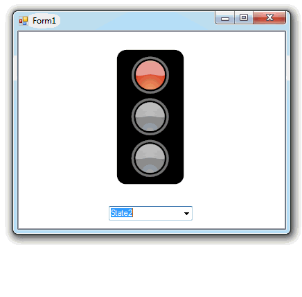
The Form1 window will have the following view.

Step 3. Add the Additional States
In this step, we will add the additional states for the TrafficLight preset. They will be two flags: USA and UK.
To accomplish this, do the following:
Locate the smart tag of the Indicator element and click Run Designer as shown below.

In the invoked Indicators-Element Designer, click the States… button to get access to the collection of the state indicator’s states.

As you see from the image below, the TrafficLight preset contains 4 states. Let’s add two additional states for this preset.
To do this, double click the Add button on the left side of the Indicator States editor.

For the Default state, change its name to State5 and ShapeType to FlagUSA. See the image below.

Rename State5 to State6 and set its ShapeType to FlagUK. Then, click OK.

- Click OK to close the Indicators - Element Designer editor.
Then, you will see the following confirmation window.
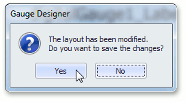
Note
The confirmation window occurs in the Gauge Designer every time the current layout is changed.
- Click Yes to confirm the operation, as shown above.
Step 4. Animate the State Indicator
In this step, we will force the state indicator to change its states using the ComboBox component.
To accomplish this, drop ComboBox from the toolbox onto the form.

- Locate the Text property of the ComboBox component in the Property window, and set it to State1.
Invoke the ComboBox String Collection Editor by clicking the Item… button in the Property window and add the following strings to this editor. Then, click OK.

- Double-click the ComboBox component in the Form1, and add the following code to the Form1.cs file.
private void comboBox1_SelectedIndexChanged(object sender, EventArgs e) {
            switch (comboBox1.Text) {
            case ("State1"): stateIndicatorComponent1.StateIndex = 0; break;
            case ("State2"): stateIndicatorComponent1.StateIndex = 1; break;
            case ("State3"): stateIndicatorComponent1.StateIndex = 2; break;
            case ("State4"): stateIndicatorComponent1.StateIndex = 3; break;
            case ("State5"): stateIndicatorComponent1.StateIndex = 4; break;
            case ("State6"): stateIndicatorComponent1.StateIndex = 5; break;
       }
  }
Step 5. Result
Run the project to see the result.