Page View
- 2 minutes to read
A PageView container stores multiple items, but displays only one item at a time. An end-user can navigate through items by clicking page headers.

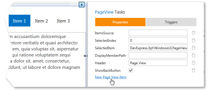
Although a PageView can contain items of any type, it is recommended that you use the specially designed PageViewItem objects. You can add them via the New Page View Item link in the PageView smart-tag:

You can also use the ItemsSource property to set a data source for your PageView.
The ContentTemplate and ItemTemplate properties allow you to visualize items and their headers respectively via data templates.
When hosted within a NavigationFrame container, PageViews display a back button. This button becomes visible when an end-user navigates to this container.
Accessibility Support
The following table lists known Page View control limitations according to the WCAG 2.x standard:
WCAG 2.x Criterion | Exception Description |
|---|---|
2.1.1 Keyboard (Level A) | Users cannot change an item’s selected state from keyboard. |
Note
Accessibility features of your application depend on implementation (your use of PageView API). Your application may not require or enable user actions listed above. The limitation list may also be incomplete. Test all required user functionality to ensure accessibility compliance.
Information on Screen Reader Support and Contrast Theme Availability
Refer to the following topic for more information on the accessibility support in DevExpress WPF Controls: Accessibility Support.
Examples
How To: Create a PageView and Populate It with Data