View Mode
- 2 minutes to read
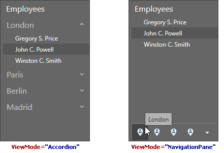
The AccordionControl can display its root items in either a navigation pane or as accordion items.
Use the AccordionControl.ViewMode property to specify how the AccordionControl displays its root items.

NavigationPane View Mode
The AccordionControl displays the subitems of the selected root item in AccordionViewMode.NavigationPane mode.
Selecting Root Items
- In code. You can specify the selected root item using the AccordionControl.SelectedRootItem property.
- In runtime. End-users can select the required root item from the overflow panel displayed in the bottom of the accordion control.
Integration with the Office Navigation Bar
The AccordionControl automatically switches to AccordionViewMode.NavigationPane mode when integrated with the OfficeNavigationBar.
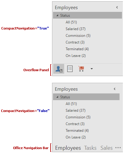
If the AccordionControl.CompactNavigation property is set to true, the original OfficeNavigationBar that is linked to the AccordionControl is hidden, and the Overflow Panel is displayed instead, as illustrated in the image below.

End-users can change the value of the AccordionControl.CompactNavigation property using the Compact Navigation checkbox in the OfficeNavigationBar‘s Navigation Options menu. This checkbox is only shown if the OfficeNavigationBar is linked to an AccordionControl.
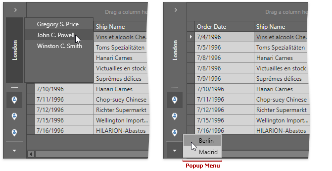
The accordion root items that could not fit into Overflow Panel or Office Navigation Bar are displayed within the popup menu.
Overflow Panel
When the AccordionControl works in NavigationPane view mode and is collapsed, the Overflow Panel switches to a vertical orientation. End-users can change its height using the separator.

Peek Form
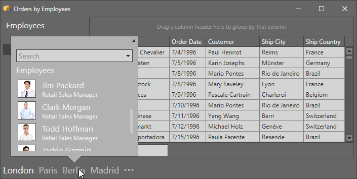
You can display additional information for each individual navigation bar item using a peek form. When an end-user hovers the mouse over a navigation bar item, a Peek Form pops up (see image below).

Use the item’s AccordionItem.PeekFormTemplate property to specify a template used to render peek form content for this item.