Expanding and Collapsing
- 2 minutes to read
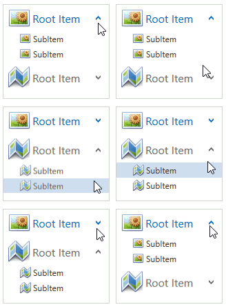
You can expand and collapse accordion items that contain nested items. The following image shows an expandable accordion item:

This topic contains the following sections:
- Expanding and Collapsing in Code
- Expanding and Collapsing at Runtime
- Expand-Collapse Button Position
- Expanding Modes
- Expanding and Collapsing Animation
Expanding and Collapsing in Code
Use the following methods to expand or collapse accordion items in code:
| Method | Description |
|---|---|
| AccordionControl.ExpandItem | Expands an accordion item. |
| AccordionControl.ExpandAll | Expands all accordion items that can be expanded. |
| AccordionControl.CollapseItem | Collapses an accordion item. |
| AccordionControl.CollapseAll | Collapses all accordion items that can be collapsed. |
Expanding and Collapsing at Runtime
To expand or collapse accordion item at runtime:
- Click the accordion item or
- Click the expand-collapse button.

You can set the AccordionControl.ExpandItemOnHeaderClick property to false to prohibit expanding when clicking an item.
Expand-Collapse Button Position
Use the following properties to hide the expand-collapse button or change its position:
| Property | Description |
|---|---|
| AccordionItem.ExpandButtonPosition | Specifies the expand-collapse button‘s position for the current accordion item. |
| AccordionControl.RootItemExpandButtonPosition | Specifies the expand-collapse button‘s position for all root items. |
| AccordionControl.SubItemExpandButtonPosition | Specifies the expand-collapse button‘s position for all subitems. |
The code sample below demonstrates how to show the expand-collapse button at root items’ left side:
<dxa:AccordionControl RootItemExpandButtonPosition="Left"> ... </dxa:AccordionControl>
The image below shows the result:

Expanding Modes
The AccordionControl supports different expanding modes. Use the AccordionControl.ExpandMode property to specify the mode:
| Mode | Description |
|---|---|
| ExpandMode.Multiple | End-users can expand multiple items. At least one item is always expanded. |
| ExpandMode.MultipleOrNone | End-users can expand multiple items. Collapsing all items is also possible. |
| ExpandMode.Single | One accordion item is always expanded. End-users cannot collapse the expanded item. |
| ExpandMode.SingleOrNone | End-users can expand one accordion item at a time. Collapsing all items is also possible. |
The following code sample demonstrates the AccordionControl in Single expanding mode:
<dxa:AccordionControl ExpandMode="Single"> ... </dxa:AccordionControl>
The image below shows the result:

Expanding and Collapsing Animation
The AccordionControl applies an animation when expanding or collapsing accordion items, by default. You can disable the animation by:
- Setting the AccordionControl.AllowAnimation property to false to disable all accordion items’ animation.
- Setting the AccordionItem.AllowAnimation property to false to disable the current accordion item’s animation.