Searching
- 3 minutes to read
The AccordionControl features a built-in search panel that allows users to locate accordion items.
Set the AccordionControl.ShowSearchControl property to true to display the search panel.
<dxa:AccordionControl ShowSearchControl="True"> ... </dxa:AccordionControl>
Tip
You can apply a smart search to the AccordionControl. Refer to the following help topic for more information: Smart Search AI-powered Extension.
This topic contains the following sections:
Search Tag
Accordion items are filtered based on their AccordionItem.Header property value (default).
You can specify a search tag for an accordion item using the AccordionItem.SearchTag property. An accordion item whose search tag meets the filter criteria is included in the search result regardless of its AccordionItem.Header property value.
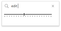
The following code sample demonstrates a data editor explicitly wrapped in an AccordionItem object that has a specified search tag:
<dxa:AccordionControl ShowSearchControl="True">
   <!-- -->
   <dxa:AccordionItem SearchTag="edit">
      <dxa:AccordionItem.Header>
         <dxe:TrackBarEdit/>
      </dxa:AccordionItem.Header>
   </dxa:AccordionItem>
</dxa:AccordionControl>
The image below illustrates the result:
Note
Only accordion items defined explicitly (not generated from a data source) support search tags.
Data-Bound Filtering
The data-bound AccordionControl is filtered based on the data source values (default).
Tip
Refer to the Data Binding topic for details on different approaches to binding the AccordionControl to data.
You can use different binding types to specify data source fields that the accordion item displays. The following table displays binding types and their matching item rules:
| Binding type | Matching rule |
|---|---|
| AccordionControl.DisplayMemberPath | An item is included in the result if the underlying data object’s displayed value meets the search criteria. |
| Data template | An item is included in the result if the underlying data object’s ToString() value meets the search criteria. |
Note
The Search Panel feature does not support BindingList.
SearchCustomization
Customize Search Text
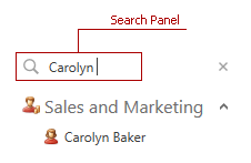
The AccordionControl searches its items according to a string specified by an end user in the search panel. Use the SearchText property to obtain or specify the search string in code.
<dxa:AccordionControl ShowSearchControl="True" SearchText="Carolyn"> ... </dxa:AccordionControl>
Customize Filter Condition
The AccordionControl uses the Contains filter condition to construct filter criteria (default). Use the AccordionControl.SearchControlFilterCondition property to specify another filter condition:
<dxa:AccordionControl ShowSearchControl="True" SearchControlFilterCondition="Equals"> ... </dxa:AccordionControl>
Customize Filtering Logic
You can handle the AccordionControl.CustomItemFilter event to customize the AccordionControl‘s filtering logic.
The following code sample excludes an accordion item from the search result:
<dxa:AccordionControl ShowSearchControl="True" CustomItemFilter="OnCustomItemFilter">
   <dxa:AccordionItem Header="Item1" Glyph="{dx:DXImage Image=Image_32x32.png}"/>
   <dxa:AccordionItem Header="Item2" Glyph="{dx:DXImage Image=Map_32x32.png}"/>
   <dxa:AccordionItem Header="Item3" Glyph="{dx:DXImage Image=Image_32x32.png}"/>
</dxa:AccordionControl>
void OnCustomItemFilter(object sender, AccordionCustomItemFilterEventArgs e) {
   if(((AccordionItem)e.Item).Header.ToString() == "Item1") {
      e.Accepted = false;
   }
}
The image below illustrates the result:

Customize Search Panel Text
Use the AccordionControl.SearchControlNullText property to specify a string that the search box displays when it is empty and not focused:
<dxa:AccordionControl ShowSearchControl="True" SearchControlNullText="Type here to search"> ... </dxa:AccordionControl>
The image below illustrates the result:
