TdxMapControl Class
A Map Control.
Declaration
TdxMapControl = class(
    TdxCustomMapControl
)
Remarks
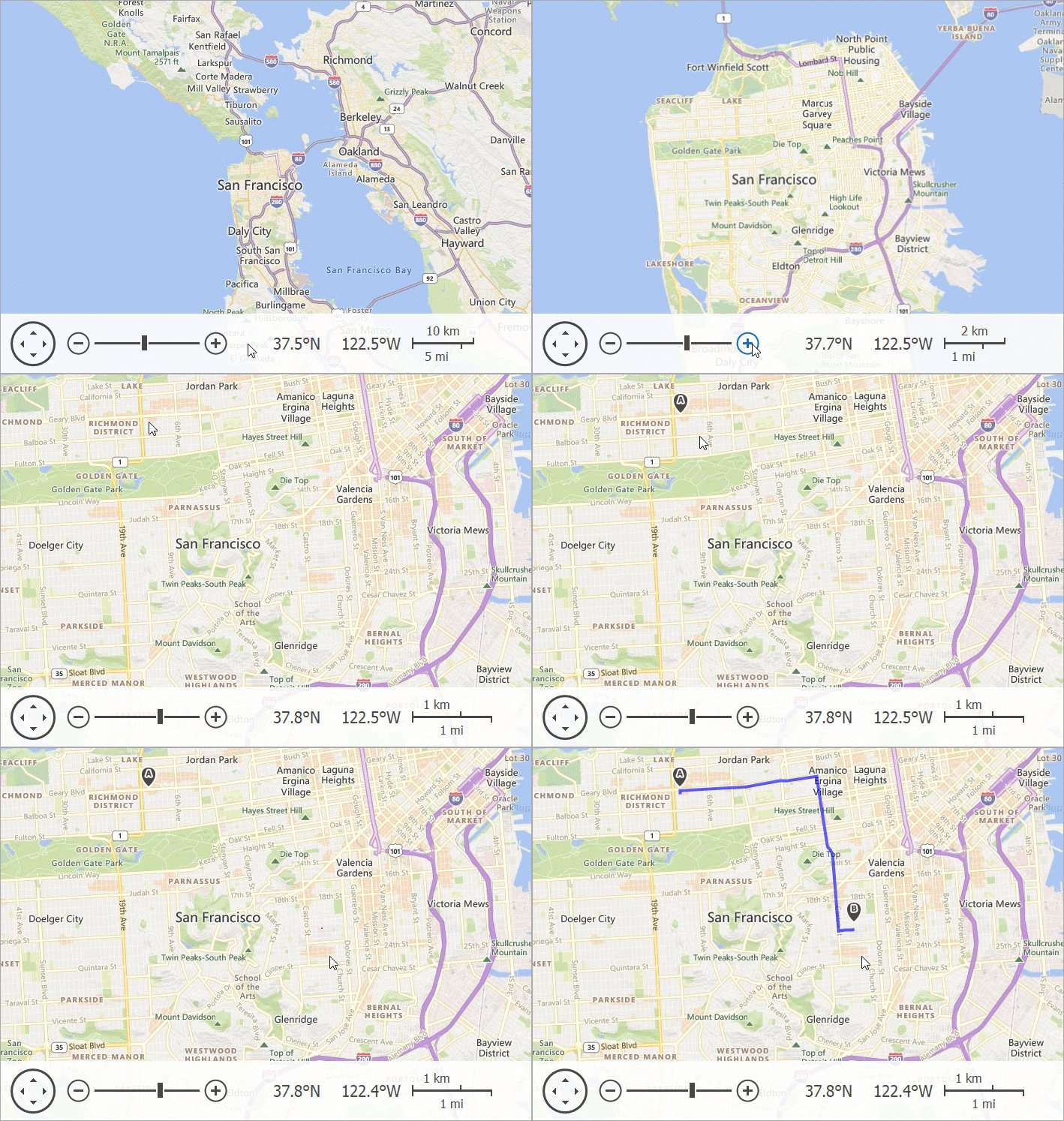
The VCL Map Control (TdxMapControl) allows you to create interactive map interfaces in an application, add image and text overlays, build routes, and pinpoint specific locations.

Main API Members
The list below outlines key members of the TdxMapControl class. These members allow you to manage map layers and data providers as well as configure UI elements and user interaction options.
Appearance and Behavior Options
- BorderStyle
- Specifies if the skin-dependent border is visible.
- Color
- Specifies the background color.
- LookAndFeel
- Provides access to look & feel settings.
- NavigationPanel
- Provides access to Navigation Panel settings.
- OnCenterPointChanged | OnZoomLevelChanged
- Allow you to respond to map zoom and pan operations.
- OnCenterPointChanging | OnZoomLevelChanging
- Allow you to prevent map zoom and pan operations depending on certain conditions in your application.
- OnSelectionChanged
- Allows you to respond to map item selection changes.
- OnSelectionChanging
- Allows you to prevent users from selecting or deselecting certain map items.
- OptionsBehavior
- Provides access to user interaction options.
Map Layer Management Options
- AddImageTileLayer | AddItemFileLayer | AddItemLayer
- Create a new map layer of the corresponding type.
- InformationProviders
Provides access to the collection of auxiliary information providers.
Information providers complement a tile data provider associated with a map image layer and allow you to display additional map-related information, such as routes and addresses.
- Layers
Provides access to the map layer collection.
Tip
Map layer indexes in the collection also determine the Z-order (draw order) of corresponding layers. A map layer with the highest index is displayed on top of all other layers.
We recommend that you display the most transparent layers on top (map item layers with markers, for example).
Map Item Selection Management Options
- ClearSelection
- Deselects all map items.
- Deselect
- Deselects an individual map item.
- Select
- Selects or deselects an individual map item.
- SelectedMapItemCount
- Returns the number of selected map items.
- SelectedMapItems
- Provides indexed access to individual selected map items.
Map Zoom and Pan Options
- ActualCenterPoint
- Returns a geographical point that corresponds to the displayed map’s center.
- ActualZoomLevel
- Returns the current map zoom level.
- CenterPoint
- Specifies the map center. You can use this property to pan the displayed map.
- Zoom | ZoomAsync | ZoomIn | ZoomLevel | ZoomOut | ZoomToFitItems | ZoomToFitLayerItems | ZoomToGeoRect
- Zoom the displayed map in or out.
General-Purpose API Members
- Assign
- Copies settings between Map Controls.
- BeginUpdate | EndUpdate
- Allow you to avoid excessive server queries and redraw operations during batch map setting changes.
- IsLocked
- Identifies if Map Control updates are disabled.
Code Example: Add a Tile Map Layer and Load Azure Maps Data
The following code example implements a procedure that accepts an Azure Maps account key, creates and configures a map tile layer, and loads data:
uses
  dxAzureMapImageryDataProvider;  // Declares TdxMapControlAzureMapImageryDataProvider
// ...

procedure TMyForm.AddAzureMapLayer(const AAzureKey: string);
var
  ATileLayer: TdxMapImageTileLayer;
  AProvider: TdxMapControlAzureMapImageryDataProvider;
begin
  ATileLayer := dxMapControl1.Layers.Add(TdxMapImageTileLayer) as TdxMapImageTileLayer;
  ATileLayer.ProviderClass := TdxMapControlAzureMapImageryDataProvider;
  AProvider := ATileLayer.Provider as TdxMapControlAzureMapImageryDataProvider;
  AProvider.BeginUpdate;  // Initiates the following batch change
  try
    AProvider.AzureKey := AAzureKey;  // Assigns the Azure account key
    AProvider.Tileset := TdxAzureMapTileset.Satellite;  // Changes the default tileset
    AProvider.MaxParallelConnectionCount := 8;  // Explicitly defines the number of parallel connections
  finally
    AProvider.EndUpdate;  // Calls EndUpdate regardless of the batch operation's success
  end;
end;
Related Compiled Demo
To see the VCL Map Control in action, run the Mapping demo in the VCL Demo Center installed with compiled DevExpress demos. Click items listed in the sidebar to switch between individual demos that highlight different Map Control features.
Tip
Compiled DevExpress demos ship with source code installed in the Public Documents folder (%Public%) for all users (default). You can find all project and source code files for the Map Control demo in the following folder:
%Public%\Documents\DevExpress VCL Demos\MegaDemos\Product Demos\ExpressMapControl