Wizard Pages
- 4 minutes to read
Wizard pages convey the information you want to display with the Wizard Control to end-users. You can display wizard pages in a specific order, and let end-users navigate between them using buttons. The Wizard Control simply switches the current page in response to navigation events and renders it based on the page content you provided.
Active Page Rendering
You can have as many pages as you like. However, only one of them can be active (shown) within the Wizard Control at one time. Before activating a wizard page, the Wizard Control renders it based on the page settings you specified, including:
Appearance and element layout settings that are common to all wizard pages;
Page-specific settings – the page content, appearance, size, and layout settings for the header and watermark.
The Wizard Control stores page-specific settings within its Pages collection. The order of collection items determines the display order of the corresponding pages. You can re-arrange collection items to change the page display order. In addition, you can optionally exclude certain wizard pages from the display.
Page Layout
Wizard pages are fully customizable – you can specify the general page appearance options via Wizard Control settings, populate pages with content, and adjust the appearance and layout aspects of UI elements on individual pages.
A wizard page includes the following UI elements:

- Header. Displays the page title, optional description and/or image. A wizard page allows you to assign the background image to the header, customize its title and description, font settings, and description offset;

Content Area. Displays the visual controls that you added as child controls to a wizard page. You can access these child controls via wizard page Controls list;
Command Area. Includes wizard buttons and an optional Info Panel, which can display text or a hyperlink;
Watermark (normally available in the Wizard 97 style only). Displays a side image. You can update this image with any page-specific information to provide additional guidance to end-users. For more information, see how it is done in the TfrmWizardControlDemoMain.PreparePageWatermark method of the WizardControlDemo shipped with the ExpressWizardControl Suite.
Title (normally available in the Aero Wizard style only). Displays the wizard title (a text common to all pages), the Back button, and an optional image.
Default page layout and visibility settings of the header and watermark are set based on the currently applied view style. You can adjust these settings as required and revert your changes at any time by switching the modified properties to default values using the AssignedValues flags.
Design-Time Experience
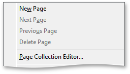
You can navigate and manage page settings stored within the Wizard Control’s Pages collection via the wizard control context menu.

In addition, you can use this context menu to invoke the page collection editor, which provides similar functionality.
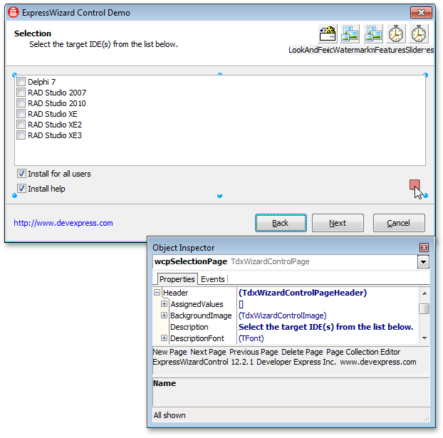
You can easily navigate between pages by clicking the Back or Next button. This automatically selects the active page and displays its properties and events in the Object Inspector.
To access the active page settings, just click anywhere within the page content area. Alternatively, you can click the page selector – a rectangle with green diagonal stripes located in the content area’s bottom-right corner. Once a page is selected, the stripes are colored in red.

As with forms, frames, page controls, and other containers, you can add visual controls to the selected page by drag and drop from the IDE’s Component Palette and pasting from the clipboard. After this, all the visual controls added to a page will be referenced via its Controls list.
The Wizard Page is implemented by the TdxWizardControlPage class. The table below lists TdxWizardControlPage members that affect main Wizard Page characteristics.
Characteristic | Description |
|---|---|
Visibility | The PageVisible property. Use the PageIndex property to move a page within the Wizard Control’s page collection and change the display order of pages. |
Activation | The Activate method. Use the Active property to determine the current page state. |
Contents | Use the Watermark and Header properties to specify page-specific settings of the watermark and header. You can access a page’s child controls via a page Controls list. |
Size | The OptionsSize property. |