Assigning Styles to Elements
- 3 minutes to read
One way to customize the NavBar controls appearance is to assign styles for different NavBar elements. The NavBar control styles can be united into two groups: the default styles and the custom styles. The difference between these two groups is that the default styles represent common styles for all NavBar elements of specific type while the custom styles can be assigned to individual NavBar elements and thus override the default styles settings.
This topic is divided into two parts:
ASSIGNING DEFAULT STYLES
ASSIGNING CUSTOM STYLES
ASSIGNING DEFAULT STYLES
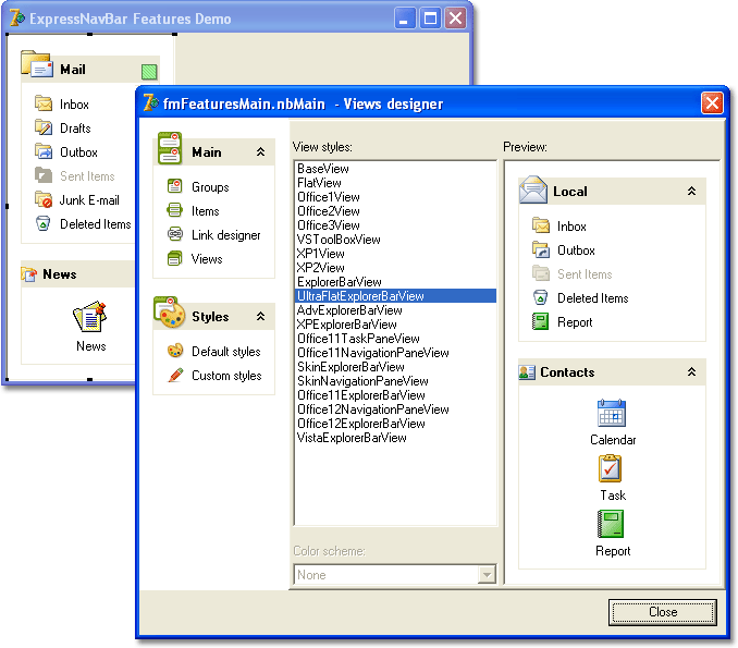
Let us modify the default styles for the UltraFlatExplorerBarView.
- Activate the NavBar designer. Go to the Views page and select the UltraFlatExplorerBarView from the Views combo. Click on the Apply button. This applies the UltraFlatExplorerBarView paint style to the NavBar control.
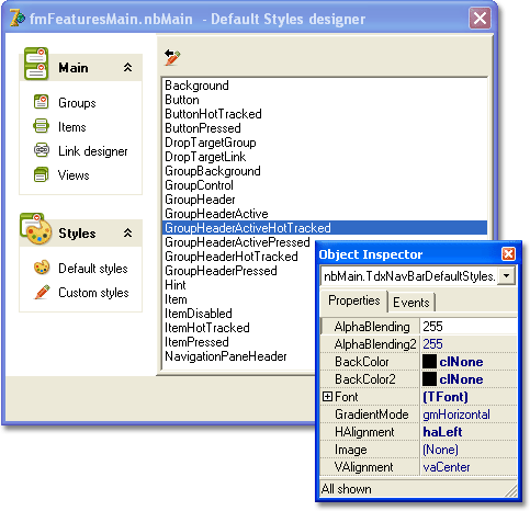
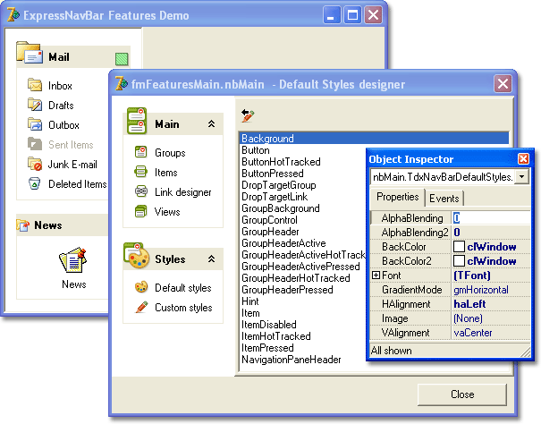
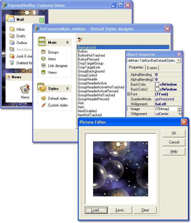
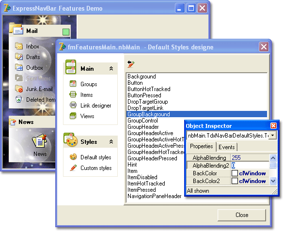
- Go to the Default styles designer page. Select the Background style in the painting styles list and set the AlphaBlending and AlphaBlending2 properties to 0. This makes the NavBar background transparent.
- Set the background image for the NavBar control.
- Select the GroupBackground style within the list. Set the AlphaBlending2 property to 0. This makes the gradient from the groups background color specified by the BackColor property to transparency.
- Set the background image for the NavBar control groups.

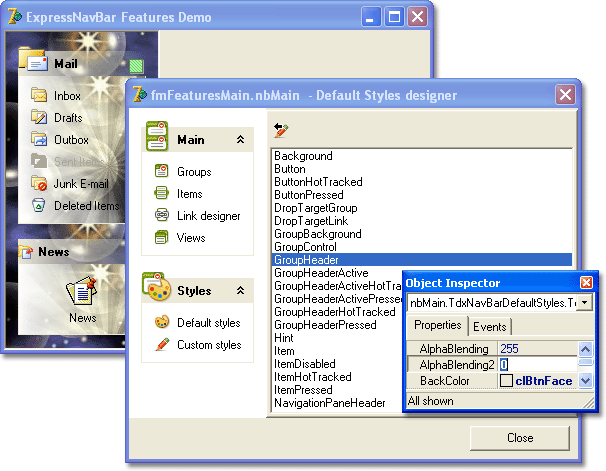
- Select the GroupHeader style. Set the AlphaBlending2 property value to 0. This makes the gradient fill within the group headers from the BackColor to transparency.
Select the GroupHeaderHotTracked style and set the AlphaBlending property to 0.
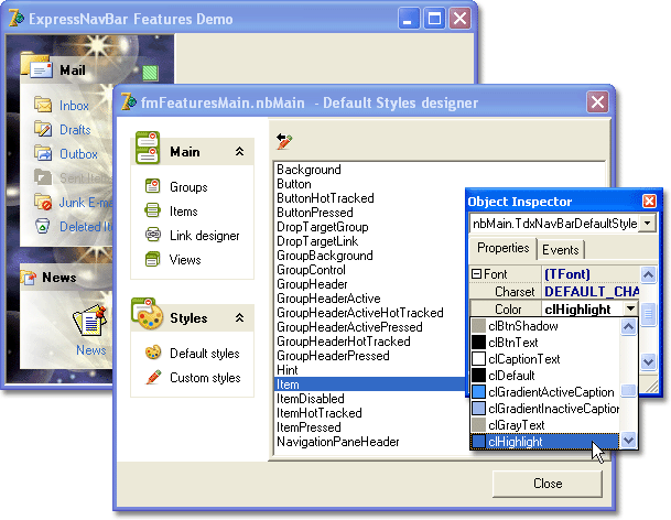
Select the Item style and set the font color for that style to clHighlight.
- Select the ItemHotTracked style and set the font color for that style to clHotLight.
The settings listed above can be applied to the control using the following code:
//...
nbMain.View := dxNavBarViewsFactory.GetIDFromName('UltraFlatExplorerBarView');
with nbMain.DefaultStyles do
begin
  Background.AlphaBlending := 0;
  Background.AlphaBlending2 := 0;
  Background.Image.LoadFromFile('C:\IMAGES\multi038.jpg');
  GroupBackground.AlphaBlending2 := 0;
  GroupBackground.Image.LoadFromFile('C:\IMAGES\multi037.jpg');
  GroupHeader.AlphaBlending2 := 0;
  GroupHeaderHotTracked.AlphaBlending := 0;
  Item.Font.Color := clHighlight;
  ItemHotTracked.Font.Color := clHotLight;
end;
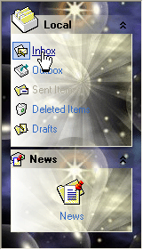
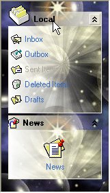
The result of all performed steps is demonstrated below:
| Item Hot-Tracked | Group Hot-Tracked |
|---|---|
 |
 |
ASSIGNING CUSTOM STYLES
Custom styles collection can be accessed via the Custom styles designer page:
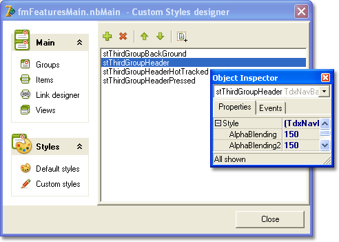
Click on the  button to create a custom style. Give the created style a unique name (CustomItemStyle in our case). Set the font color for the created style to clRed.

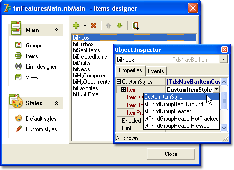
Go to the Items designer page. Select the biInbox item and assign the CustomItemStyle style to the CustomStyles.Item property of the biInbox item:
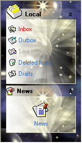
Note, that now the biInbox item text is painted in red:
Return to the Custom styles designer page and create another custom style. Give it a name (in our case it will be CustomGroupStyle). Set the Image property value.
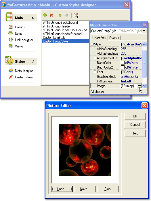
Switch to the Groups page of the NavBar designer, select the bgNews group and assign the CustomGroupStyle as the CustomStyles.Background property value for the selected group:
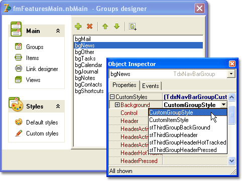
Note, that in this step you can choose between two created custom styles when assigning a style to the group background. Thus you can assign any created custom style to any NavBar element.
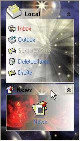
The result of applying a custom style for the group background is demonstrated below:
The following code performs the same actions as described above:
//..
nbMain.Styles.Add;
nbMain.Styles.Add;
with nbMain.Styles[0] do
begin
  Name := 'CustomItemStyle';
  Style.Font.Color := clRed;
end;
nbMain.Items[0].Style := nbMain.Styles[0];
with nbMain.Styles[1] do
begin
  Name := 'CustomGroupStyle';
  Style.AlphaBlending := 0;
  Style.Image.LoadFromFile('C:\IMAGES\red008.jpg');
end;
nbMain.Groups[1].StyleBackground := nbMain.Styles[1];