DevExpress Button & Toggle Button for .NET MAUI
- 2 minutes to read
The DevExpress Mobile UI for .NET MAUI suite ships with DXButton and DXToggleButton controls.
Button
The DevExpress DXButton for .NET MAUI performs the assigned action when a user taps it. The control can display a caption string ( Content ), icon ( Icon ), or both.

Add a DXButton to the Page
Before you proceed, read the following topic: Get Started with DevExpress Controls for .NET Multi-platform App UI (.NET MAUI).
The following example adds a DXButton to the page and sets its content to match the image above:
<ContentPage ...
             xmlns:dx="clr-namespace:DevExpress.Maui.Core;assembly=DevExpress.Maui.Core">
        <dx:DXButton ...
            Content="CLEAR"
            Icon="clear" />
</ContentPage>
Toggle Button
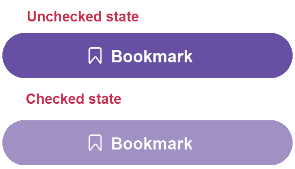
The DevExpress DXToggleButton for .NET MAUI performs the assigned action when a user switches it to the checked or unchecked state. The control can display a caption string ( Content ), icon ( Icon ), or both.
Add a DXToggleButton to the Page
Before you proceed, read the following topic: Get Started with DevExpress Controls for .NET Multi-platform App UI (.NET MAUI).
The following example adds a DXToggleButton to the page and sets its content to match the image above:
<ContentPage ...
             xmlns:dx="clr-namespace:DevExpress.Maui.Core;assembly=DevExpress.Maui.Core"
        <dx:DXToggleButton ...
            Content="Bookmark"
            Icon="bookmark" />
</ContentPage>