DevExpress Expander for .NET MAUI
- 2 minutes to read
The DevExpress DXExpander component for .NET MAUI is a container that can expand and collapse any content in both horizontal and vertical directions.
Add an Expander to a Page
Download and install the DevExpress.Maui.Core package from the DevExpress NuGet Gallery to obtain the DXExpander component. For more information on how to build your first .NET MAUI app, refer to the following help topic: Get Started.
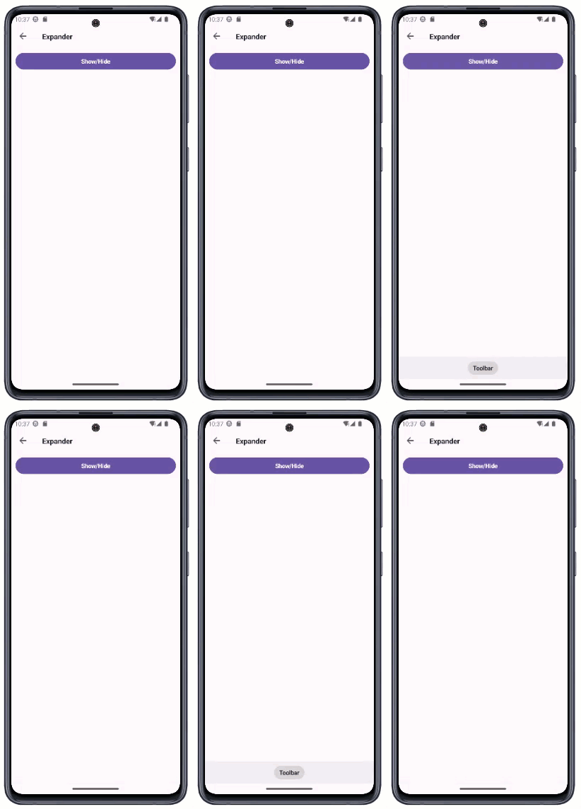
The following code snippet adds a DXExpander instance to a ContentPage:

<ContentPage ...
            xmlns:dx="http://schemas.devexpress.com/maui">
    <dx:DXDockLayout StretchLastItem="False">
        <dx:DXButton
            dx:DXDockLayout.Dock="Top"
            ButtonType="Accent"
            Content="Show/Hide"
            Command="{Binding Source={x:Reference expander}, Path=Commands.ToggleExpandState}" />
        <dx:DXExpander
            x:Name="expander"
            dx:DXDockLayout.Dock="Bottom"
            VerticalExpandMode="FromStartToEnd">
            <dxc:DXToolbar ItemAlignment="Center">
               <dxc:ToolbarText Content="Toolbar"/>
            </dxc:DXToolbar>
        </dx:DXExpander>
    </dx:DXDockLayout>
</ContentPage>
Show and Hide Content
Use the IsExpanded property to specify whether content is visible (in the expanded state). If you want to stretch content to occupy the entire available space within the container, enable the StretchContent property.
To expand and collapse content at runtime, call the SetIsExpanded(Boolean, Boolean) method. This method changes the IsExpanded property value, and has an optional parameter that enables animation effects.
You can also use the ToggleExpandState command to change the DXExpander state.
Horizontal and Vertical Animation
Use HorizontalExpandMode and VerticalExpandMode properties to define horizontal and vertical animation effects applied to the control during expand and collapse operations. The ExpandMode enum lists the following values:
FromStartToEnd- reveals content from start to end.FromEndToStart- reveals content from end to start.FromCenter- reveals content from its center to its edges.None- no animation effect (animation in another direction may be enabled).
To play an animation when the control is displayed for the first time, enable the AllowStartupAnimation property.
Opacity Animation
Use the following properties to expand and collapse a DXExpander component with the opacity animation effect:
- AllowOpacityAnimation
- Gets or sets whether to show and hide content with the opacity animation effect. This is a bindable property.
- ExpandedOpacity
- Gets or sets the control opacity in the expanded state. This is a bindable property.
- CollapsedOpacity
- Gets or sets the control opacity in the collapsed state. This is a bindable property.
- AnimationDuration
- Gets or sets the duration of the animation. This is a bindable property.